|
Author
|
Topic: collectSPACE patch (cS member designs)
|
Hart Sastrowardoyo
Member Posts: 3469
From: Toms River, NJ
Registered: Aug 2000
|
 posted 07-04-2013 02:37 PM
   
quote:
Originally posted by sts205cdr:
Okay, no tattoo, but how 'bout a t-shirt, or denim collared shirt or polo?
Gee... don't the polos worn by shuttle crews have a variation of the official emblem? So I guess there will have to be another round of voting on the polo emblem... (grin, duck). |
GoesTo11
Member Posts: 1377
From: Denver, CO
Registered: Jun 2004
|
posted 07-04-2013 03:05 PM
Hart, there's another reason to vote N (or O)!You don't want to wear a polo shirt with a "stripped" logo that's just generic pointy things flying around, do you? |
Rick Mulheirn
Member Posts: 4593
From: England
Registered: Feb 2001
|
posted 07-04-2013 03:36 PM
I used to be indecisive. Now... I'm not so sure.  |
Tykeanaut
Member Posts: 2267
From: Worcestershire, England, UK.
Registered: Apr 2008
|
posted 07-04-2013 06:10 PM
Guys and gals, I'm getting old and confused. Can we please now have a run-off between two designs if applicable or go for one?Thanks! 
|
aero-engineer
Member Posts: 26
From: Los Angeles, CA
Registered: Jan 2012
|
posted 07-04-2013 11:06 PM
quote:
Originally posted by Robert Pearlman:
I'd want the ISS to be better rendered...
Don't forget this will be in thread, so the ISS would be simplified anyway. |
spaced out
Member Posts: 3211
From: Paris, France
Registered: Aug 2003
|
posted 07-05-2013 01:56 AM
Looking back through the thread there seems to be a slight majority for 'n' over 'm' but I still think a clean run-off vote would be good.The only problem then is that 'n' seems to be a moving target. Maybe we could have a black velcro background to the patch then produce little embroidered versions of Mercury, Gemini, Apollo, the Shuttle, Constellation (!), the ISS, etc that people can stick on as they prefer, or move around going 'whoosh'. [Please note - this is a joke] So I would suggest let's settle 'n' then have a clean run-off vote in a new thread or by email or whatever. |
Gonzo
Member Posts: 599
From: Holland, MI, USA
Registered: Mar 2012
|
posted 07-05-2013 07:22 AM
Amen, Chris! As I said before, we can't let this go on forever. There has to be a time when we say, "This is enough. These are the choices. No more changes." And then move on from there. We're not going to please everyone. Some will be happy, some will be not so happy with the options. But we have to decide. So I agree with Chris, let's finalize "N" and put it up to a run-off. (I'd still vote for "N" though.)And the joke was funny. |
Hart Sastrowardoyo
Member Posts: 3469
From: Toms River, NJ
Registered: Aug 2000
|
posted 07-05-2013 07:54 AM
quote:
Originally posted by GoesTo11:
You don't want to wear a polo shirt with a "stripped" logo that's just generic pointy things flying around, do you?
At that scale, and with thread, will it be recognizable as more than generic pointy things? |
GoesTo11
Member Posts: 1377
From: Denver, CO
Registered: Jun 2004
|
posted 07-05-2013 10:31 AM
Well, yes. The Apollo CSM and Shuttle silhouettes definitely would be recognizable in embroidery even at a very small scale, which is kinda the point (no offense intended) I was joking about the stripped logo, but come on, peeps...let's get this to a vote and make a (proudly worn) patch. |
Jake
Member Posts: 486
From: Independence, OR U.S.A.
Registered: Jun 2002
|
posted 07-05-2013 11:10 AM
Having reviewed the entire thread, I agree that "n" would be the best choice.*Just one voice in the solar wind... ------------------
Jake Schultz - curator,
Newport Way Air Museum (OK, it's just my home) |
canyon42
Member Posts: 241
From: Ohio
Registered: Mar 2006
|
posted 07-05-2013 03:14 PM
I'M STILL VOTING FOR A! (pounding fist on table)Just sayin'. |
Rick Mulheirn
Member Posts: 4593
From: England
Registered: Feb 2001
|
posted 07-05-2013 05:13 PM
Robert, when do you expect to put an end to the discussion and commit? |
Robert Pearlman
Editor Posts: 52924
From: Houston, TX
Registered: Nov 1999
|
posted 07-05-2013 06:00 PM
The artist behind M/N will soon make a post explaining his thoughts and share I believe what will be the final designs to decide between. |
mode1charlie
Member Posts: 1475
From: Honolulu, HI
Registered: Sep 2010
|
posted 07-05-2013 08:50 PM
Just a request for clarification: what is the preferred term for "N with ISS"? Is that still "N", or is it "O"? When people refer to "N" now it's not entirely clear which design they are referring to. So is the choice now between M or N, or M, N, and O? Not trying to be a pain here, but it's getting a little confusing and I think we could use a little clarification. |
Robert Pearlman
Editor Posts: 52924
From: Houston, TX
Registered: Nov 1999
|
posted 07-05-2013 08:55 PM
When the artist posts his final versions for consideration, we can assign clear designations. |
astro-nut
Member Posts: 1057
From: Washington, IL
Registered: Jan 2006
|
posted 07-06-2013 09:11 AM
Originally, I liked A, but now I think I lean towards N a little more. |
KAPTEC
Member Posts: 649
From: Madrid, Spain
Registered: Oct 2005
|
posted 07-07-2013 07:25 AM
I agree with you Harald. In my (personal) opinion, "simplest is better". M is still being my winner. |
Dave Ginsberg
Member Posts: 201
From: Redmond, Washington, USA
Registered: Dec 2007
|
posted 07-09-2013 01:36 AM
I am the artist that created design "M", and subsequently made the modifications requested by Robert, resulting in "N"... and now "P". I also submitted design "G".It has been gratifying to see the positive response to my designs. I want to take this opportunity to share my thoughts and design rationale. I am also posting an update to design "N", and a new version with a clean ISS ("P"), as requested by Robert. As has already been shared when "M" was posted, the concept of the design came to me as a result of reading some of the early suggestions about including the Earth, Moon, Mars and stars. It dawned on me that the emblems that Mike Okuda had created for the Constellation program could provide some inspiration. I also took inspiration from examples of space art I have seen that show the three planetary bodies receding behind each other as a way to represent mankind's aspirations to explore our solar system and the sequential steps leading into the future of human spaceflight. I would like to note that design "M" was actually my first rough draft of the concept. In order to get something produced quickly for comments on the forum, I made all of the spacecraft generic triangles. I realize that generic icons might allow the diverse community of cS members to use their imaginations to "fill in the blank" with their favorite spacecraft. However, my original intent had been to use recognizable spacecraft from history. The decision as to exactly which ones would be left for later. I do not see generic triangle icons as carrying the meaning behind the origins of collectSPACE. Spacecraft silhouettes would achieve this better, in my opinion. I agree with what one cS member said - "M" could just as easily be a fictitious corporate logo or space-tourism startup. (e.g. ArrowSpaceLines?) As for the other variants, I do understand the desire by some to be more "international" since it is true that cS members are from all over the world. However, if you will allow, we may be seen as the inhabitants of the world - represented by the Earth, below - observing and supporting the efforts of spaceflight and exploration. From my perspective, the chosen patch should represent the entity of collectSPACE, rather than attempt to show everything achieved in space history, or every interest held by the cS community. I believe "N" best represents collectSPACE, the entity. Here now, are the two latest designs - an update to "N", and "P" with a clean ISS. N.(updated)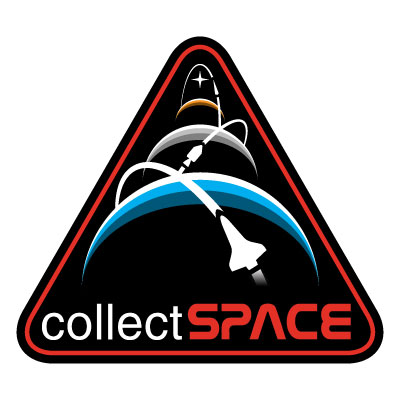 Design "N" is the completed variant of the original draft that was posted as "M". It incorporates the Shuttle Orbiter and the Apollo CSM to make the connection to the origins of collectSPACE. The third spacecraft remains a generic future spacecraft travelling to Mars and beyond. I made some minor adjustments relative to the original "N". I enlarged the star and adjusted the sizes and alignment of the planets and orbits. I also enlarged and reshaped the shuttle to be more accurate and I rounded out the back end of the Mars spacecraft so that it might look less like a mouse pointer.I am very pleased with how the design came together. I particularly like how the geometry worked out with each orbital path "launching" from the point at which the previous orbit crosses its respective horizon. To me it symbolizes how each new advancement in our exploration of space jumps off the successes of earlier accomplishments as our reach continues to extend beyond each horizon. I also like YankeeClipper's interpretation, referring to design "M"... quote:
Originally posted by YankeeClipper:
It has a strong theme of progression in space exploration from the shape of the patch and the planets suggestive of the past, present, and future. The spheres are also suggestive of the diverse cS community meeting/aligning while the orbital paths reflect artifacts and knowledge circulating.
After all, what is space collecting if not, in large part, objects changing hands from one interested individual to another, passing along lessons of history in the process of preserving a legacy for future generations to enjoy? quote:
Originally posted by Robert Pearlman:
collectSPACE was "born" on the 30th anniversary of the Apollo 11 moon landing and it is a "child" of the space shuttle program.
After Robert explained how he associates the origins of collectSPACE with the Apollo and Shuttle programs - and being that this is a collectSPACE (vs. generic space history) patch - I think that using those spacecraft is a subtle and elegant way to make the connection and to uniquely identify the patch with collectSPACE. In my view, "N" achieves this very well. P.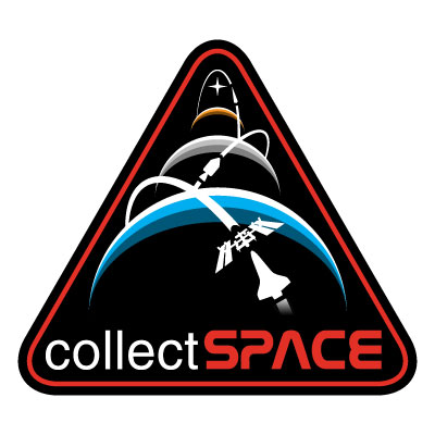 Robert asked me to modify the "O" variations and try cleaning up the ISS and extending the orbital trail behind the shuttle. Design "P" is my best representation of a design that includes the ISS. I found this to be somewhat challenging in that I wanted to avoid overcrowding the design. I reduced the size of the shuttle to make room for the ISS. The result is that two small graphic elements replace the larger single shuttle. Although this may still be a pleasing design, from an objective artistic perspective, I think this tends to weaken the overall graphic impact. Finding the right level of simplification for the ISS, while still making it recognizable in all the forms the design might be produced, was also a challenge. If I made the ISS too detailed, the threaded patch and the small pins might not work well. Make it too stylized and it might not be a good enough representation. I believe I have found the right balance. However, while "P" is perfectly fine as patch designs go, in my view, the design is not quite as successful as "N". To me, it is tending toward being too cluttered. Also, to my eye, the ISS tends to cut off the visual flow. The shuttle begins to lead the eye upwards into the design along its orbit (as is the case with "N"), but then the flow is immediately blocked visually at the station. My eye has some difficulty continuing upwards. Finally, this design is starting to look too much like a mission patch, in my opinion - with too many specific mission elements represented. I believe it would look best if the collectSPACE patch did not compete visually too much with other authentic mission patches that might be worn on the same garment. In conclusion... I believe these two designs represent my best efforts. I would be proud to be the artist if one of these were to ultimately be chosen to represent collectSPACE. To me, design "N", with its Apollo and Shuttle spacecraft, perfectly represents collectSPACE and its origins, and it would be an excellent choice to use as a patch. I personally prefer design "N" from an objective design perspective and for its strong identification with Robert's creation - without which, none of us would be here enjoying this enriching and educating exchange of knowledge, as well as this lively exchange of design opinions.
I trust the cS community will not be shy about sharing their own opinions. I look forward to reading what everyone thinks. |
Tykeanaut
Member Posts: 2267
From: Worcestershire, England, UK.
Registered: Apr 2008
|
posted 07-09-2013 04:41 AM
N for me. |
GACspaceguy
Member Posts: 3096
From: Guyton, GA
Registered: Jan 2006
|
posted 07-09-2013 05:46 AM
Aviation is in my blood but Space Exploration is in my heart. I keep hearing in my heart the statement Robert made in an earlier post on this thread and Dave quoted above “collectSPACE was "born" on the 30th anniversary of the Apollo 11 moon landing and it is a "child" of the space shuttle program.” With that in mind and knowing all things space cannot be included, I feel that the best representation and visual appeal is “N”. |
Harald Kraenzel
Member Posts: 325
From: Dinslaken,Germany
Registered: Nov 2005
|
posted 07-09-2013 06:37 AM
I can follow the explanations regarding updated N and P. And I understand the intend collectSPACE started from.But I also see that collectSPACE has grown since then and therefore today is representing much more than in the past. Furtheron everyone knows that the brilliant collectSPACE site was founded by the space specialist Robert Pearlman in the US and therefore it is vaild to choose US spacecrafts instead of mouse pointers. But what if someone from Europe has choosen the Ariane V rocket -which is f.e. launching the ATV to the ISS- or a person from Russia has choosen the Sojus rocket -which all who want to reach the ISS has to fly with in nower days- instead of the Shuttle(N)/Shuttle+ISS(P), would the community would accept this also? And there are not only manned spacecrafts. There are a lot of unmanned spacecrafts that did a great job. From my point of view the community has to choose what such a logo is for: - to honor the history of collectSPACE -which of course would be a great thing- (this could be N or P) or
- to show all the aspects the community represents (this should be M)
- to combine 1. and 2.
That's my personal view. |
fredtrav
Member Posts: 1799
From: Birmingham AL
Registered: Aug 2010
|
posted 07-09-2013 09:50 AM
I would go with N. P makes it too busy. I understand the desire for the ISS but it just does not fit the patch. You can not put everything in a single patch. |
GoesTo11
Member Posts: 1377
From: Denver, CO
Registered: Jun 2004
|
posted 07-09-2013 10:15 AM
Sticking with N, for all the reasons stated. I'd be OK with P, but I agree with the artist that N is more visually striking and flows better aesthetically. |
Gonzo
Member Posts: 599
From: Holland, MI, USA
Registered: Mar 2012
|
posted 07-09-2013 12:01 PM
I too am sticking with "N". I agree with the artist in that "P" is not visually as pleasing. With "N", the patch flows visually with rounded edges in the image. On "P", with the ISS added, it has sharp corners and interrupts the upward flow. It's a hard image to look at due to those sharp edges and corners. (Not in the sense that it hurts your eyes, but in the sense that it's not as fluid as "N".)While I too agree that "P" may be a bit more contemporary, that works against the patch in that it doesn't represent where cS came from. And that, to me, is what the patch should represent. It's not about current space technology, rather, it represents where cS came from and it's history. The ISS is just an add-on to that history. As Robert said, cS was born on the 30th anniversary of A-11 and is a child of the shuttle. No where in there is the ISS mentioned. So to keep with that rich history, the ISS *SHOULD* be left out. My .02 worth... "N" for me. |
Rick Mulheirn
Member Posts: 4593
From: England
Registered: Feb 2001
|
posted 07-09-2013 03:42 PM
"P".....Superb! |
lspooz
Member Posts: 488
From: Greensboro, NC USA
Registered: Aug 2012
|
posted 07-09-2013 04:37 PM
Another vote for "N" |
Greggy_D
Member Posts: 1014
From: Michigan
Registered: Jul 2006
|
posted 07-09-2013 06:06 PM
Let's go with "N" then. |
mach3valkyrie
Member Posts: 762
From: Albany, Oregon
Registered: Jul 2006
|
posted 07-09-2013 09:07 PM
I still like "A", but "N" will make an excellent looking patch. Thanks for the efforts of all of the artists who submitted designs. |
mode1charlie
Member Posts: 1475
From: Honolulu, HI
Registered: Sep 2010
|
posted 07-09-2013 09:33 PM
I strongly support the symbolism of including the ISS (both because it is a current program and because it emphasizes the international endeavor), and hoped that it might be possible to include it. P is a big improvement over the previous iteration of this (i.e. "O") and so I applaud the effort of the artist in making that attempt. However, I acknowledge that from a graphic/visual perspective, "N" is superior.My vote is for N. On edit: for whomever may be tallying votes, mine is still for N but I would not be unhappy with P. |
KAPTEC
Member Posts: 649
From: Madrid, Spain
Registered: Oct 2005
|
posted 07-10-2013 05:13 AM
Dave, I take my hat off. Congratulations.My opinion for "N": since you put the most recent spacecraft in the front (the Shuttle) and Apollo in the middle... why not to make a tribute to the oldest spacecraft who's still flying...the Soyuz? It might be the third spacecraft in the distance... |
Ronpur
Member Posts: 1260
From: Brandon, Fl
Registered: May 2012
|
posted 07-10-2013 06:36 AM
Well, I still like the simple A patch, but N is beautiful. P is great for adding the ISS, but it just doesn't flow as well as N. I would buy any and all of them, actually. Too bad we can't get more than one type. |
Tykeanaut
Member Posts: 2267
From: Worcestershire, England, UK.
Registered: Apr 2008
|
posted 07-10-2013 07:44 AM
I hope someone is "totting-up" these votes, or would a straight-forward poll be easier? In any event, I'm sure we'd all like it agreed soon? |
Jake
Member Posts: 486
From: Independence, OR U.S.A.
Registered: Jun 2002
|
posted 07-10-2013 12:35 PM
Still like "n" the best... |
MarylandSpace
Member Posts: 1437
From:
Registered: Aug 2002
|
posted 07-10-2013 01:30 PM
I favor G over N over P.So my vote would be for N between the 2 finalists. |
YankeeClipper
Member Posts: 639
From: Dublin, Ireland
Registered: Mar 2011
|
posted 07-10-2013 04:43 PM
N (updated) gets my vote.The orbiter silhouette can represent either the manned US STS spaceflights (with the Canadarm and international astronauts and experiments) or the unmanned USSR Buran spaceflight. No need to add more. |
Space Emblem Art
Member Posts: 198
From: Citrus Heights, CA - USA
Registered: Jan 2006
|
posted 07-10-2013 08:26 PM
I vote for the new "N". |
crash
Member Posts: 356
From: West Sussex, England
Registered: Jan 2011
|
posted 07-11-2013 05:10 PM
It's a vote for N from me but P would be a close second. Whatever the outcome, I would be happy with either. Great work, Dave Ginsberg |
sts205cdr
Member Posts: 759
From: Sacramento, CA
Registered: Jun 2001
|
posted 07-11-2013 08:17 PM
Definitely P for me! |
Skyforce1
Member Posts: 223
From: Port Richey, Florida
Registered: Aug 2009
|
posted 07-11-2013 08:59 PM
My vote is for "P". |
aero-engineer
Member Posts: 26
From: Los Angeles, CA
Registered: Jan 2012
|
posted 07-12-2013 12:16 AM
P for me! quote:
Originally posted by Dave Ginsberg:
I particularly like how the geometry worked out with each orbital path "launching" from the point at which the previous orbit crosses its respective horizon. To me it symbolizes how each new advancement in our exploration of space jumps off the successes of earlier accomplishments as our reach continues to extend beyond each horizon.
I did not notice that. REALLY nice touch Dave. |


