|
Author
|
Topic: collectSPACE patch (cS member designs)
|
Chariot412
Member Posts: 164
From: Lockport, NY, 14094
Registered: Jun 2011
|
 posted 06-20-2013 02:33 PM
   
A is my first choice. That said, A if worn on the arm; G if on the chest. |
GACspaceguy
Member Posts: 3096
From: Guyton, GA
Registered: Jan 2006
|
posted 06-20-2013 02:39 PM
I like (a) the best. I am also concerned about destination perception therefore a small "star" field either side of the name could be added as future destinations could be implied (planets, asteroids or other investigative bodies that a space telescope would view would be covered that way). I would steer clear of those with defined vehicles as it limits the scope. |
Moonmichael
Member Posts: 157
From: Essen, Germany
Registered: Jul 2002
|
posted 06-20-2013 02:40 PM
A or G |
GACspaceguy
Member Posts: 3096
From: Guyton, GA
Registered: Jan 2006
|
posted 06-20-2013 02:44 PM
quote:
Originally posted by Chariot412:
A is my first choice. That said, A if worn on the arm; G if on the chest.
I like that idea as (g) is my second choice as well. |
onesmallstep
Member Posts: 1475
From: Staten Island, New York USA
Registered: Nov 2007
|
posted 06-20-2013 03:03 PM
'A' would be my first choice. Maybe add a few background stars, as future destinations, but overall I like the simple design. Either 'I' or 'J' would be good second choices, provided the words 'collect' and 'Space' could be integrated/joined with the images of the Earth and Moon. Nice submissions from the members! |
mikepf
Member Posts: 448
From: San Jose, California, USA
Registered: Mar 2002
|
posted 06-20-2013 03:27 PM
Congrats and thanks to those who put in such great ideas. But having to pick just one, I'll vote for A also. Maybe a small Mars floating in the background will settle the idea of exploration going forward. |
Spacemac
Member Posts: 68
From: Schererville, Indiana, united states
Registered: May 2009
|
posted 06-20-2013 04:19 PM
I also vote for A. It is s simple design but I agree adding a Mars in the background will avoid it from being too limited. |
mode1charlie
Member Posts: 1475
From: Honolulu, HI
Registered: Sep 2010
|
posted 06-20-2013 04:28 PM
Another vote for "A". It's the most obvious fit, although not the most exciting in some ways. But "I" and "J" have a certain charm that with a bit of adjustment, might possibly be better than "A". To accomplish that, the "c-ness" of the Earth would need to be better defined. |
James Brown
Member Posts: 1288
From: Atlanta, Georgia, USA
Registered: Jun 2000
|
posted 06-20-2013 05:11 PM
A |
Gonzo
Member Posts: 599
From: Holland, MI, USA
Registered: Mar 2012
|
posted 06-20-2013 05:35 PM
OK, here's my .02, for what it's worth.I too like A, but with reservation. I think it's a great design. But I'm concerned how it would come out as a patch. Too much detail. For what this site is, the patch should be simple, yet elegant. That leads to the other end of the spectrum with G. While it is a great representation of the site's logo, I think it is too simple and lacks elegance. So what would I pick? My pick would be I as well. I like it better than J in that J looks like a super-highway to the moon. The only limiting factor I'd say with I is that it lacks future vision as others have said about A - it needs more than just the Earth an Moon. But again, stars or even Mars could be incorporated somehow. (I'd prefer simple stars.) I think a more clear "C" would help as well. We all have to remember here that this is more than just the design. It has be able to transfer and look good as a patch too. |
wickball
Member Posts: 128
From: Cleveland, Ohio, USA
Registered: Jul 2005
|
posted 06-20-2013 05:38 PM
AG is nice but if I had it on my jacket and someone walked by and saw it, they would probably have no idea what it means. A - has the the Earth and Moon and would probably hint that the patch has something to do with space. |
Robert Pearlman
Editor Posts: 52924
From: Houston, TX
Registered: Nov 1999
|
posted 06-20-2013 06:06 PM
I'm really enjoying reading the feedback thus far, and encourage others to weigh in.I'd also mention that if you are an artist and are inspired to alter or improve upon any of these designs, please do. I think derivative works are entirely appropriate and contributes to the community approach we've adopted on cS. With regards to the logo, we have a versionthat incorporates the '.com' that could used for the production version of the emblem. |
Hart Sastrowardoyo
Member Posts: 3469
From: Toms River, NJ
Registered: Aug 2000
|
posted 06-20-2013 06:07 PM
I'm partial to G, because I think it'd look neat on a flightsuit, like the similarly-shaped USAF or McDonnellDouglas patches.That said, shouldn't A have red soil - standing on Mars looking toward the Earth rather than standing on the moon?  |
bwhite1976
Member Posts: 287
From: Belleville, IL
Registered: Jun 2011
|
posted 06-20-2013 06:18 PM
I like G the most. It looks great, isn't cluttered, and conveys all of the necessary information. |
MarylandSpace
Member Posts: 1437
From:
Registered: Aug 2002
|
posted 06-20-2013 09:23 PM
I like the simplicity of G. To the point! |
Tykeanaut
Member Posts: 2267
From: Worcestershire, England, UK.
Registered: Apr 2008
|
posted 06-21-2013 03:20 AM
A for me. (Perhaps with .com?) |
KSCartist
Member Posts: 3090
From: Titusville, FL
Registered: Feb 2005
|
posted 06-21-2013 03:41 AM
I like "A" but I'd ask the artist to consider putting Earth in the foreground, then the Moon, then Mars. Maybe change the shape to be like the STS 111 patch.I also like the idea of a motto. Can anyone post the translations? My Latin is very rusty. Even if the design is not selected, maybe the motto can be adopted. Somone suggested two patches. Not a bad idea using "G" on the sleeve. It's a clean tribute to the original logo. ".com" has to be there. Not for our benefit, but for the people we will all meet. The idea is after all to increase the size of the community. Speaking from experience, all of the submitted designs will embroider just fine. Finally - this project is to help us identify fellow cSers. Let me suggest a name patch as well. Two lines, the first being our cS ID, the second being our name. |
hoorenz
Member Posts: 1045
From: The Netherlands
Registered: Jan 2003
|
posted 06-21-2013 04:08 AM
quote:
Originally posted by KSCartist:
...Two lines, the first being our cS ID, the second being our name.
Poor Hart Sastrowardoyo!
|
johntosullivan
Member Posts: 162
From: Cork, Cork, Ireland
Registered: Oct 2005
|
posted 06-21-2013 05:11 AM
As it's a patch and not just the logo, I vote for A. |
Rick Mulheirn
Member Posts: 4593
From: England
Registered: Feb 2001
|
posted 06-21-2013 05:29 AM
I like "A" but prefer the idea of the Earth in the foreground and the moon beyond.I would also add a vehicle to the design; perhaps a docked CSM/LM heading towards the moon to represent Mankind's spirit of adventure and exploration, with the hint of a trail arcing behind the "E" of collectSPACE (in Apollo 12 Clipper style) as if leaving Earth orbit... |
canyon42
Member Posts: 241
From: Ohio
Registered: Mar 2006
|
posted 06-21-2013 09:48 AM
I'm going to be contrary and disagree with all of the suggestions that Mars (or something else) be added to the "A" design. The fact is that we haven't sent crewed missions to Mars or anywhere else beyond the moon, and unfortunately I don't think that's going to change for a long, long time. I certainly hope to be proven wrong there, but I'm not holding my breath.So in that sense, seeing as how there presently isn't anything to "collect" from beyond the moon (short of some unmanned patches and I guess a few meteorites), I would leave the elements in that design as they are. It shows where we've been — Earth orbit, check; the moon, check. If and when that changes, hey, the design can be updated. What a happy day that will be.  |
J Blackburn
Member Posts: 313
From: Riner
Registered: Sep 2011
|
posted 06-21-2013 10:02 AM
My vote is for "A". However I agree that there needs to be a few stars and Mars in the background. I like the Moon since we have achieved that task. Mars in the background would show our future steps in exploration. Also I agree that "A" needs to have the ".com" added and would make a nice patch for the chest.I also like the idea of "G" as a shoulder patch. Overall, all of the designs are nice. |
GACspaceguy
Member Posts: 3096
From: Guyton, GA
Registered: Jan 2006
|
posted 06-21-2013 12:40 PM
quote:
Originally posted by canyon42:
I'm going to be contrary and disagree with all of the suggestions that Mars (or something else) be added to the "A" design. The fact is that we haven't sent crewed missions to Mars or anywhere else beyond the moon...
While I do understand where you are coming from cS is more than just the crewed missions. I have pieces of Hubble that have searched the heavens, a model of Spirit/Opportunity, Curiosity, Viking, that are on the surface of Mars as well as Voyager that one could argue is in the interstellar spaces, all of which I either purchased or became aware of on this forum. To limit their inclusion would deny a significant portion of this site, at least in my opinion. |
onesmallstep
Member Posts: 1475
From: Staten Island, New York USA
Registered: Nov 2007
|
posted 06-21-2013 01:22 PM
...or maybe a patch can be produced that has an image of Mars hidden by a cover, to be pulled off once we reach the Red Planet, a la the Gemini 5 patch that had the covered slogan 'Eight days or bust'? |
p51
Member Posts: 1784
From: Olympia, WA
Registered: Sep 2011
|
posted 06-21-2013 02:58 PM
quote:
Originally posted by wickball:
A - has the the Earth and Moon and would probably hint that the patch has something to do with space.
quote:
Originally posted by canyon42:
The fact is that we haven't sent crewed missions to Mars or anywhere else beyond the moon, and unfortunately I don't think that's going to change for a long, long time. I certainly hope to be proven wrong there, but I'm not holding my breath.
Very good points, both.It should be something a member of the public should have a fighting chance of getting the topic without having to ask. "collectSPACE" in itself as a name doesn't really tell people what the topic is as in all fairness, it could mean darned near anything. And I agree any graphic representation should be limited to where people have gone. |
Jake
Member Posts: 486
From: Independence, OR U.S.A.
Registered: Jun 2002
|
posted 06-21-2013 04:51 PM
I'd lean toward the first (oval) design... |
mikepf
Member Posts: 448
From: San Jose, California, USA
Registered: Mar 2002
|
posted 06-21-2013 05:27 PM
Plenty of people on this site collect things from the unmanned programs. They should not be excluded. And don't forget that there are cS forum topics on the subject as well. |
Greggy_D
Member Posts: 1014
From: Michigan
Registered: Jul 2006
|
posted 06-21-2013 05:40 PM
Add some stars or colored distant "stars" (aka planets) to version A and call it a day. That should cover all of us. |
mach3valkyrie
Member Posts: 762
From: Albany, Oregon
Registered: Jul 2006
|
posted 06-21-2013 06:57 PM
I like (a). It's a clean design and to the point.I also like (i) because it reminds me of the Voyager photo of the Earth-Moon system taken soon after launch in 1977 from 7 1/4 million miles above Mt. Everest. Cool! |
p51
Member Posts: 1784
From: Olympia, WA
Registered: Sep 2011
|
posted 06-21-2013 07:09 PM
quote:
Originally posted by Greggy_D:
Add some stars or colored distant "stars" (aka planets) to version A and call it a day. That should cover all of us.
Sounds fair. Just slap a 'dot com' onto the name and I think it'd be just fine. |
GoesTo11
Member Posts: 1377
From: Denver, CO
Registered: Jun 2004
|
posted 06-21-2013 07:12 PM
Agree on both.
|
Robert Pearlman
Editor Posts: 52924
From: Houston, TX
Registered: Nov 1999
|
posted 06-21-2013 10:34 PM
Interesting discussion. A few clarifications: - collectSPACE is about the history of space exploration, manned and unmanned, U.S. and Soviet/Russian (and international), past, present and in the near future.
- collectSPACE is the "source for space history and artifacts." We have our roots in space collectibles, but the "collect" in our name (one word, not two), has come to mean collecting stories, collecting artifacts and collecting people together.
With that said, we have our first set of derivative ideas, created by cS members in response to the comments in this thread. k. The artist says: A has strong recognition from the classic "Earthrise" photo but needed additional deep space. I don't think a starfield would work quite as well — the impact from the original Earthrise was the blue sphere against the infinite deep black of space. Calls for more destinations and vehicles on the patch would steer the design more toward the McCall Mission Control patch design. l.  The artist says: G is a simple clean design but the original border drew attention away from the cS logo. I've changed the border colour to a light grey or silver in order to accentuate the cS logo. m. 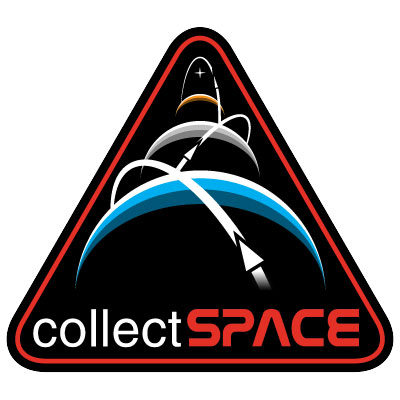 The artist says: I had been reading some of the early comments and suggestions about the patch entries about including the Earth, Moon, and Mars. It dawned on me that the emblems that Mike Okuda had created for the Constellation program could provide some inspiration. So, last night, referencing Okuda's designs, I created a similar (but hopefully not too similar) design for the cS patch.
When I awoke this morning, I saw several more comments that essentially described what I had drawn the night before! |
Skyforce1
Member Posts: 223
From: Port Richey, Florida
Registered: Aug 2009
|
posted 06-21-2013 11:44 PM
I'm all in for "A". The oval shape with the earth and the moon is direct, to the point, clean and very well done. No need for stars or the planet Mars. People will no doubt ask about the patch and what collectSPACE is. I strongly believe the patch is self-explanatory. |
YankeeClipper
Member Posts: 639
From: Dublin, Ireland
Registered: Mar 2011
|
posted 06-22-2013 12:58 AM
I really like design M! Clever adaptation of an existing concept. It has a strong theme of progression in space exploration from the shape of the patch and the planets suggestive of the past, present, and future. The spheres are also suggestive of the diverse cS community meeting/aligning while the orbital paths reflect artifacts and knowledge circulating. Great design, well executed ... has to be a strong contender. |
mode1charlie
Member Posts: 1475
From: Honolulu, HI
Registered: Sep 2010
|
posted 06-22-2013 05:26 AM
M! Now the clear standout. Well done. |
GACspaceguy
Member Posts: 3096
From: Guyton, GA
Registered: Jan 2006
|
posted 06-22-2013 05:38 AM
"...collecting stories, collecting artifacts and collecting people together."An interesting perspective that I had not truly considered. The stories heard, the relationships fostered and the people remembered are every bit as cherished as the artifacts obtained. Thanks for the reality check Robert. |
Rick Mulheirn
Member Posts: 4593
From: England
Registered: Feb 2001
|
posted 06-22-2013 07:16 AM
M is excellent. I'd be quite happy with that one. |
canyon42
Member Posts: 241
From: Ohio
Registered: Mar 2006
|
posted 06-22-2013 09:47 AM
M is cool (although I'm afraid that it is perhaps a little TOO close to the Constellation design), but the original A is still far and away my first choice. |
p51
Member Posts: 1784
From: Olympia, WA
Registered: Sep 2011
|
posted 06-22-2013 11:41 AM
quote:
Originally posted by mode1charlie:
M! Now the clear standout. Well done.
I agree, either this one or A. |
butch wilks
Member Posts: 336
From: Lowestoft, Suffolk, UK
Registered: Mar 2007
|
posted 06-22-2013 11:54 AM
Me, I like; I. and M.But make I. into an oval as this would help you fit in the .COM in the bottom part of the patch, and than would have a better look to it than just as a straight patch as it is now. I like M. as it is. But I like the idea of a name tab as a add on too. Can i suggest to you some sizes for the patches; I. in a 4" patch for the pocket or arm, and for M. a 4" and an 8" or 10" for pocket, arms and back panels patch. I'd love to have a 10" M. patch on my back. |


