|
Author
|
Topic: collectSPACE patch (cS member designs)
|
Robert Pearlman
Editor Posts: 52924
From: Houston, TX
Registered: Nov 1999
|
 posted 06-22-2013 03:43 PM
   
I asked the artist of M. to add a couple of visual elements that I thought would help convey the space history focus of this site, while also symbolizing the history of cS itself.collectSPACE was "born" on the 30th anniversary of the Apollo 11 moon landing and it is a "child" of the space shuttle program. n.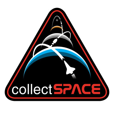 |
hoorenz
Member Posts: 1045
From: The Netherlands
Registered: Jan 2003
|
posted 06-22-2013 04:15 PM
Make the third one a mouse pointer! (that is what I saw in the first version of 'm'). And why not ISS instead of Shuttle as a more international symbol (and to represent history, present and future). |
mode1charlie
Member Posts: 1475
From: Honolulu, HI
Registered: Sep 2010
|
posted 06-22-2013 06:51 PM
M - new and improved! Tough to beat.Point taken on the ISS versus Shuttle, although in addition to Robert's points about the symbolism for cS's inception, it's tricky for other reasons as well. I agree that the international significance of the ISS would be good to have, although the Shuttle was also international in an important sense, and the vehicle itself is rather more iconic. Also, where do you stop with that - must Soyuz also be included? Vostok? Sputnik? Too many design elements and the thing becomes visually cluttered. It's impossible to have everything, or to reflect every single constituency, and so I think the current ("M" version 2.0) design is excellent as it is. On edit: it's hard to see what the third vehicle over Mars is intended to represent. In a nod to unmanned probes, what about a Voyager or similar vehicle? (Granted that it would need to be something easily represented as a stylized, simplified icon so this may be hard to do given how small that design element must necessarily be.) |
KSCartist
Member Posts: 3090
From: Titusville, FL
Registered: Feb 2005
|
posted 06-23-2013 04:47 AM
Since cS was "born" on the 30th anniversary of Apollo 11 - smack dab in the middle of the shuttle program, the image of the orbiter and Apollo CSM are appropriate. I would change the icon orbiting Mars to a star ( ala the CSA emblem). Due to the distance and that we don't know what spacecraft will be used. Although Erik's suggestion of a mouse pointer icon is perfect! I'd like to make one last pitch for the motto. Promovere, Conservet, Disserendum from the "E" and "F" — "Pomote, Preserve, Discuss" is what we do as a community. |
Rick Mulheirn
Member Posts: 4593
From: England
Registered: Feb 2001
|
posted 06-23-2013 05:30 AM
The new improved M is the one for me. |
GACspaceguy
Member Posts: 3096
From: Guyton, GA
Registered: Jan 2006
|
posted 06-23-2013 05:41 AM
The new version of M (now identified as N) changes the feel altogether. At first I felt that it was too similar to the Constellation Program. However, with the vehicle addition, it changes that completely (as well as adjusting my computer screen aspect ratio that allows me to see that the shape is actually matching the Shuttle Program patch). My concerns about the types of vehicle and those that may be missing are not as strong once Robert explained how the two that are depicted greatly influenced the birth of this site. I feel that N is now my front runner as it can also convey previous outward exploration as well as forward thinking. |
GoesTo11
Member Posts: 1377
From: Denver, CO
Registered: Jun 2004
|
posted 06-23-2013 08:11 AM
I like N.  |
Rick Mulheirn
Member Posts: 4593
From: England
Registered: Feb 2001
|
posted 06-23-2013 08:48 AM
"n" does it for me. The only thing I would change would be to make the mouse pointer heading toward Mars in to a recogniseable spacecraft such as Mariner or Viking. |
GoesTo11
Member Posts: 1377
From: Denver, CO
Registered: Jun 2004
|
posted 06-23-2013 10:33 AM
quote:
Originally posted by Rick Mulheirn:
The only thing I would change would be to make the mouse pointer heading toward Mars in to a recogniseable spacecraft such as Mariner or Viking.
Respectfully disagree. I like the indistinct icon...it represents our future explorations of Mars and beyond, whatever the craft.
|
Rick Mulheirn
Member Posts: 4593
From: England
Registered: Feb 2001
|
posted 06-23-2013 12:52 PM
GoesTo11, I see where you are coming from, and was torn between a recogniseable third vehicle and an ambiguous representation of spacecraft to come.Both options have their merits. Safe to say I would buy the patch whichever of those options were chosen. |
GoesTo11
Member Posts: 1377
From: Denver, CO
Registered: Jun 2004
|
posted 06-23-2013 01:05 PM
To me, the "pointer" icon is fitting, as it can represent not only our prior (and ongoing) expeditions to Mars and the outer planets, but also what may come.I'll leave aside whether the ".com" should be added, and say I'm on board with this design either way. |
Gonzo
Member Posts: 599
From: Holland, MI, USA
Registered: Mar 2012
|
posted 06-23-2013 07:22 PM
I said before that "A" had some limitations to me and that "I" was my choice, again with some limitations that I didn't care for.Then I saw "N" and have read the comments thus far. "N" is the clear choice. It clearly represents all that cS stands for and all of the explorations as well. As for the comments, I'll say this. The third vehicle should stay as it is. While I understand the reasoning on making it a mouse pointer, and I like the idea, to me, because it is so small, any shape it may have will only be discernible on a larger decal or patch. That is, for it to be recognizable to any degree, it seems it would need to be bigger. So I say it's a moot point (no pun intended). As for adding ".com" to the patch. No way. In this day and age and working in IT, if someone is interested, they will know to add ".com" to the name. It's pretty much a given at this point and adding it to the patch, to me, is not only unneeded, but would distract from the beauty of the patch. I'm sure everyone on here will agree that while the site itself is limited, technically, to the website, it has affected each of us in many ways that go far beyond the site itself, with new avenues of learning we may not have tried, new friends that we now interact with outside of the site, etc. One last thing, having the shuttle in the foreground and the CSM second, makes perfect sense. Looking at the design, you can't change the order. The Earth is first, the Moon second and Mars third. We all started here and went to the Moon. We then sent probes to Mars. It is also the physical order of the three. Going further, cS was born in the age of the shuttle (making that design element more important), on the 30th anniversary of A-11 landing, an secondary significant element. While we look to the future, at Mars, makes it third. The order to me is very appropriate, not just for the history of cS, but also space exploration as well. Finally, I too agree with the idea of a name patch. Maybe with collectSpace on the first line and your name (or your ID from the site or otherwise) on the second line. But that would also mean that they would have to be custom patches too. Which means Robert would have to track, and order, custom patches for everyone. As an alternative, maybe just a simple one like "I". In any event, I'd support that idea too. My only questions now are: - When will they be available and in what sizes, and
- When can we place advance orders?
My kudos to the artist for this one. I think it will be the clear winner! |
Robert Pearlman
Editor Posts: 52924
From: Houston, TX
Registered: Nov 1999
|
posted 06-23-2013 07:35 PM
Unless a strong case is made for a design other than N. by mid-week (June 26), then I'll proceed with the artist to produce the final artwork and begin work on its production (I have already been in touch with both patch and pin companies).It might not be possible to have these patches (and pins) in hand by our anniversary on July 20, but by then we should at least have the orders submitted. Assuming we're all in agreement by Wednesday, I'll also share the names of all of the artists, as they are all due praise for their contributions. |
Gilbert
Member Posts: 1521
From: Carrollton, GA USA
Registered: Jan 2003
|
posted 06-23-2013 07:51 PM
I like N a lot. I also agree with Tim that "Promovere, Conservet, Disserendum" would be cool also. |
GoesTo11
Member Posts: 1377
From: Denver, CO
Registered: Jun 2004
|
posted 06-23-2013 07:55 PM
Agree with Gonzo's comments. "N" it is, as far as I'm concerned.Assuming this is our winner (no disrespect intended to anyone else's contributions), can I suggest a baseline size for the embroidered patch start at 3" (76 mm) a side? That would make it comfortably applicable to a hat, as well as a shirt or jacket. |
Ronpur
Member Posts: 1260
From: Brandon, Fl
Registered: May 2012
|
posted 06-23-2013 08:18 PM
Some very cool designs here. I love N as well and would love it for a hat or jacket. Or even a polo or t-shirt! As for the name tag for members, I keep thinking of the rectangle add-on that were designed to be used for the original Shuttle Program patch. Something like that below this patch would look cool! |
Hart Sastrowardoyo
Member Posts: 3469
From: Toms River, NJ
Registered: Aug 2000
|
posted 06-23-2013 08:31 PM
N won me over, too. I'm thinking a 4" patch... and there's room on the bottom to put square aprons for collectSPACE functions, like the original ideas for space shuttle missions... |
mode1charlie
Member Posts: 1475
From: Honolulu, HI
Registered: Sep 2010
|
posted 06-23-2013 08:40 PM
I second Gonzo's comments. N is the clear standout in the crowd. I don't think any other design elements (name, Latin, etc.) should be added to the main design. Simplicity is beauty. That said, an add-on rectangular name tag below the patch might be fine, but it would be good to see an example of what this would look like, and if it would entail a much bigger production headache for Robert, then that should be put off in the name of expediency.) A pin - or a sticker, for that matter - is a great idea. Although I collect patches, I'm 100% more likely to actually wear a pin for an occasion or slap a sticker somewhere. Finally, thanks and congrats to all the artists and to Robert. So Robert, will this also become the official cS logo? I think you've got a real winner with this design. |
Chariot412
Member Posts: 164
From: Lockport, NY, 14094
Registered: Jun 2011
|
posted 06-23-2013 10:20 PM
n. |
Space Emblem Art
Member Posts: 198
From: Citrus Heights, CA - USA
Registered: Jan 2006
|
posted 06-23-2013 10:28 PM
Robert, Great submissions by talented artists. N seems the winner by consensus. As you continue this project I'd recommend a 4 inch patch also, as it's a standard size and should allow enough space so the design does not get cramped. Not sure how far you've gotten with the patch company but may I recommend having the patches finished with a sewn merrowed border rather than a hot needle cut border. The patches' shape would allow for a merrowed border, and unless pricing is an issue, a merrowed border would provide a better and richer finish and look. Thanks for listening.
|
Rick Mulheirn
Member Posts: 4593
From: England
Registered: Feb 2001
|
posted 06-24-2013 03:40 AM
"n" in a 4 inch size would be preferable in my opinion; the idea of an enameled pin badge is very good. Count me in for both.A quick production time too; with a bit of luck I will be able to flaunt the design when travelling to KSC in August. |
ejectr
Member Posts: 2011
From: Killingly, CT
Registered: Mar 2002
|
posted 06-24-2013 06:14 AM
"N" is my choice. Nice walk through past, and future. |
Marwin2
Member Posts: 190
From:
Registered: Oct 2006
|
posted 06-24-2013 09:49 AM
I vote for M. |
YankeeClipper
Member Posts: 639
From: Dublin, Ireland
Registered: Mar 2011
|
posted 06-24-2013 01:38 PM
M was very good, N is even better. |
hoorenz
Member Posts: 1045
From: The Netherlands
Registered: Jan 2003
|
posted 06-24-2013 02:26 PM
M. Shuttle is too prominent. I like the more anonymous mouse pointers.We can all see in them what we like... |
spaced out
Member Posts: 3211
From: Paris, France
Registered: Aug 2003
|
posted 06-24-2013 04:47 PM
I do like N but using specific vehicle shapes means picking and choosing between programs and inevitably in leaving out some key spacecraft (Mercury, Gemini, Skylab, ISS..). That's why my preference would be for the 'pointers' in M.Having said that, I may be biased because the logo I made for my SpaceFlownArtifacts site used much the same style for exactly those reasons.  And no... I didn't submit any of the designs here. |
p51
Member Posts: 1784
From: Olympia, WA
Registered: Sep 2011
|
posted 06-24-2013 05:02 PM
I felt bad that I didn't get to the design I had in mind but in all fairness I think N is better than what I'd thought of anyway. quote:
Originally posted by Robert Pearlman:
Unless a strong case is made for a design other than N. by mid-week (June 26), then I'll proceed with the artist to produce the final artwork and begin work on its production (I have already been in touch with both patch and pin companies).
Yeah, I think you do have a consesus there. I didn't think it would be quite this simple. |
Rick Mulheirn
Member Posts: 4593
From: England
Registered: Feb 2001
|
posted 06-24-2013 05:09 PM
The relative sizes of the spacecraft lend perspective to the design in my opinion. Not to mention the 100+ shuttle missions that flew compared to the 9 Apollo flights to the moon give shuttle certain bragging rights under the circumstances. |
GoesTo11
Member Posts: 1377
From: Denver, CO
Registered: Jun 2004
|
posted 06-24-2013 05:37 PM
quote:
Originally posted by Rick Mulheirn:
The relative sizes of the spacecraft lend perspective to the design in my opinion.
I agree with this. While I "get" the support for M, I think N appears more visually interesting and aesthetically balanced. I also agree with the poster who noted that a consensus on this came a lot more smoothly than I would have guessed!
|
Cozmosis22
Member Posts: 1115
From: Texas * Earth
Registered: Apr 2011
|
posted 06-24-2013 05:57 PM
The first couple of pages of this thread the Earth/Moon design of proposal "A" seemed to be the front runner. Now it is "M" which is getting more attention but is by no means a universal favorite.The "A" patch is clean and simple and cannot be misunderstood. Earth is our starting point and the moon was the first step on our quest for expansion out into the galaxy. |
Greggy_D
Member Posts: 1014
From: Michigan
Registered: Jul 2006
|
posted 06-24-2013 06:19 PM
Now seeing M/N, I would like to change my vote from A. I do think the pointers on M are appropriate, because they represent any craft (or country) that has orbited the Earth, Moon, or Mars and you are not tied down to a specific program/vehicle.My vote is now M. |
Robert Pearlman
Editor Posts: 52924
From: Houston, TX
Registered: Nov 1999
|
posted 06-24-2013 06:37 PM
From my perspective, what "M" lacks is an indication that collectSPACE is about space history. Whereas, by adding the shuttle and command module, that element is added, as is a subtle touch of symbolism about the history of cS. |
canyon42
Member Posts: 241
From: Ohio
Registered: Mar 2006
|
posted 06-24-2013 09:06 PM
I'm still holding out my vote for A as well. It would be immediately identifiable as to the topic even for those completely unfamiliar with collectSPACE, and I think the reminiscence of the "Earthrise" photo it contains would be a powerful association for many people. I also like the simplicity of the design compared to the others now in the front-running: it's more spare and to the point, with less clutter. Plus, I still think the other design is too close to the Constellation emblem.I will admit that the M/N basic design is pretty good, but it's not a 100 percent consensus — A still does it for me. |
GoesTo11
Member Posts: 1377
From: Denver, CO
Registered: Jun 2004
|
posted 06-24-2013 09:53 PM
quote:
Originally posted by canyon42:
Plus, I still think the other design is too close to the Constellation emblem.
The what emblem...?  |
justin13
Member Posts: 58
From: Richmond, VA, U.S.A.
Registered: Aug 2005
|
posted 06-24-2013 09:54 PM
Nothing had jumped out at me until I saw M. N makes some good changes- I like the silhouettes of the specific spacecraft. I'm less enthused about the shape being inspired by a cancelled program. I read another comment in this thread suggesting a shape more like STS-111. An extended triangle like that might allow for more flexibility in which spacecraft are used, especially in Earth orbit. Perhaps something akin to the Shuttle/ISS silhouette used for STS-121 (though updated to show the completion of Station construction) could give the patch a more international flair?If it's too late for such changes, I'll cast my vote for N. |
DG27
Member Posts: 270
From: USA
Registered: Nov 2010
|
posted 06-25-2013 01:45 AM
This has become a very interesting effort and has provoked some good discussions. Here are a few of my thoughts.Regardless which design is finally chosen, keep in mind that any name with .com is really just a street address on the internet highway. I have not found any use of “collectSPACE.com” in the title of Robert’s site. Unless there is a desire to advertise the web address, I would recommend not adding .com to the patch. For example, I have never seen a Boeing.com patch. Also, the problem with adding specific spacecraft details or other elements to a patch is that it becomes self limiting. I know we all like to add additional details to make the patch more eye catching. However, by adding only one or a few spacecraft or planets, you have excluded all others by not including them. As Robert stated, collectSPACE is about the history of space exploration, manned and unmanned, U.S. and Soviet/Russian (and international), past, present and in the near future. So by showing only US spacecraft, other countries are excluded. Try and add the others and it rapidly becomes too cluttered. Sometimes simpler is more powerful and says much more. Lots of details are good on a mission patch where there is a specific mission, crew, vehicle, and/or destination. Conversely, program patches are more difficult to convey their meaning since they have too many details to capture in one patch, so they intentionally have less specific details but focus on the essence of the objective of the program (An example is the Gemini Program Patch. Also, while the Apollo program patch had more details than the Gemini program patch, it still had far less details on it than what was performed on the entire Apollo program.) Now, Robert’s collectSPACE patch may be the most difficult of all to design, since it captures the essence all of spaceflight, spacecraft, missions, artifacts, history, and people. This is an interesting challenge. And since it has to cover such a wide range, I believe simpler can be more effective. |
canyon42
Member Posts: 241
From: Ohio
Registered: Mar 2006
|
posted 06-25-2013 09:46 AM
quote:
Originally posted by GoesTo11:
The what emblem...?
Sorry, you lost me. What did I goof on with the Constellation reference? |
GoesTo11
Member Posts: 1377
From: Denver, CO
Registered: Jun 2004
|
posted 06-25-2013 10:50 AM
Sorry, just making a (lame) joke... I didn't think we talked about Constellation anymore.
|
p51
Member Posts: 1784
From: Olympia, WA
Registered: Sep 2011
|
posted 06-25-2013 03:50 PM
quote:
Originally posted by DG27:
For example, I have never seen a Boeing.com patch.
Yeah, well, Boeing isn't primarily an internet entity. cS is a website as it's primary (and I think ONLY) function. The huge difference between the two should be obvious. |
YankeeClipper
Member Posts: 639
From: Dublin, Ireland
Registered: Mar 2011
|
posted 06-25-2013 08:02 PM
I concur with an earlier comment from mode1charlie.The NASA STS Orbiter is iconic and has a simple silhouette. Although inherently a US spacecraft, it flew many international astronauts and experiments, docked with Mir and helped to build the ISS. The Orbiter links many international space agencies. The silhouette could also represent the Soviet Buran Orbiter which made one unmanned spaceflight. I don't think Sputnik or Vostok would be as readily identifiable to a non-expert. |


