|
Author
|
Topic: collectSPACE patch (cS member designs)
|
aero-engineer
Member Posts: 26
From: Los Angeles, CA
Registered: Jan 2012
|
 posted 06-26-2013 03:49 PM
  
The "N" concept is excellent.I agree with Tim and suggest a slightly different motto along the bottom in smaller font of "Preserve, Discuss, Discover". Also, I feel that visually the logo is unbalanced. It is quite heavy on the right hand side between the shuttle and the "SPACE" font. There is a empty space on the left above "collect". As a possible solution, I suggest that the ISS be put in place of the shuttle on the orbital track, and that the shuttle be positioned in close formation toward the left to balance the emblem visually. (No shuttle orbital track) As a side benefit, both the shuttle and ISS would be represented. As an alternate, try keeping the shuttle where it is and place the ISS on the left with no orbital track. This would allude to the shuttle visiting the station. I understand the limits to embroidery and the desire to keep a simple elegant design. There is a fine line between balanced and cluttered. |
mode1charlie
Member Posts: 1475
From: Honolulu, HI
Registered: Sep 2010
|
posted 06-26-2013 05:26 PM

I don't want to get into the proposed ISS addition either way, so just addressing aero-engineer's visual balance concern: Visually, it looks good to me as currently proposed. Rather than trying to achieve symmetry, from an artistic standpoint it's better to have the elements laid out corresponding to the Golden Ratio. I haven't taken out a ruler and measured it, but it seems pretty close to that mark. |
aero-engineer
Member Posts: 26
From: Los Angeles, CA
Registered: Jan 2012
|
posted 06-26-2013 06:59 PM
Also basically "Rule of Thirds". (Not exact though, rule of thirds is a 1.5151 resultant ratio) No, I don't think the emblem should be symmetric. But I do feel it is not balanced. Personally, my eye stays on the right side and follows the shuttle track down into the "A" is "SPACE". There is nothing guiding my eye to the left. The track of the Apollo capsule dead ends right into the shuttle track. That is why in my mind an element aligned with the Apollo track out to the left in the empty void area could guide the eye into the double l in "collect". Just one person's subjective opinion though. I'm the type to put something down on paper just to see how it works. |
lspooz
Member Posts: 488
From: Greensboro, NC USA
Registered: Aug 2012
|
posted 06-26-2013 10:41 PM
To help finalize dsign/features, consider the overall goals/functions: - advertise/promote the site: this requires clarity and simplicity in an eye-catching design. While adding .com is more technically accurate, it is becoming as superfluous as the now-unnecessary 'www' prefix - anyone already familiar with collectSPACE would see the patch and recognize a fellow; anyone unfamiliar BUT interested given the design would just Google the word.
With this in mind, I'd pick N (with G as backup). It's attractive, versatile, and choice N would make a great enamel pin or sticker as well as a patch. And while the Shuttle is no longer flying, it's silhouette is by far the most well known to the public worldwide, particularly with them being now on display... Put me down for 2 patches, 2 enamel pins, 10 decals, 2 T-shirts, perhaps a hat... - Recognize fellow members - Shoulder patch G
- fundraising/publicity/giveaways-contest prizes (hint hint) Up for grabs.
If bulk lots of cheap decals, it might be worth adding .com in smaller text and vertical orientation, conveying the online presence and looking somewhat like an exclamation point. |
Philip
Member Posts: 6266
From: Brussels, Belgium
Registered: Jan 2001
|
posted 06-30-2013 05:50 AM
Didn't read everything in detail but design M is superb... for an "oldtimer" on cS.  |
SkyMan1958
Member Posts: 1389
From: CA.
Registered: Jan 2011
|
posted 06-30-2013 10:04 PM
I like A and it's derivative K. In my opinion a patch should be neither too busy or too boring, and A/K are classic. |
aero-engineer
Member Posts: 26
From: Los Angeles, CA
Registered: Jan 2012
|
posted 07-01-2013 11:49 PM
Just for giggles, I was proposing something like this: 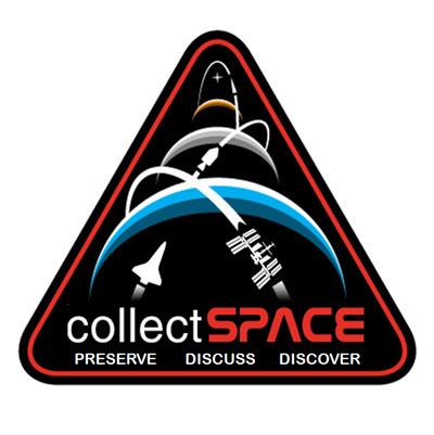 |
GoesTo11
Member Posts: 1377
From: Denver, CO
Registered: Jun 2004
|
posted 07-02-2013 12:12 AM
I'd be okay with the ISS addition; the new text not so much.That said, aren't we supposed to have settled on this by now? |
Gonzo
Member Posts: 599
From: Holland, MI, USA
Registered: Mar 2012
|
posted 07-02-2013 05:07 AM
I second that comment. Two points. First, I too thought this was settled. And second, I don't like the addition of either the ISS or the text. I thought it was good the way it was. The addition now makes it too busy. Now there's too much going on. And this is the risk you take in trying to represent too much. If you add the ISS (which I thought was represented quite well with the shuttle), why not Gemini and Mercury? I appreciate that the ISS is new (historically speaking) and that there are those that have an interest in it over the "old" programs. But what about those of us that have an interest in Gemini, Mercury and Apollo? (You can argue that all 3 are represented with the CSM. But if that's the case, why the specific representation of the shuttle AND the ISS?) So if you add them too to appease us old-timers, where do you stop? The way it was had a simple, yet elegant design and represented everything. Leave it alone. It was great the way it was. |
GACspaceguy
Member Posts: 3096
From: Guyton, GA
Registered: Jan 2006
|
posted 07-02-2013 05:10 AM
I agree, it is too busy with the ISS and words. "N" is fine as is for me. |
Skyforce1
Member Posts: 223
From: Port Richey, Florida
Registered: Aug 2009
|
posted 07-02-2013 05:55 AM
Here's my idea. Delete the Shuttle, ISS and Apollo, keep the generic pointer in the background over Mars and instead of the star put a swirling galaxy. Delete the words at the bottom and since the patch is in the form of an Apollo CM a la Apollo 8, that will pay homage to the historical aspect of collectSPACE and the generic pointer to the future. Simple, clean and crisp. |
Tykeanaut
Member Posts: 2267
From: Worcestershire, England, UK.
Registered: Apr 2008
|
posted 07-02-2013 06:40 AM
Yep, let's make a decision all. We're not politicians! |
Rick Mulheirn
Member Posts: 4593
From: England
Registered: Feb 2001
|
posted 07-02-2013 06:41 AM
Docking the shuttle to the ISS might be an appropriate compromise. And I'd stick with "collectSPACE" as the only text on the patch in my opinion. |
spaced out
Member Posts: 3211
From: Paris, France
Registered: Aug 2003
|
posted 07-02-2013 08:08 AM
I note that aero-engineer's post above started with the words "Just for giggles...". He explicitly wasn't intending the text as a serious addition.I suggest that at this point it might be worth Robert proposing a simple run-off vote between the two most popular options, which I believe to be (m) with generic pointers and (n) with Shuttle et al silhouettes. |
fredtrav
Member Posts: 1799
From: Birmingham AL
Registered: Aug 2010
|
posted 07-02-2013 10:01 AM
I too think it is time to choose. I would think the choices are A or N and would be happy with either. |
GoesTo11
Member Posts: 1377
From: Denver, CO
Registered: Jun 2004
|
posted 07-02-2013 10:42 AM
My vote for N, as is. |
aero-engineer
Member Posts: 26
From: Los Angeles, CA
Registered: Jan 2012
|
posted 07-02-2013 12:30 PM
Regarding a few things above: - I presume this thread is still open since Robert hasn't looped back around called the book closed.
- I feel a picture is worth a thousand words.
- My personal interpretation on the emblem is "Past, Present and Future". Apollo represents the Past and the culmination of the prior NACA/NASA programs. Mars represents the Future. Not to rehash it, but what represents the Present? The ISS, which could be thought of a culmination of Skylab and STS. However, a lot of us recognize the Shuttle was a jack of all trades, Robert said he wants the Shuttle, and I already stated what I was trying to do visually right or wrong with my untrained eye.
I think the goal of having a community "group grope" is a good one. Those often are chaotic in progress, but the results of the session are usually quite good as long as everyone keeps the powder dry. |
englau
Member Posts: 110
From: tampa, florida, usa
Registered: Mar 2012
|
posted 07-02-2013 10:48 PM
M is incredible. I dont know what the status is on the contest, but if it is still open, I'd like to cast my vote for that one! It is bold, simple and elegant. |
keith.wilson
Member Posts: 95
From: Isle of Gigha, Argyll, Scotland
Registered: Jun 2002
|
posted 07-03-2013 06:02 AM
M gets my vote.I take Robert's point about wanting the patch to convey the space history focus of this site, while also symbolizing the history of cS. cS is an American organisation and so has every right to give the patch an American human spaceflight slant (Apollo, Shuttle).
However, lots of cS members focus on non-US aspects of spaceflight and also unmanned spaceflight and design N in my view doesn't cater for them. Is the patch intended to represent the organisation and its history or is it intended to represent the wide variety of interests of all its members? |
lm5eagle
Member Posts: 429
From:
Registered: Jul 2007
|
posted 07-03-2013 06:24 AM
cS is dynamic, moving forward with time and events as they occur during that time period. Design m is reflective of dynamic progression and the graphic representation illustrates this so well and in a very likeable way. |
Rick Mulheirn
Member Posts: 4593
From: England
Registered: Feb 2001
|
posted 07-03-2013 07:04 AM
Keith makes some valid points. Were design "n" however to include the shuttle docked to the "International Space Station" this.... in addition to the "generic" pointer heading out beyond Mars would in my opinion be a sufficient representation of the multi-national nature of spaceflight.Design "n"...either as it stands or with the shuttle docked to ISS floats my boat. |
Philip
Member Posts: 6266
From: Brussels, Belgium
Registered: Jan 2001
|
posted 07-03-2013 07:29 AM
Agreed, I'd also stick with "collectSPACE" as the only text on the patch in my opinion... How large will the patch be? |
xlsteve
Member Posts: 397
From: Holbrook MA, USA
Registered: Jul 2008
|
posted 07-03-2013 08:08 AM
I agree with choice N without text. Let's light this candle! |
Tykeanaut
Member Posts: 2267
From: Worcestershire, England, UK.
Registered: Apr 2008
|
posted 07-03-2013 09:22 AM
Whichever design is chosen, do you think an iron-on transfer would be a good idea in addition to an embroidered patch?We could also have pin badges too I guess? |
dabolton
Member Posts: 419
From: Seneca, IL, US
Registered: Jan 2009
|
posted 07-03-2013 12:35 PM
Who's up for getting it tattooed?
|
astrobock
Member Posts: 210
From: WV, USA
Registered: Sep 2006
|
posted 07-03-2013 12:44 PM
I like design N concepts. collectSPACE has an international following. Perhaps spacecraft of a more generic design and ISS? |
KAPTEC
Member Posts: 649
From: Madrid, Spain
Registered: Oct 2005
|
posted 07-03-2013 02:08 PM
My vote goes to M. |
Gonzo
Member Posts: 599
From: Holland, MI, USA
Registered: Mar 2012
|
posted 07-03-2013 03:01 PM
We can't go on forever on this. Sooner or later it's going to have to end. Everyone likes "N". So let's accept it and as very well put by xlsteve: quote:
Originally posted by xlsteve:
Let's light this candle!
|
Harald Kraenzel
Member Posts: 325
From: Dinslaken,Germany
Registered: Nov 2005
|
posted 07-03-2013 03:23 PM
My vote is for M.It shows all aspects in a more general way compared to N which is directly related to specific spacecrafts although for example the shuttle represents a lot of countries and projects. But there have been many comments on having other specific spacecraft added. The icons in M represent all in a clear and simple symbol. And regarding texts "collectSPACE" is all what is needed. |
mode1charlie
Member Posts: 1475
From: Honolulu, HI
Registered: Sep 2010
|
posted 07-03-2013 04:29 PM
quote:
Originally posted by Gonzo:
We can't go on forever on this. Sooner or later it's going to have to end. Everyone likes "N". So let's accept it...
Agreed. I like the idea of the ISS - symbolically as both a current program as well as to internationalize it further - but there are aesthetic drawbacks to that and I think "N" seems to be the best consensus. Also, since he's the head honcho here, Robert gets a bigger say, and he seems to prefer N as well. |
Rick Mulheirn
Member Posts: 4593
From: England
Registered: Feb 2001
|
posted 07-03-2013 06:23 PM
Let's hear it for "n"....!! |
Robert Pearlman
Editor Posts: 52924
From: Houston, TX
Registered: Nov 1999
|
posted 07-03-2013 06:31 PM
quote:
Originally posted by mode1charlie:
Also, since he's the head honcho here, Robert gets a bigger say, and he seems to prefer N as well.
I have been holding back from responding because I didn't want — and don't want — to put forth the impression that what I want matters more than others.It's true though, I like "N" for the reasons already given. That said, there have been some good arguments put forth for the inclusion of the International Space Station — both online and offline. Today, a cS member mocked up this idea as a compromise: 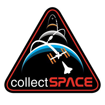 I'm still not 100 percent sold on including the ISS, but if we were, then this comes closer to a solution to do so. I'd want the ISS to be better rendered, and the orbital track to extend to and beyond the shuttle. Thoughts? |
Rick Mulheirn
Member Posts: 4593
From: England
Registered: Feb 2001
|
posted 07-03-2013 06:43 PM
Looks good to me. I'd imagine a docked shuttle would be pretty insignificant if done to scale so I think this is a good compromise.I agree that the ISS would need to be a better rendition as well.... otherwise spot on! |
GACspaceguy
Member Posts: 3096
From: Guyton, GA
Registered: Jan 2006
|
posted 07-03-2013 07:11 PM
I like the original N. Just my opinion. |
GoesTo11
Member Posts: 1377
From: Denver, CO
Registered: Jun 2004
|
posted 07-03-2013 07:25 PM
I'm still not convinced that the ISS depiction isn't redundant (given that it was orbited and assembled almost entirely through Shuttle operations), but that's a handsome design.On a more general note, since this seems to be headed toward an M vs. N showdown...my preference for the latter is because its "mission" is clearer. I understand that M supporters like the less specific (or more inclusive, if you prefer) pointer icons, but to me it's just too broad. Take away the "collectSPACE", and it could be a corporate logo...maybe a space-tourism startup. The N design attractively represents both the site's mission and its origins. What more could we reasonably want in 4" of embroidery? /steps off soapbox |
mode1charlie
Member Posts: 1475
From: Honolulu, HI
Registered: Sep 2010
|
posted 07-04-2013 02:11 AM
Are we calling this new ISS version "O"?I like it. It's a good compromise. Since it seems to be down to M, N, and O, here are my 2 cents. I do think it's important to have: A. Recognizably iconic spacecraft (thus eliminating M); B. linking past, present, and future (arguing for N or O); C. Acknowledging the international component (which O fits better than N, although as I pointed out already, Shuttle was international); and D. Making a clear statement about the current, active space program (winner O, hands down). O ticks all the main boxes except Russia's contributions (and no let's not go there!). I like the color echo between Mars and the ISS solar arrays - nice touch, and adds something. I didn't think it was possible to include ISS without it cluttering the aesthetic; this new design proves me wrong, with one caveat: I agree with Robert that it could still use some tweaks (more defined and yet still stylized representation of the ISS) and giving the Shuttle back its orbital tracks. If these can be done without cluttering, then I vote O. if not, I could definitely live with N (it's still pretty great). On edit: For O, maybe consider making ISS a little smaller. There's still something I can't quite put my finger on with O that is unbalanced somewhere, and how that's all going to work with putting orbital tracks back in for the orbiter, I'm not sure. But reducing the ISS size just a tad might help clarify things a bit. Just a thought. |
Rick Mulheirn
Member Posts: 4593
From: England
Registered: Feb 2001
|
posted 07-04-2013 03:37 AM
So the latest design has a designation; "O" it is for me then.On reflection, a tweeked ISS may be a little too fussy visually. It is evident what it is in its present form, it is simple and stylistic so I would have no issues personally if "O" went to press as it stands. Nice one guys. |
Tykeanaut
Member Posts: 2267
From: Worcestershire, England, UK.
Registered: Apr 2008
|
posted 07-04-2013 06:42 AM
If the last image is "O", then I'm happy with that. Although if Robert wants to extend the ISS flightpath etc that's ok too. |
johntosullivan
Member Posts: 162
From: Cork, Cork, Ireland
Registered: Oct 2005
|
posted 07-04-2013 09:46 AM
N. Not giggles, not O.As stated above "Let's light this candle." |
sts205cdr
Member Posts: 759
From: Sacramento, CA
Registered: Jun 2001
|
posted 07-04-2013 01:23 PM
I'm loving this whole project and will buy patches, pins, stickers, and maybe my first tattoo!Okay, no tattoo, but how 'bout a t-shirt, or denim collared shirt or polo? I'm proud to be a member of the cS community. Y'all ROCK! |


