|
Author
|
Topic: ISS Expedition 19 insignia
|
Robert Pearlman
Editor Posts: 50582
From: Houston, TX
Registered: Nov 1999
|
 posted 09-22-2008 05:46 PM
   
ISS Expedition 19 insigniaIn March 2009, Expedition 19 commander Gennady Padalka and flight engineer Michael Barratt will launch to the International Space Station. Nicole Stott will then join them in August, arriving with the STS-128 shuttle crew to replace Tim Kopra. 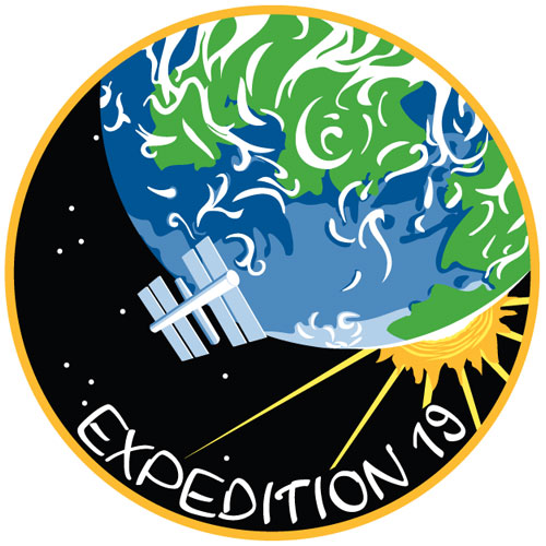 In May, cosmonaut Roman Romanenko will launch on Soyuz TMA-15 with European Space Agency astronaut Frank De Winne of Belgium and Canadian Space Agency astronaut Robert Thirsk. Their arrival will expand the station's crew size to six for the first time. Expedition 19 will include visits by two space shuttle missions that will equip the station with the additional facilities needed to support a six-person crew. The increment will also prepare the ISS for the later arrival of Russian research modules and additional docking ports. |
KAPTEC
Member Posts: 633
From: Madrid, Spain
Registered: Oct 2005
|
posted 09-22-2008 05:58 PM
One of the most beautiful emblems of last times. I like it very much. Congratulations to the artist(s).  |
KSCartist
Member Posts: 3047
From: Titusville, FL
Registered: Feb 2005
|
posted 09-22-2008 06:39 PM
A fantastic design! Kudos to the artist(s) and the crew. |
Dave Clow
Member Posts: 236
From: South Pasadena, CA 91030
Registered: Nov 2003
|
posted 09-23-2008 11:41 AM
Reminds me a little of the Kelly Freas Skylab art. |
Space Emblem Art
Member Posts: 197
From: Citrus Heights, CA - USA
Registered: Jan 2006
|
posted 09-23-2008 10:12 PM
I wonder if the artist is Russian. If you've seen samples of Soviet/Russian space art, some of it is rather abstract compared to the more detailed space art we may be used to in the West. |
KSCartist
Member Posts: 3047
From: Titusville, FL
Registered: Feb 2005
|
posted 11-26-2008 04:59 PM
The crew liked it. The artist (who has a great future) is now a part of space program history forever. |
hoorenz
Member Posts: 1040
From: The Netherlands
Registered: Jan 2003
|
posted 11-27-2008 03:02 PM
An observation: in this patch, the Earth, basic shape of the Sun, the ISS and the lettering all share a very distinguished style. Then, there are these perfectly rounded stars, all exactly the same size, the perfect circular shape of the patch itself, the perfectly arced script and the extremely clean, straight rays appearing from behind the Sun. I have noticed that this mixture of styles (usually it manifests itself in a slightly different way: with certain elements pictured extremely detailed as in a photograph, the other elements more stylized) is something seen pretty often in modern day patches. |
BMckay
Member Posts: 4002
From: MA, USA
Registered: Sep 2002
|
posted 01-29-2009 08:48 AM
Check out this photo. Why is this different? |
hoorenz
Member Posts: 1040
From: The Netherlands
Registered: Jan 2003
|
posted 01-29-2009 08:55 AM
This is not a patch, but directly embroidered onto the polos. Probably not such sophisticated equipment and thus less detail and colors possible? |
Robert Pearlman
Editor Posts: 50582
From: Houston, TX
Registered: Nov 1999
|
posted 01-29-2009 08:59 AM
That is the "crew version" of the insignia. For their crew apparel, ISS and shuttle crews typically use a simplified version of their mission patch. |
dogcrew5369
Member Posts: 760
From: Statesville, NC
Registered: Mar 2009
|
posted 03-04-2009 08:24 PM
Could anyone tell me why my Expedition 19 patch I purchased is 5" in diameter when all other round ISS patches are the usual 4"? Why the shift to a larger size with this patch? Just curious. |
Bill Hunt
Member Posts: 404
From: Irvine, CA
Registered: Oct 2002
|
posted 03-05-2009 03:12 PM
Don't fret, that's the size it's supposed to be. It's closer to 5 inches — about 4.5 I think. It could be that it needed to be a little larger so that all of the cloud detail could be more easily embroidered. But that's only a thought. Does anyone else know anything more definitive? |
Robert Pearlman
Editor Posts: 50582
From: Houston, TX
Registered: Nov 1999
|
posted 10-23-2013 12:23 PM
I learned today that the artist behind the ISS Expedition 19 insignia was Olivia Huynh. She worked with astronaut Michael Barratt.In 2008, when the patch was designed, Olivia was a senior in high school. Since then, she attended the Maryland Institute College of Art (MICA), where she graduated Summa Cum Laude. Her senior project, "Borrowed Light," was featured by Adobe on Facebook and at the Animation Block Party in New York. |
hoorenz
Member Posts: 1040
From: The Netherlands
Registered: Jan 2003
|
posted 10-23-2013 01:25 PM
Ah, finally! I remember we both heard the name at the time, but were unable to confirm it. |
KSCartist
Member Posts: 3047
From: Titusville, FL
Registered: Feb 2005
|
posted 10-23-2013 03:47 PM
Remeber the name Olivia Huynh. We're going to see a lot of great things from this young lady.Beautiful film. |
KAPTEC
Member Posts: 633
From: Madrid, Spain
Registered: Oct 2005
|
posted 10-25-2013 04:38 AM
I agree totally with you Tim. She's great! |


