Sept. 12, 2014 – NASA's new "Flight Operations" emblem has a long history dating back decades.
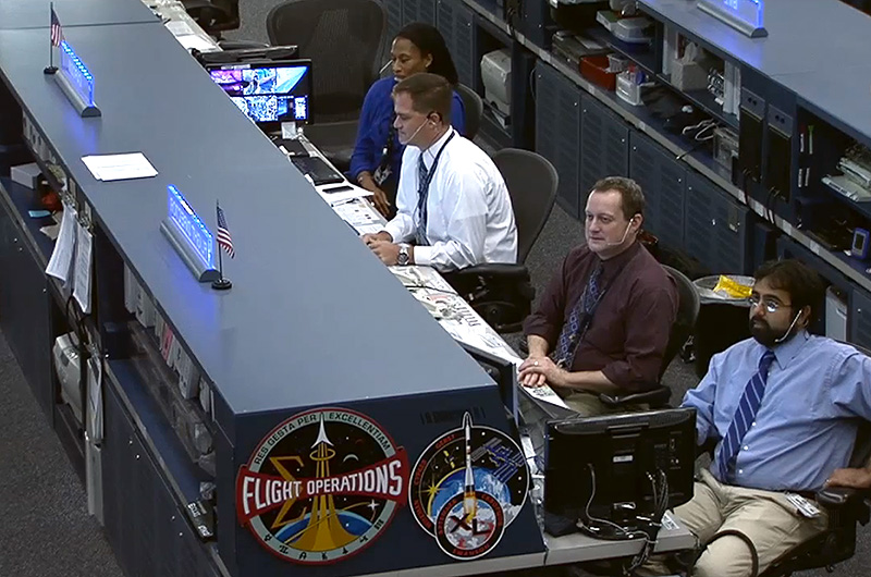
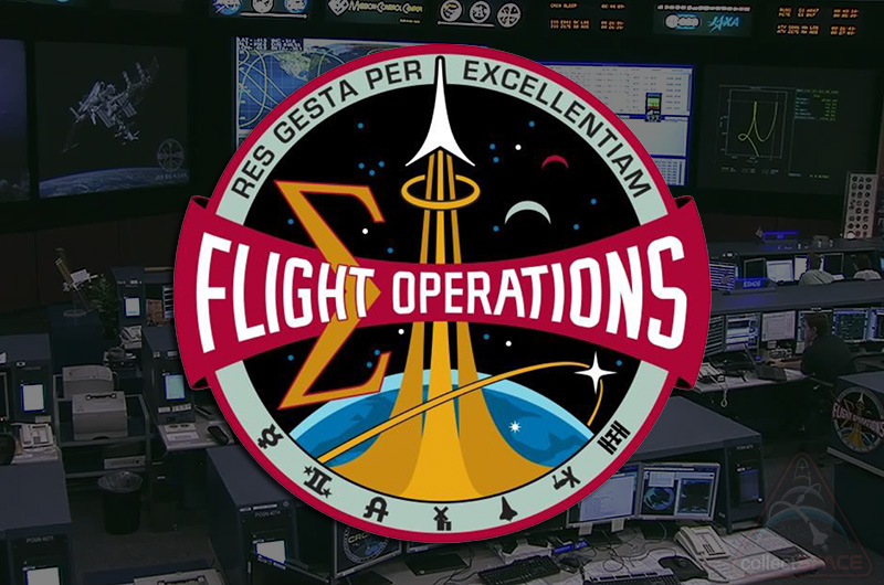
As displayed in mission control at NASA's Johnson Space Center in Houston, the Flight Operations insignia replaces the earlier "Mission Operations" logo, reflecting the merger of the flight crew and mission operations divisions.
The newly-established Flight Operations Directorate (FOD) now has responsibility for the astronauts' activities as well as the planning and execution of their missions. The new directorate describes its mission as "to select and protect our astronauts and to plan, train and fly human spaceflight and aviation missions."
The directorate's emblem represents that, while preserving artwork that dates back to end of NASA's Apollo program.
The new Flight Operations emblem can be seen displayed on the flight director's console in NASA's mission control center. (NASA) |
Achieve through excellence
In December 1972, artist Bob McCall was sitting on a step in mission control, sketching the flight controllers as they tended to the last days of Apollo 17, NASA's final manned moon landing mission. Flight director Gene Kranz, noticing McCall in the room, waited until the respected artist took a coffee break to approach him with an idea.
"I do not think [McCall] was surprised when I asked him to design an emblem for the Mission Control team," recalled Kranz in his memoirs, "Failure is Not an Option" (Simon & Schuster, 2000).
McCall, who had designed the Apollo 17 patch, worked for six months to develop the insignia, which he credited back to Kranz.
"He was very, very instrumental in [creating the emblem]," McCall, who died in 2010, said in a NASA oral history. "He was the one that asked me to do it, but also the one who really did most of the design. I just brought it together in a way that could be reproduced nicely."
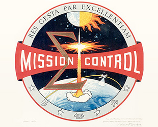
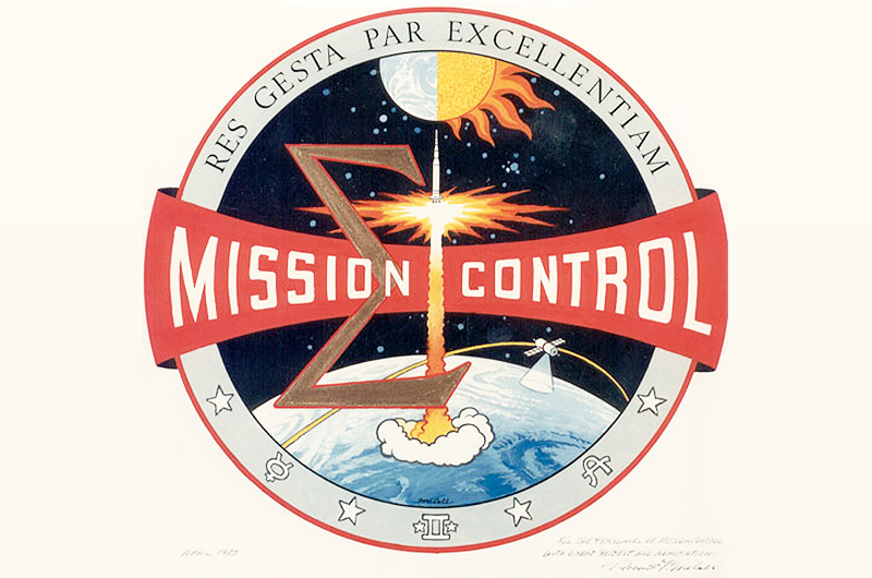
Robert McCall's original art for the "Mission Control" emblem, as suggested by flight director Gene Kranz in 1972. (McCall Studios) |
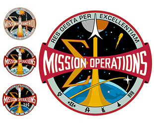
McCall's round patch depicted a Saturn V rocket launching from the Earth as a satellite orbited the planet. The greek letter Sigma ("∑"), which filled the left side of the emblem, represented the sum of the mission control team's efforts, which was further stressed by the words "Mission Control" running across the center of the design.
Icons for Mercury, Gemini and Apollo were punctuated on the emblem's lower border by four stars, each symbolizing one of the principles of Mission Control: discipline, morale, toughness, and competence.
At the border's top was the inscription in Latin, "Res Gesta Par Excellentiam," or "Achieve through Excellence."
From 'Mission Control' to 'Operations'
McCall's (and Kranz's) design remained unchanged for ten years before undergoing the first of the five revisions.
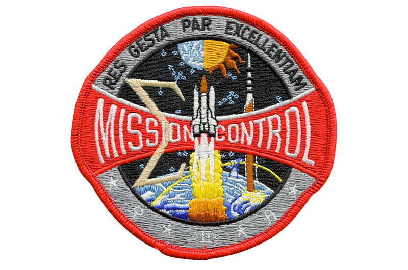
Recognizing the then-still new space shuttle program, the "Mission Control" patch was redesigned in 1983 to replace the Saturn V at its center with a rising shuttle (the Apollo rocket was retained but moved to the background).

Modern embroidered example of the first space shuttle-era patch based on Bob McCall's "Mission Control" emblem. (AB Emblem) |
Five years later, following the tragic loss of space shuttle Challenger and its crew of seven, the patch was revised, this time changing its central red banner to read "Mission Operations" to be inclusive of the entire team. The Saturn V was removed and replaced with a comet as a memorial to the fallen astronauts.
It was the loss of the space shuttle Columbia in 2003 that inspired the next set of changes, 30 years after the patch was first introduced.
With the help of graphic artist Michael Okuda, best known for his design work on "Star Trek," the Mission Operations Directorate again updated its emblem to fix its starfield at 17 stars: one for each of the fallen members of the Apollo 1, STS-51L and STS-107 crews. At the same time, Okuda replaced the orbiting satellite that McCall had created with the International Space Station, which was then still being assembled.
"Star Trek" graphic designer Mike Okuda was enlisted by NASA to update the Mission Operations emblem through changes to the agency's human spaceflight programs and directorates. (NASA) |
Okuda moved the white stars representing the principles of Mission Control into the vector extending from the rising space shuttle, and a white star was placed on the Earth, symbolizing Houston, the home of the mission operations team.
Okuda revisited his own work eight years later in 2012, a year after the end of the shuttle program. The shuttle and station were removed from the emblem's central elements and added to the icons lining the "legacy ring" along the border. Taking their place on the emblem were a stylized launch vector and orbiting vehicle to represent the growing variety of U.S. space vehicles in operation.
The four white stars standing for the original principles of mission operations were also repositioned from the launch vector into the starfield.
Flight Operations
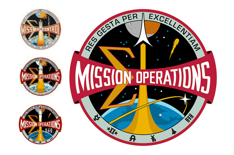
Okuda was again enlisted for this latest revision, reflecting the reunification of the flight crew and mission operations directorates.
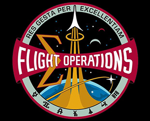
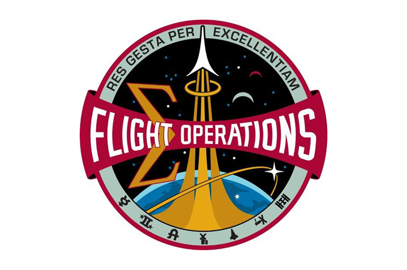
NASA's 2014 Flight Operations Directorate (FOD) emblem. (NASA) |
"[This emblem] symbolizes and commemorates the flight operation team's unique contribution to human spaceflight since the Mercury program," NASA stated.
The new insignia keeps the Sigma, legacy ring and Latin inscription that McCall designed 40 years ago. Okuda kept the moon and Mars that he introduced in 2004 (replacing McCall's sun and moon), but changed them to crescents and inserted them in place of the 1988 emblem's comet. The fallen astronauts are still remembered by the 17 stars.
Okuda reworked the launch vector to become the symbol of the astronaut corps and the banner, which for the past 25 years has read "Mission Operations," was updated with the directorate's new title, "Flight Operations."