|
Author
|
Topic: Artemis II moon mission crew patch
|
Robert Pearlman
Editor Posts: 56546
From: Houston, TX
Registered: Nov 1999
|
 posted 04-03-2025 01:18 PM
   
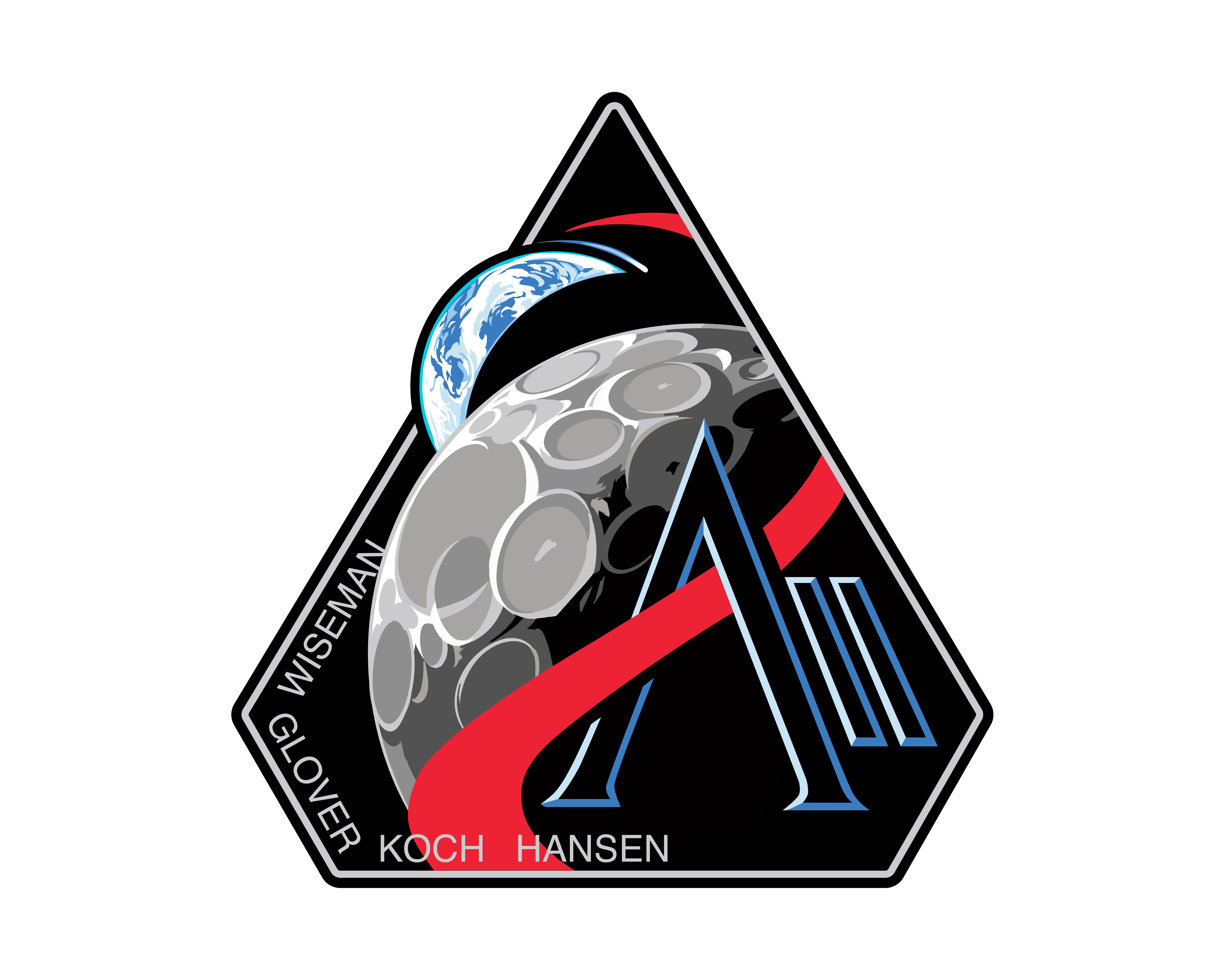
collectSPACE NASA's Artemis II astronauts reveal moon mission patch to honor 'AII'The next astronauts to fly to the moon now have a mission patch to represent their history-making journey. NASA on Thursday (April 3) debuted the official Artemis II insignia, its first emblem for a moon-bound crew in more than 50 years. Astronauts Reid Wiseman, Victor Glover, Christina Koch and Jeremy Hansen will wear the patch when they launch on the Artemis II mission, currently targeted for no later than April 2026. 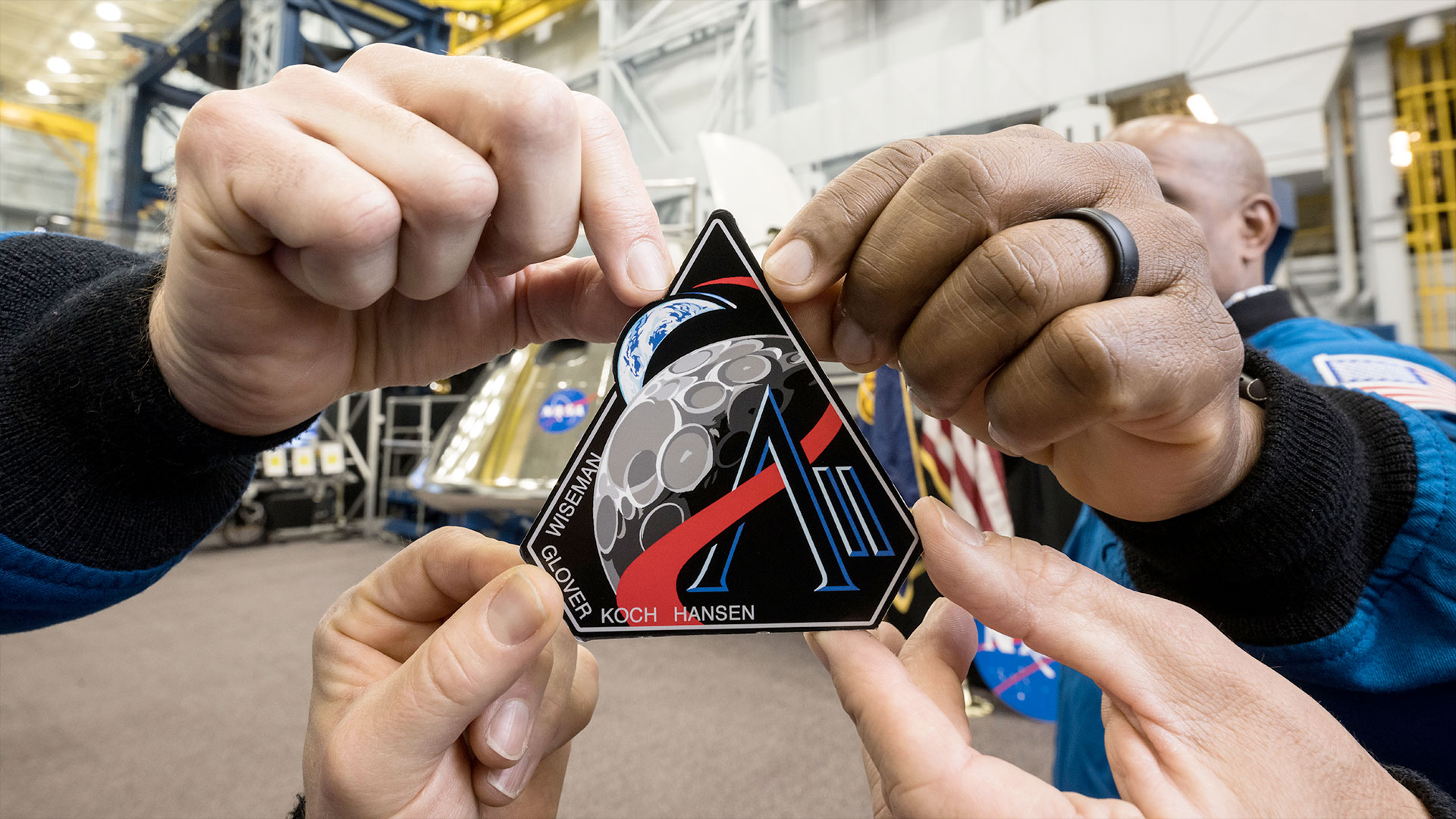 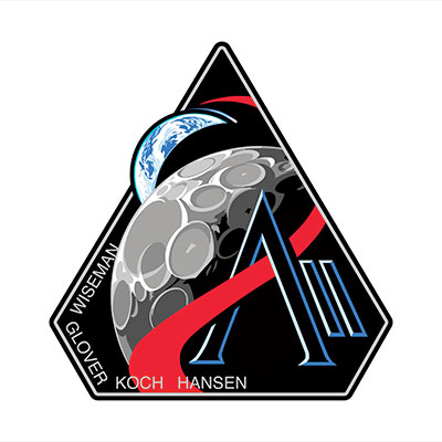
|
lucspace
Member Posts: 546
From: Hilversum, The Netherlands
Registered: Oct 2003
|
posted 04-03-2025 02:05 PM
Love it! Has a visual hint of Apollo 8... |
GACspaceguy
Member Posts: 3308
From: Guyton, GA
Registered: Jan 2006
|
posted 04-03-2025 02:50 PM
I think it is great!! |
Paul J. Brennan
Member Posts: 309
From: Linden, CA
Registered: May 2019
|
posted 04-03-2025 05:22 PM
Outstanding! |
Robert Pearlman
Editor Posts: 56546
From: Houston, TX
Registered: Nov 1999
|
posted 04-03-2025 08:42 PM
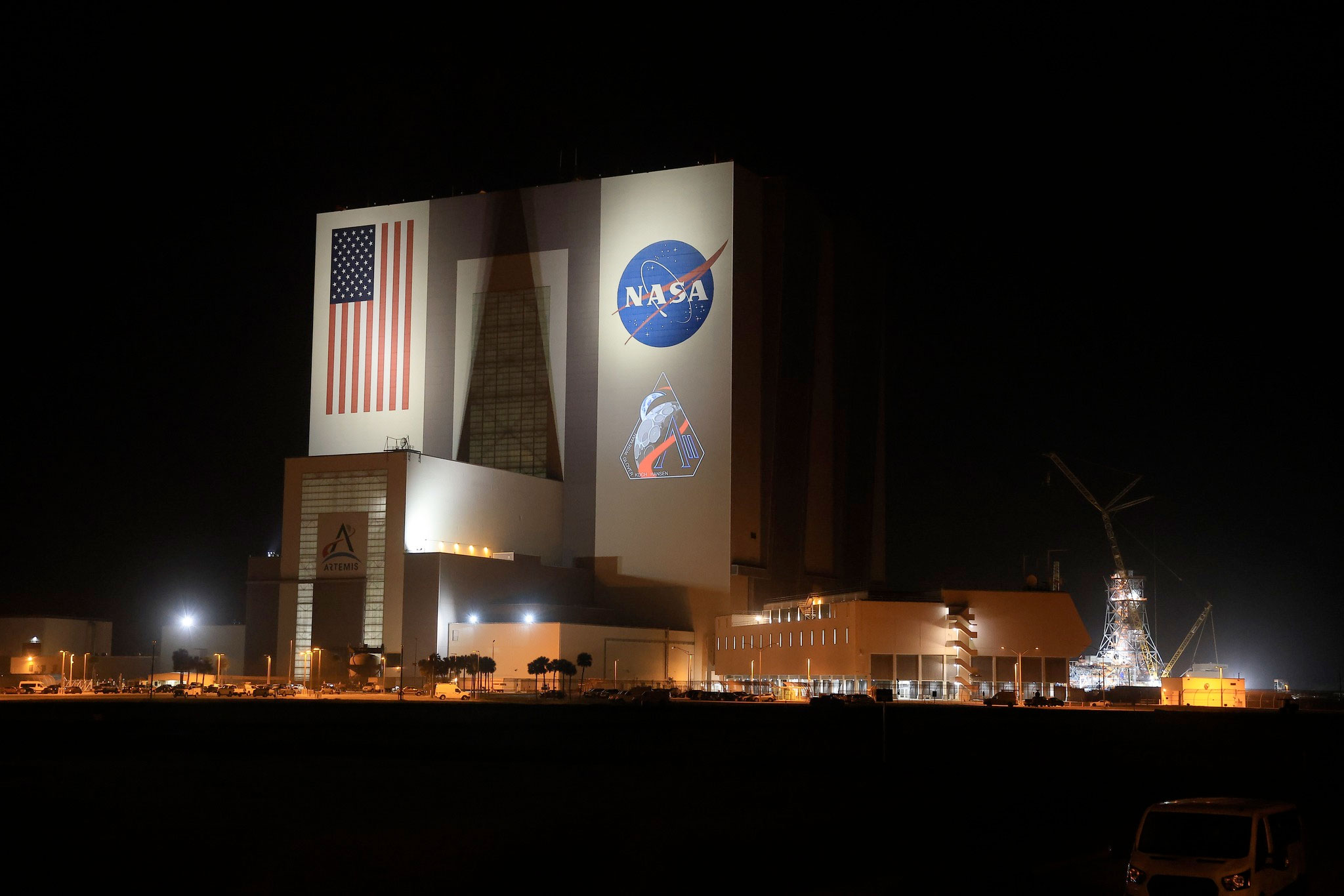
It is going to be a little longer before A-B Emblem can start offering this patch for sale. They are still working on finalizing the embroidery with the Astronaut Office. NASA is projecting the Artemis II patch on the Vehicle Assembly Building tonight: 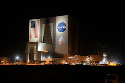
|
davidcwagner
Member Posts: 1189
From: Albuquerque, New Mexico
Registered: Jan 2003
|
posted 04-03-2025 10:38 PM
Should switch position of Earth and moon for better balance. That would be more Apollo 8 like. The red curve becomes path to Mars. As is, the moon is downright cartoon-ugly and dominates the patch.The moon could be photo realistic with the point of the "A" on lunar south pole. |
Dave Ginsberg
Member Posts: 240
From: Redmond, Washington, USA
Registered: Dec 2007
|
posted 04-04-2025 12:41 AM
I like this design. To my eye, the way the Moon’s craters are drawn is eye-catching and quite original. I also like the way they paired the “II” with the Artemis “A”. It’s really a fitting insignia for this mission, imo. Do we know the name of the designer? |
Tom
Member Posts: 1803
From: New York
Registered: Nov 2000
|
posted 04-04-2025 07:37 AM
Will soon be as "iconic" as the Apollo lunar mission patches. |
thisismills
Member Posts: 620
From: Michigan
Registered: Mar 2012
|
posted 04-04-2025 10:07 AM
Wonderful and striking design, it captivated me upon first glance. I like it more and more each time I see it with all the elements together in a visually appealing patch.Every detail is with a reason, so I am wondering what the "N" in Wiseman touching the lunar surface means. Any thoughts? |
Robert Pearlman
Editor Posts: 56546
From: Houston, TX
Registered: Nov 1999
|
posted 04-04-2025 07:22 PM
quote:
Originally posted by Dave Ginsberg:
Do we know the name of the designer?
No word yet on who the artist(s) were who came up with the design, but from a friend who works at Johnson Space Center, it was NASA's team of artists who delivered the final product. He did confirm, though, that the patch "originated outside our gates." |
Robert Pearlman
Editor Posts: 56546
From: Houston, TX
Registered: Nov 1999
|
posted 04-07-2025 11:59 AM
I am told the crew worked artist Greg Manchess, who previously helped design the SpaceX Crew-1 and Crew-3 patches, as well as Expedition 67. |
Dave Ginsberg
Member Posts: 240
From: Redmond, Washington, USA
Registered: Dec 2007
|
posted 04-07-2025 03:23 PM
Thanks for the info and link, Robert. It’s good to see talented artists get their chance to contribute to the long history of space mission insignias. I hope one day to have the same opportunity. |
Robert Pearlman
Editor Posts: 56546
From: Houston, TX
Registered: Nov 1999
|
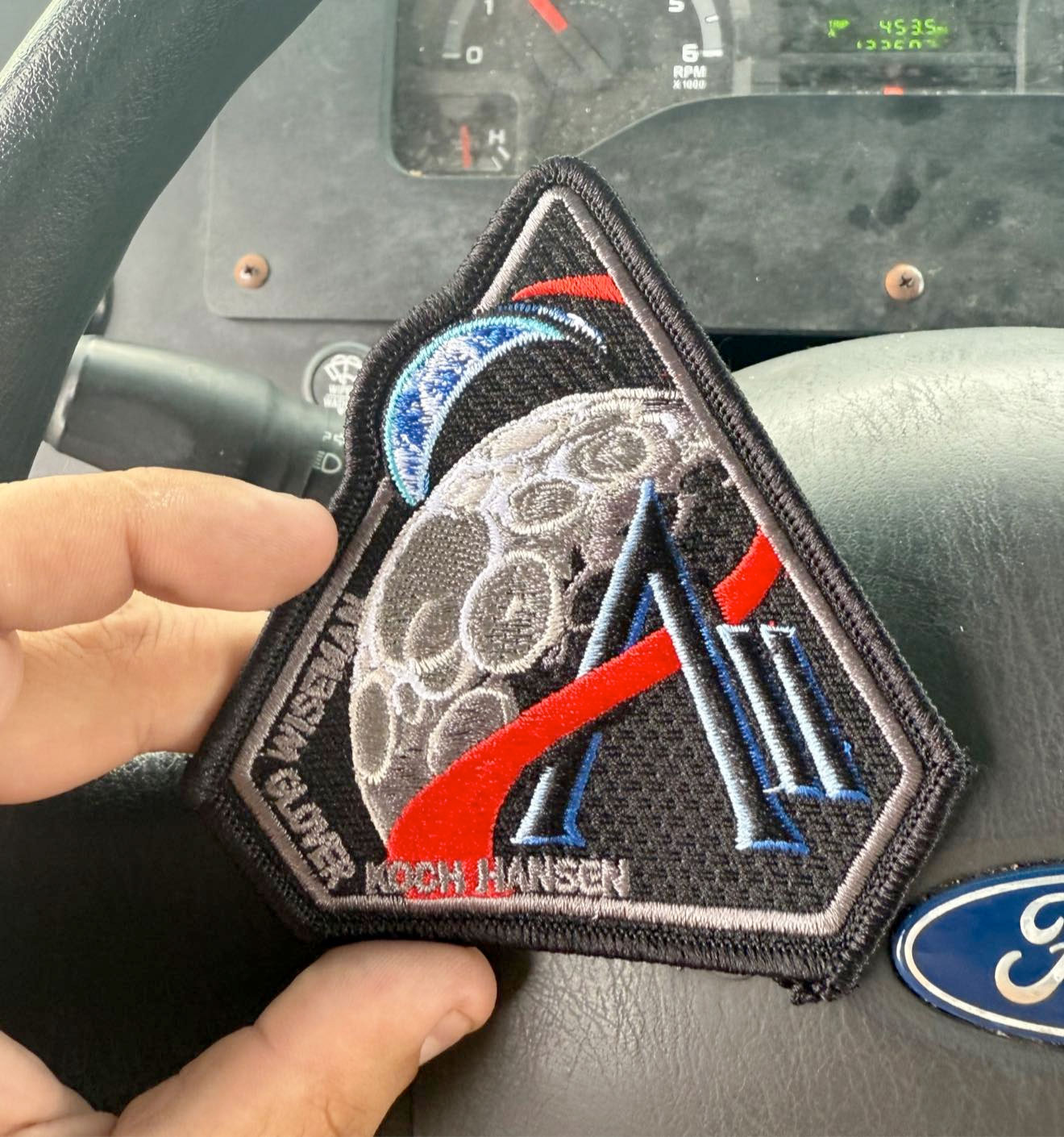
posted 05-06-2025 04:35 PM
A first look (?) at the embroidered patch as received directly from Reid Wiseman (as seen on Facebook):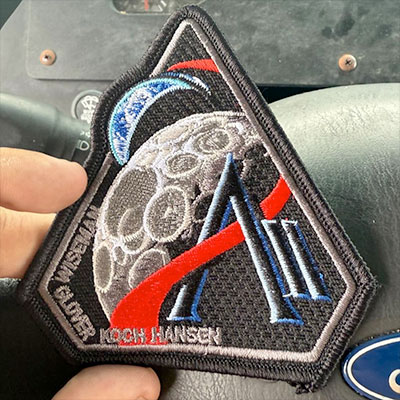 |
Space Emblem Art
Member Posts: 203
From: Citrus Heights, CA - USA
Registered: Jan 2006
|
posted 05-06-2025 06:29 PM
What I thought was an error on the Artemis II emblem design was copied and included into the patch version. I speak of the small earth section above the curved black line surrounding the crescent Earth. Makes it look like an embroidery error. I wonder if anyone had pointed this out before. |
Robert Pearlman
Editor Posts: 56546
From: Houston, TX
Registered: Nov 1999
|
posted 05-06-2025 07:17 PM
That small arc is not intended to be part of Earth but a nod to the activity in low Earth orbit (the ISS in particular): The orbit around Earth highlights the ongoing exploration missions that have enabled Artemis... |
Dave Ginsberg
Member Posts: 240
From: Redmond, Washington, USA
Registered: Dec 2007
|
posted 05-06-2025 08:06 PM
I had been thinking that arc was a depiction of the “thin blue line” of atmosphere. Good to know the true intent. |
davidcwagner
Member Posts: 1189
From: Albuquerque, New Mexico
Registered: Jan 2003
|
posted 05-07-2025 11:34 AM
One of the ugliest human spaceflight patches. The Acne Moon ruins the design. Looked if crater pattern on patch matched South Pole landing area. No match.This Artemis-inspired patch is a truly beautiful work of art. The original Artemis program design had moon at top. Better balanced. |
MartinAir
Member Posts: 512
From:
Registered: Oct 2020
|
posted 05-07-2025 02:49 PM
Not bad, maybe a bit dark for my taste. I like most Gemini, Apollo patches and the STS-107 emblem is probably my favorite space shuttle insignia. |
Robert Pearlman
Editor Posts: 56546
From: Houston, TX
Registered: Nov 1999
|
posted 05-07-2025 08:07 PM
quote:
Originally posted by davidcwagner:
The Acne Moon ruins the design.
To each their own, of course. The craters on the patch remind me of the craters on the far side... |
Space Emblem Art
Member Posts: 203
From: Citrus Heights, CA - USA
Registered: Jan 2006
|
posted 05-08-2025 12:56 AM
quote:
Originally posted by Robert Pearlman:
That small arc is not intended to be part of Earth but a nod to the activity in low Earth orbit...
Robert, thanks for the clarification on the arc over Earth. Apparently, I'd missed seeing that when I originally read the emblem description. Upon re-reading it, there it was. Now it makes sense. |
Robert Pearlman
Editor Posts: 56546
From: Houston, TX
Registered: Nov 1999
|
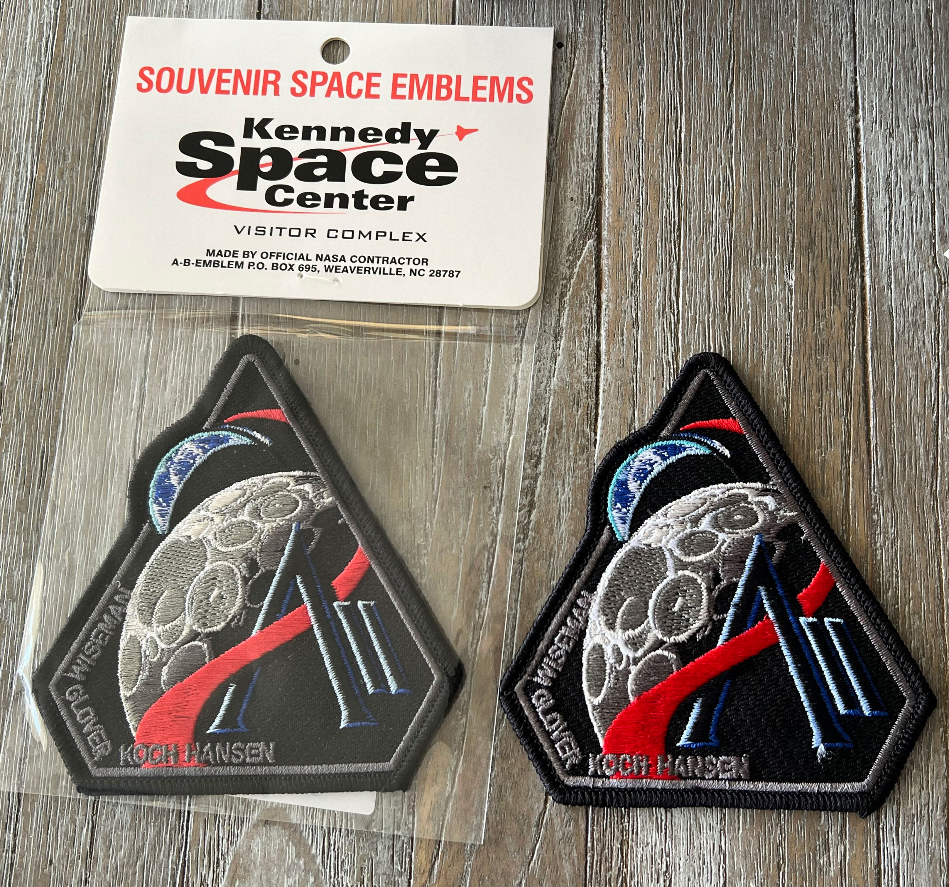
posted 05-23-2025 04:02 PM
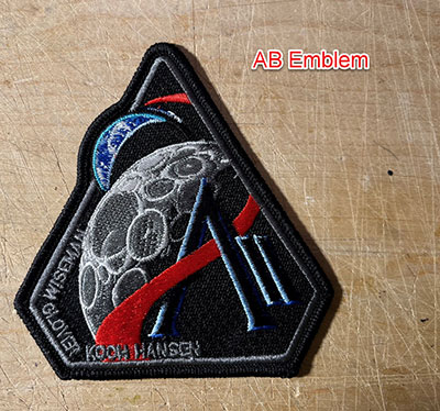
The employee exchange store (Shop NASA) at Johnson Space Center now has the Artemis II patch, decal and lapel pin available for sale. The patch is of unknown manufacture. It is not AB Emblem. Tell tale signs may be the use of only metallic thread colors, copper thread to fill the craters on the moon (no silver or gray thread) and no white in the low Earth orbit trail. There is no merrowed border and the wax back has no label. 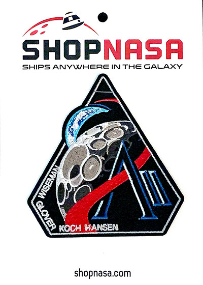 |
Robert Pearlman
Editor Posts: 56546
From: Houston, TX
Registered: Nov 1999
|
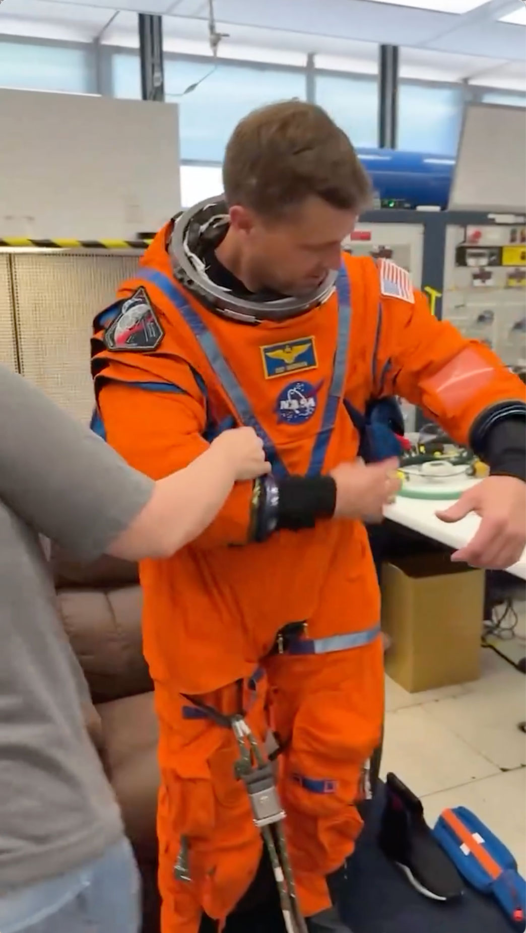
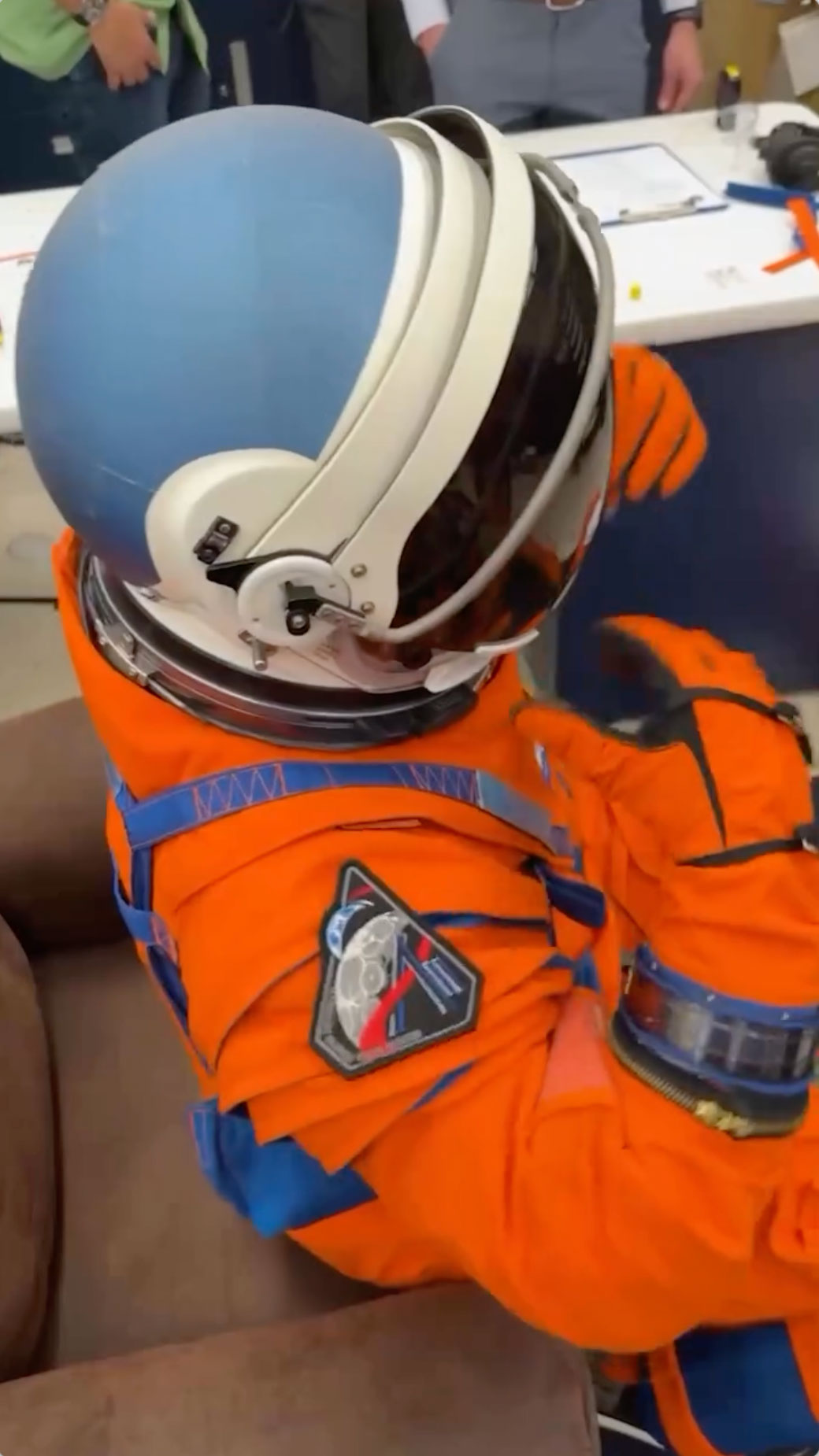
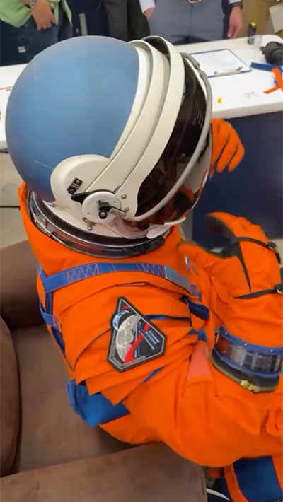
posted 05-26-2025 02:31 PM
I believe these may be the first publicly-released views of the Artemis II crew patch being worn on the OCSS (Orion Crew Survival System) launch and escape suit. Still frames from video posted by Reid Wiseman during his final fit check:  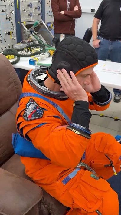
|
dcfowler1
Member Posts: 178
From: Eugene, OR
Registered: May 2006
|
posted 07-19-2025 12:45 AM
Now available at AB Emblem.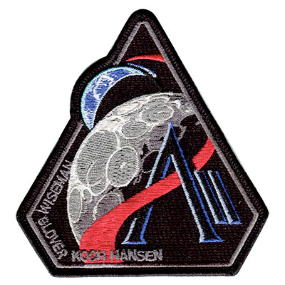 |
CollectingPatches
Member Posts: 17
From: United States
Registered: Oct 2023
|
posted 07-24-2025 02:57 PM
I'm currently in Florida visiting Kennedy Space Center and the surrounding area, and I bought two Artemis II patches — one from the KSCVC gift shop and one from the Sands Space History Center.The date codes I received are as follows: - 475652 A-B Emblem Made In China 06/2540 (Purchased at KSCVC)
- 475652 A-B Emblem Made In USA 05/2520 (Purchased at Sands)
As far as I know they should be visually identical, as A-B says they use the same thread colors, but the made in USA one looks slightly more vibrant than the China one. Thoughts?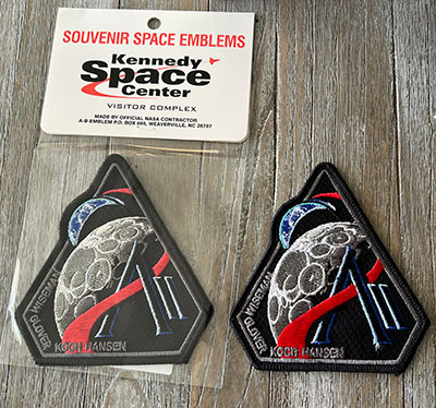 |
Kevin T. Randall
Member Posts: 1715
From: Chesham, Bucks UK
Registered: Dec 2008
|
posted 07-25-2025 01:04 AM
It has been reported to me that AB Emblem is currently selling the following production run date code combination on their website:- 475652 A-B Emblem Made In USA 0525 20
|
GACspaceguy
Member Posts: 3308
From: Guyton, GA
Registered: Jan 2006
|
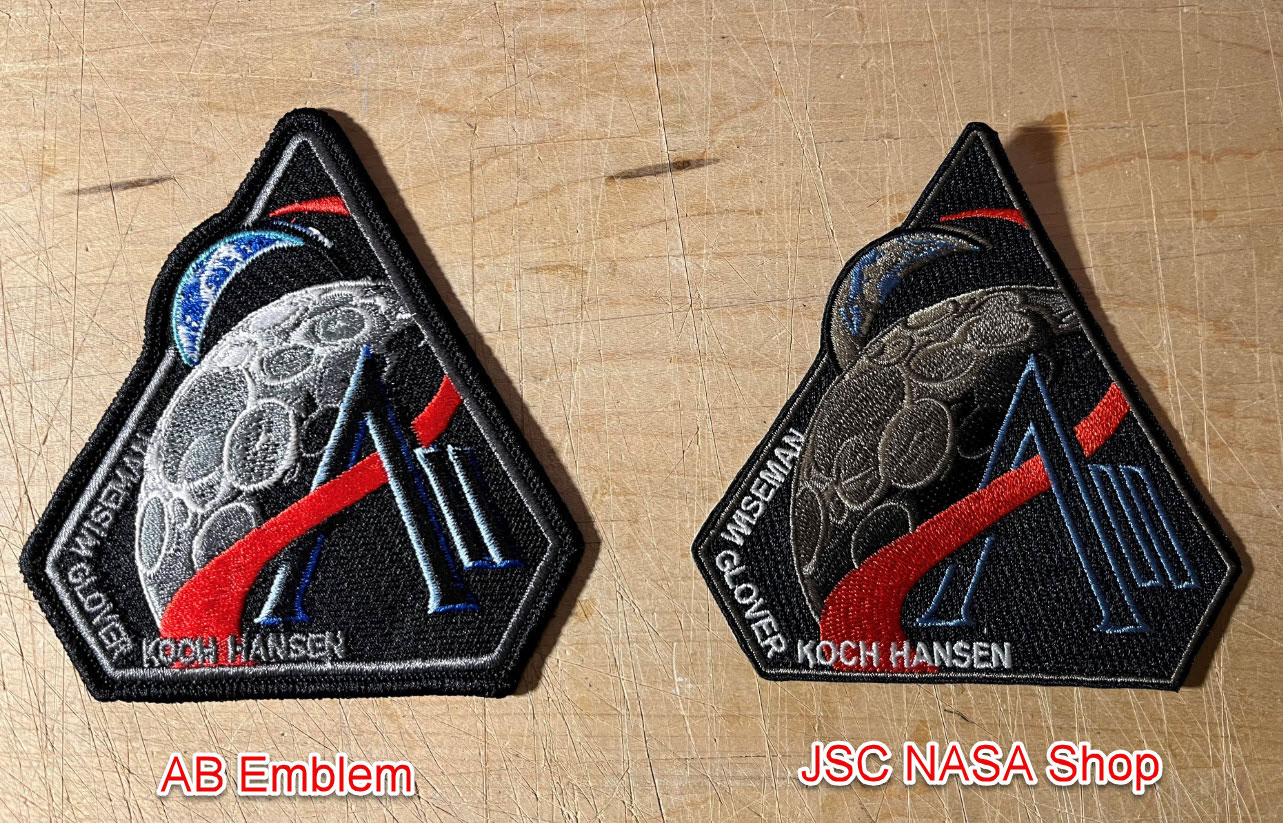
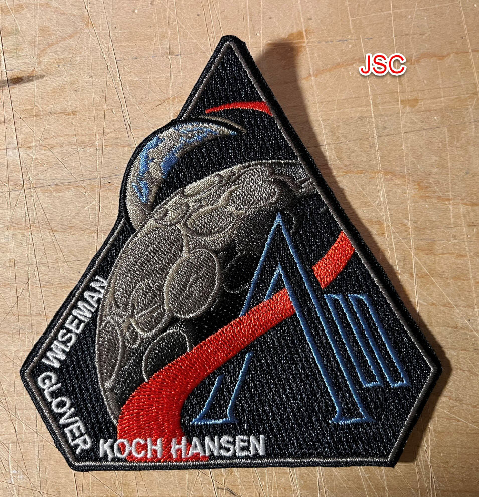
posted 07-25-2025 10:23 AM
I had purchased the Artemis II patch from the JSC NASA shop a while back and yesterday I received the AB Emblem version. Below are the comparisons.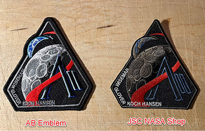 
|
Robert Pearlman
Editor Posts: 56546
From: Houston, TX
Registered: Nov 1999
|
posted 07-31-2025 03:42 PM
collectSPACE What's behind NASA's Artemis II moon mission patch? The flip side is coming.As it turns out, there is a flip side to the Artemis II mission patch. Debuted by the crew in April, the triangular badge is the first insignia to represent moon-bound astronauts in more than 50 years. It depicts Earth rising over the moon, while designating the mission "AII" as it is both the second flight of NASA's Artemis program and it "seeks to explore for all and by all." There is more behind the design, though ... literally. 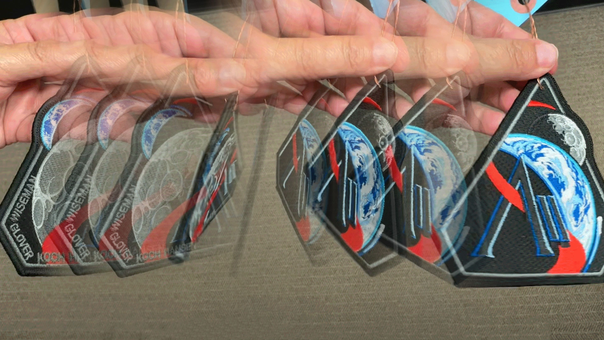 |
Dave Ginsberg
Member Posts: 240
From: Redmond, Washington, USA
Registered: Dec 2007
|
posted 07-31-2025 04:26 PM
I love this idea … especially fitting for a mission sending people back to the Moon. |
David C
Member Posts: 1484
From: Lausanne
Registered: Apr 2012
|
posted 08-02-2025 06:28 PM
Great idea, but I hope the hole in the top is just for test sample patches. |
Robert Pearlman
Editor Posts: 56546
From: Houston, TX
Registered: Nov 1999
|
posted 08-02-2025 07:16 PM
Yes, it is only for the prototype labels. The production patch will not have a hole.Also, because it is two-sided, there will be no label, so no design number, date codes or "made in" identifiers. |
MartinAir
Member Posts: 512
From:
Registered: Oct 2020
|
posted 08-03-2025 05:32 AM
An out of the box idea, very cool! |
Jacques van Oene
Member Posts: 920
From: Houten, The Netherlands
Registered: Oct 2001
|
posted 08-11-2025 07:37 PM
Artemis II pin made by A-B Emblem: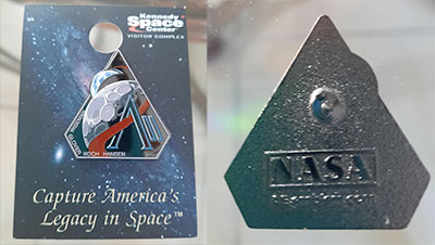 |
Kevin T. Randall
Member Posts: 1715
From: Chesham, Bucks UK
Registered: Dec 2008
|
posted 09-27-2025 05:22 AM
AB Emblem have just released the "double sided" commemorative collector version of this Artemis II patch.It is 4.3" high x 4" wide. It has the patch design number 477391. As this is a double sided patch there are no visible embedded labels.  |
davidcwagner
Member Posts: 1189
From: Albuquerque, New Mexico
Registered: Jan 2003
|
posted 10-07-2025 09:36 PM
Just got two of the double sided patches. The big Earth patch design is better balanced and more attractive in my opinion. |
lucspace
Member Posts: 546
From: Hilversum, The Netherlands
Registered: Oct 2003
|
posted 04-01-2026 12:43 PM
The Artemis II patch the crew is wearing is not the (standard?) A-B Emblem version... |
justin13
Member Posts: 60
From: Richmond, VA, U.S.A.
Registered: Aug 2005
|
posted 04-01-2026 02:05 PM
A clearer image of the patches on the OCSS suits was attached to one of NASA's recent press releases. It definitely lacks the thick black border of the AB Emblem patch, and Hansen's name being entirely outside of the red vector also obviously sets this one apart from other versions. 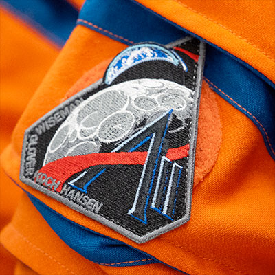 |
lucspace
Member Posts: 546
From: Hilversum, The Netherlands
Registered: Oct 2003
|
posted 04-01-2026 02:11 PM
(Position of) craters is also different. So, who produced this version and will it be commercially available? |
Robert Pearlman
Editor Posts: 56546
From: Houston, TX
Registered: Nov 1999
|
posted 04-02-2026 12:27 PM
The patch on the OCCS suits was made at Reid Wiseman's request and is slightly smaller than the one sold to the public.A-B Emblem is inquiring if they can offer this "crew patch" as well. |
lucspace
Member Posts: 546
From: Hilversum, The Netherlands
Registered: Oct 2003
|
posted 04-05-2026 06:27 AM
Would it help if those of us interested sent a mail to AB Emblem expressing our interest in the 'flight version'? |
Robert Pearlman
Editor Posts: 56546
From: Houston, TX
Registered: Nov 1999
|
posted 04-05-2026 08:30 AM
It is not so much a matter of interest as it is a matter of permission. A-B will not proceed without NASA approval. |