On April 16, the Shenzhou 20 spacecraft-rocket combination was transferred to the launch area, and the Shenzhou 20 manned flight mission is about to begin. As the mission approaches, the designer of the mission logo shared the design concept and birth process behind the logo.Overall design concept of the logo
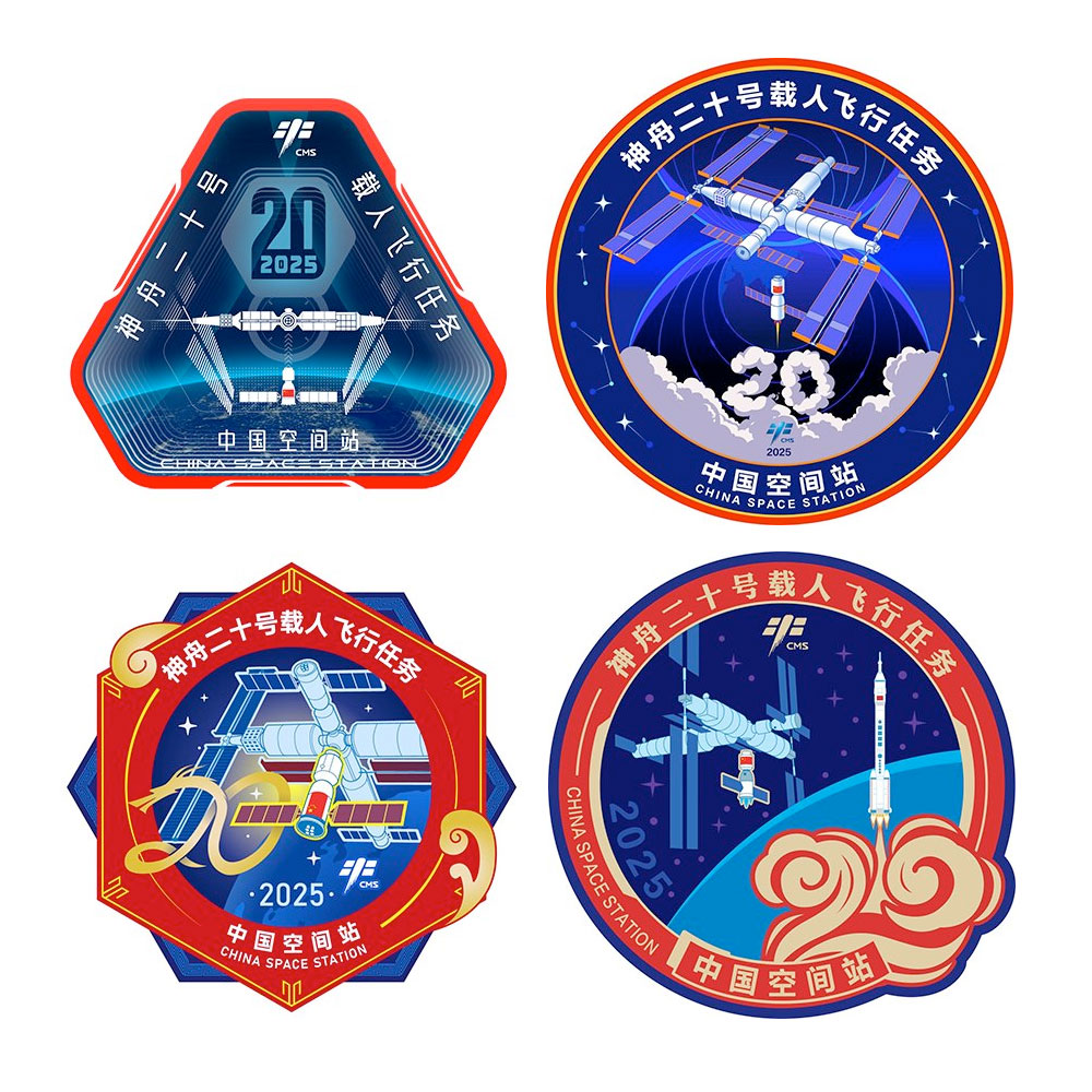
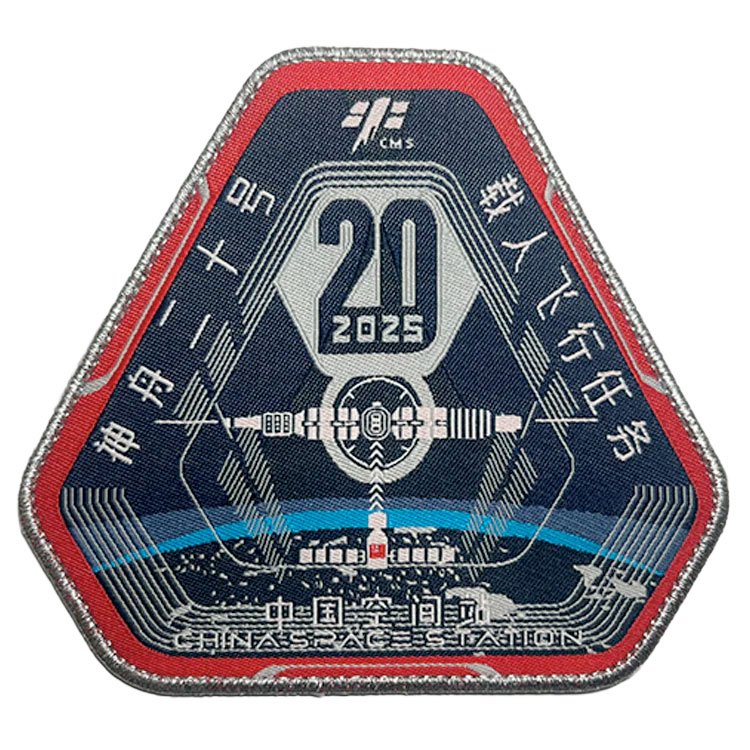
The Shenzhou 20 manned flight mission logo combines tradition and innovation, with a stable triangle as its base, symbolizing that astronauts are climbing new heights based on their experience.
The main elements of the logo are composed of the Earth, the Chinese space station and the Shenzhou 20 manned spacecraft. With "precision", "depth" and "focus" as the design themes, these elements are reconstructed through large perspective and gradient, presenting a stronger visual level as a whole, simulating a visual experience of looking at the outside space through a porthole.
Logo details design concept
The red outer frame of the Shenzhou 20 manned flight mission logo conveys the mission of carrying manned flight, and the dark blue inside represents the vast space. The main body of the Shenzhou spacecraft radially docks with the space station, and the solar wing cleverly forms the Chinese character "二十" (i.e. "twenty").
The bright light of the space station cuts through the sky, demonstrating the spirit of astronauts moving forward towards the light and moving forward courageously. The logo simulates the perspective of the porthole, with clear layers and a full sense of visual depth. The simple flat pattern is interwoven with functional wind dots and lines, adding a modern atmosphere.
This logo not only highlights the driving force of China's aerospace technology but also expresses the infinite longing and determination for future exploration.
Logo color design concept
The outer ring color of the Shenzhou 20 manned flight mission logo continues the red color used in previous manned flight missions, representing the country and life; the logo uses dark blue and indigo to depict the earth, orbit and the intersecting horizon; the Chinese space station and the Shenzhou 20 manned spacecraft are the main components of the composition, and white is used to reflect their inherent color, scientific intention and highlight the visual subject.
Considering that the main usage scenario of manned space flight mission logos in the early stage was in digital media, the designers made extensive use of gradient colors and Gaussian blur styles to reflect its technological characteristics, aiming to make the logo look less like a traditional badge and more like a semi-realistic digital graphic. The later physical armband version will be modified in the traditional flat color application method.
Logo font selection
Four fonts are used for the Shenzhou 20 manned flight mission logo. These fonts are used mainly to highlight the design concept with "science fiction" and "dream" as keywords. The font spacing is adjusted to meet the composition requirements and match the overall visual style.
Logo evolution process
The initial logo design started with the idea of "using Chinese characters to replace numbers", hoping to combine Chinese characters with the main elements of the logo. Following this idea, the designer hopes to combine the elements of the Chinese space station and the manned spacecraft to form the mission number "twenty".
In this process, the designer also used digital means to build three-dimensional models of space stations and spacecraft to find the best drawing angle, but after many attempts, the combination with "二十" did not bring him satisfactory results. Later, he thought that "二十" could also be made into "二十", and "二十" has greater advantages in the composition of the logo design elements, such as exaggerating proportions to create greater perspective, and the central symmetrical layout can create a sense of solemnity.
The final version that evolved later was a high-fidelity improvement based on the above ideas. He tried a variety of composition and color schemes, especially how to change the perspective angle of the solar wing to achieve the maximum element resolution. The final version made slight adjustments to the composition and brightened the color brightness based on the finalist plan.
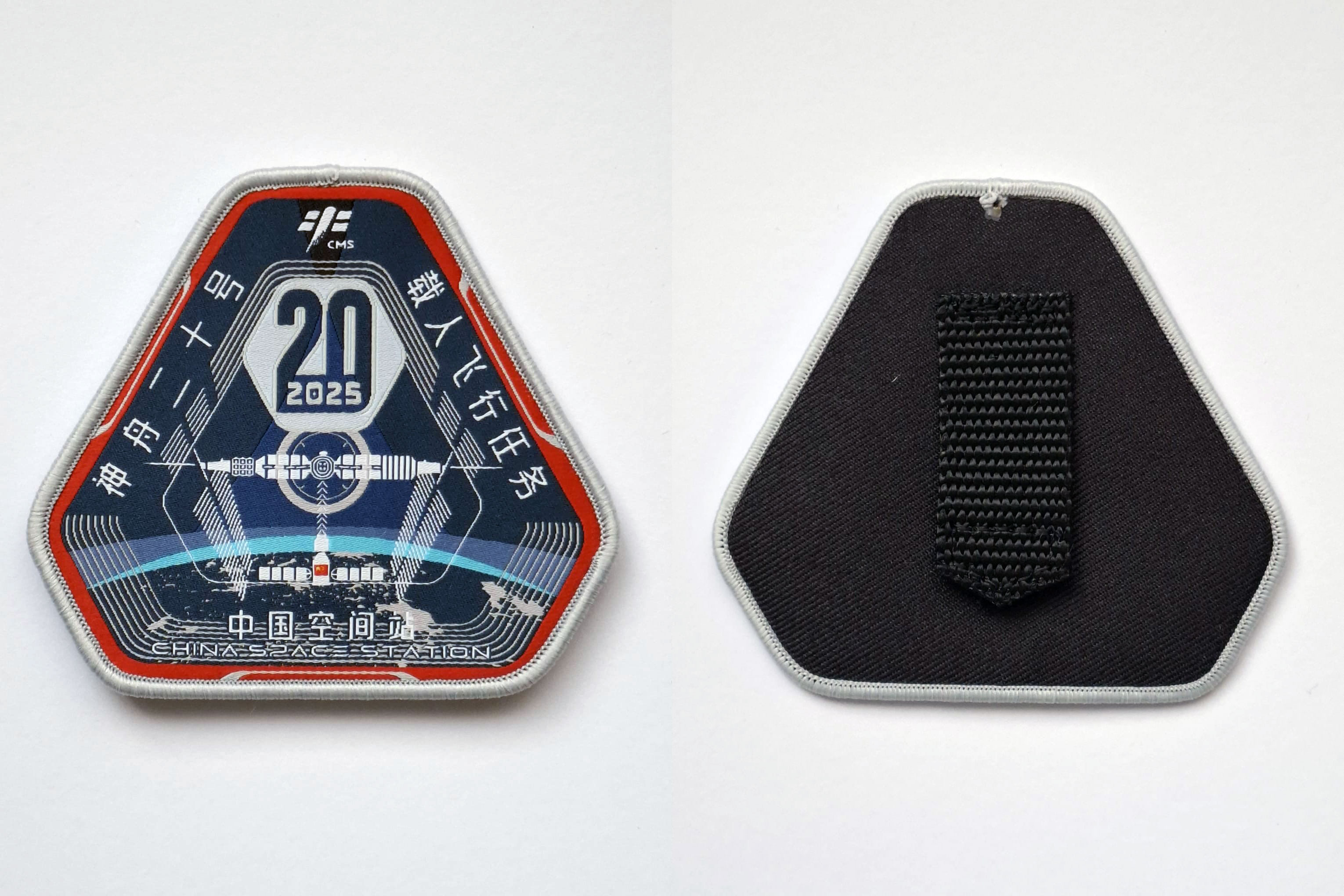
In order to facilitate the production and processing of the physical logo, he modified the gradient color of the final plan into a flat single color presentation, used silver-white to form a regular edge design, and thickened some overly thin lines to form a physical armband version.


 posted 12-30-2024 03:31 PM