|
Author
|
Topic: China's Shenzhou 18 mission patch
|
Robert Pearlman
Editor Posts: 53401
From: Houston, TX
Registered: Nov 1999
|
 posted 04-17-2024 08:29 AM
   
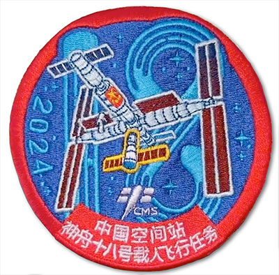
The China Manned Space Engineering Office released the mission logo for the Shenzhou 18 crewed flight to the China Space Station:  |
SkyMan1958
Member Posts: 1399
From: CA.
Registered: Jan 2011
|
 posted 04-17-2024 02:10 PM
   
Does anyone know if the stars on the Shenzhou patches have any significance? Large stars on US patches often represent the number of astronauts on the mission, but I'm not seeing that on this patch or the Shenzhou 17 patch. |
onesmallstep
Member Posts: 1484
From: Staten Island, New York USA
Registered: Nov 2007
|
 posted 04-18-2024 08:23 AM
   
I count 18 stars (dots and crosses) on the patch; therefore they possibly denote flight #18. |
KAPTEC
Member Posts: 654
From: Madrid, Spain
Registered: Oct 2005
|
 posted 04-18-2024 05:56 PM
   
For the first time in a manned ShenZhou mission, the text of the patch is completely and solely written in Chinese. |
lucspace
Member Posts: 525
From: Hilversum, The Netherlands
Registered: Oct 2003
|
 posted 04-26-2024 04:26 AM
   
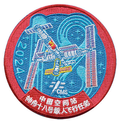
Some background to the design. As the mission is approaching, Cao Aodong, the designer of the mission logo, was invited to share the design concept and birth process behind the logo.In the early stage of design, I conducted in-depth research on the logos of previous manned space missions in China and related foreign space mission logos and design cases, and conducted a comprehensive understanding and sorting of the Shenzhou 18 manned flight mission, the structure of the space station, the docking sequence of various spacecraft, and the relationship with previous mission logos. I decided to explore the design from the three styles of "honor and solemnity, modern technology, and national style." When designing the Shenzhou 18 mission logo, in order to consider the systematicity and continuity with the previous mission logo, I chose the Chinese red commonly used by the Shenzhou spacecraft as the identification color. The design style is simple and modern, with a focus on technology. The overall appearance presents the appearance of the Medal of Honor. The main graphic is the main visual element of the Chinese space station logo, and the yellow line is used to emphasize the docking position and status of the current mission spacecraft and the space station. The mission number "18" is designed in a technological style, and a blue circle extends upward, representing the thriving Chinese space industry. The numbers are used as the background to emphasize the mission sequence and improve the logo recognition and memorability. The 18 shining stars on the blue background correspond to the mission number "18." |
KAPTEC
Member Posts: 654
From: Madrid, Spain
Registered: Oct 2005
|
 posted 04-26-2024 07:46 PM
   
Thanks for the explanation Luc. |
lucspace
Member Posts: 525
From: Hilversum, The Netherlands
Registered: Oct 2003
|
 posted 05-09-2024 06:58 AM
   
Best view of the embroidered patch so far:  |
Robert Pearlman
Editor Posts: 53401
From: Houston, TX
Registered: Nov 1999
|
 posted 07-13-2024 11:07 AM
   
AB Emblem is now offering the Shenzhou 18 patch: |
Kevin T. Randall
Member Posts: 1630
From: Chesham, Bucks UK
Registered: Dec 2008
|
 posted 07-13-2024 11:10 AM
   
The details on this Shenzhou 18 patch has now been confirmed as follows; - 468658 Made In China 07/2440
|


