|
Author
|
Topic: Artist concepts for redesigning NASA's logo
|
Robert Pearlman
Editor Posts: 42984
From: Houston, TX
Registered: Nov 1999
|
 posted 04-25-2010 09:10 AM
   
Personally, I like the meatball. From the Boston Globe...Space, the designer's frontierThe let's-go-to-the-moon-again scheme wasn't the only way NASA has been stuck repeating itself. Even the agency's current emblem is a rerun -- it is 51 years old, a cluttered mess of lettering, a red airfoil, and a white orbital path, all crammed into a blue-and-white starry globe. Its in-house name is "the meatball." Drawn up in 1959, when the outline of the airfoil represented, in NASA's words, "the latest design in hypersonic wings," it was brought out of mothballs in 1992, in the malaise of the post-lunar, post-Challenger era, in a vain attempt to recall the days of brave explorers on their new rocket ships. Today, it's just a reminder that a half-century ago, the future seemed exciting. Ideas asked four graphic designers to come up with a new emblem for the 21st-century space agency, to conjure a vision of NASA that fits the present. 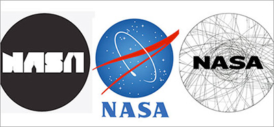 |
ejectr
Member Posts: 1751
From: Killingly, CT
Registered: Mar 2002
|
posted 04-25-2010 09:58 AM
I'm sorry but I don't agree with his view. Some things are best left alone as the new Navy uniforms are testament to. There are some things that are better left to tradition. The NASA logo is one of them. |
Tykeanaut
Member Posts: 2212
From: Worcestershire, England, UK.
Registered: Apr 2008
|
posted 04-25-2010 11:37 AM
New is not always better, especially in this instance. I never liked the "Worm" patch much either. Keep the "Meatball"! |
Go4Launch
Member Posts: 542
From: Seminole, Fla.
Registered: Jul 2003
|
posted 04-25-2010 12:04 PM
I'm firmly in the "keep the meatball" camp, but that aside, these are the best that "big-city" graphic designers could come up with? You have got to be kidding. |
KSCartist
Member Posts: 2896
From: Titusville, FL USA
Registered: Feb 2005
|
posted 04-25-2010 01:28 PM
Clearly created by people unfamilar with NASA. Keep the "Meatball" but I would accept the font from the "Worm" to replace the font in the "Meatball". |
Fezman92
Member Posts: 1031
From: New Jersey, USA
Registered: Mar 2010
|
posted 04-25-2010 02:14 PM
Don't change the logo. Keep the meatball. It's nice. |
GACspaceguy
Member Posts: 2474
From: Guyton, GA
Registered: Jan 2006
|
posted 04-25-2010 03:29 PM
The meatball is NASA. |
FFrench
Member Posts: 3161
From: San Diego
Registered: Feb 2002
|
posted 04-25-2010 03:39 PM
quote:
Originally posted by KSCartist:
Keep the "Meatball" but I would accept the font from the "Worm" to replace the font in the "Meatball".
Yes, I always thought the unofficial Wormball was an interesting hybrid. |
GoesTo11
Member Posts: 1309
From: Denver, CO
Registered: Jun 2004
|
posted 04-25-2010 04:08 PM
Yeah. Yeah, that's what's wrong here...the logo!Seriously, while I have a child-of-the-80s soft spot for the "Worm", I still love the "Meatball." I'm not reflexively opposed to the notion of overhauling NASA's logo, but if that happens I'd hope the agency would be able to find more creative energy than the Boston Daily Worker, uh, I mean Boston Globe did. Those "alternative" designs are about as inspiring as the staff meeting I'm going to have to endure tomorrow morning. |
Rick Mulheirn
Member Posts: 4167
From: England
Registered: Feb 2001
|
posted 04-25-2010 04:14 PM
If it ain't broke... don't fix it. The NASA meatball is just fine and evocative of an earlier pioneering heyday. Leave it alone. |
cspg
Member Posts: 6210
From: Geneva, Switzerland
Registered: May 2006
|
posted 04-25-2010 11:40 PM
Today, it's just a reminder that a half-century ago, the future seemed exciting. I fail to see how changing the logo is going to make the present (and future) as interesting as the past.It was probably a slow news day. |
Mike Z
Member Posts: 451
From: Ellicott City, Maryland
Registered: Dec 2005
|
posted 04-26-2010 01:08 AM
The NASA Meatball is one of the best logos of all time. Past, present or future!! It would be sad to change anything!! It stands for some of man's greatest achievements! The only other logo that's anywhere near the Meatball might be the Coca-Cola script and bottle. |
Space Emblem Art
Member Posts: 194
From: Citrus Heights, CA - USA
Registered: Jan 2006
|
posted 04-26-2010 01:19 AM
With no disrespect to the artists who've designed these proposed updates, I must say that they're not my cup of tea. I've always liked the meatball but concur with Tim (KSCartist) that updating the font with the worm style would be okay. It would modernize it without abandoning the meatball's origin and history. |
KAPTEC
Member Posts: 578
From: Madrid, Spain
Registered: Oct 2005
|
posted 04-26-2010 03:40 AM
The Meatball his the History. I like it over all logos. It is the NASA.But I like also the 'Wormball'. It could be the future... leaving the history present. |
Philip
Member Posts: 5952
From: Brussels, Belgium
Registered: Jan 2001
|
posted 04-26-2010 10:34 AM
For some reason managers believe that a brand's logo should be changed from time to time (e.g. Raider bar became Twix) but in most cases the original (genuine) logo should be kept for ever... That's certainly the case with NASA! |
mjanovec
Member Posts: 3811
From: Midwest, USA
Registered: Jul 2005
|
posted 04-26-2010 05:18 PM
The funny thing is that the article is critical of the meatball design (and NASA's use of an old design for the modern spaceflight program), but three of the five designs they came up with were just re-workings of past designs... two reworked meatballs and one reworked worm logo. Only two of the five designs were original... but had the misfortune of being extremely bland. Is that really the best they could come up with? |
Fezman92
Member Posts: 1031
From: New Jersey, USA
Registered: Mar 2010
|
posted 04-26-2010 06:13 PM
I am a bit confused. Is this article just talk or is NASA considering changing its logo? |
Robert Pearlman
Editor Posts: 42984
From: Houston, TX
Registered: Nov 1999
|
posted 04-27-2010 01:27 AM
quote:
Originally posted by Fezman92:
Is this article just talk or is NASA considering changing its logo?
NASA is not considering changing its logo; the article was simply an exercise in design by the Boston Globe. |
kyra
Member Posts: 583
From: Louisville CO US
Registered: Aug 2003
|
posted 04-27-2010 02:39 AM
The Meatball will never go out of style  |
Robert Pearlman
Editor Posts: 42984
From: Houston, TX
Registered: Nov 1999
|
posted 09-05-2014 12:11 PM
Sorry Wired, I disagree with your headline that NASA Needs to Adopt This Cool New Logo: NASA has put men on the moon, but it couldn't stick the landing when it came to designing a logo that is as cool as its missions. Its two attempts have been nicknamed the "meatball" and the "worm," proving that failure is an option.The Russians were NASA's chief rival during the space race, so it's ironic that it took a young Russian named Max Lapteff to design a smart, speculative rebranding of the National Aeronautics and Space Administration logo. The mark pulls off a hat trick, referencing NASA's illustrious past, nodding to its dreams of taking us to new planets, and ditching the dated features of the old logo. (Also, what's with putting the logo on a cosmonaut's Sokol suit and a Mars One graphic?)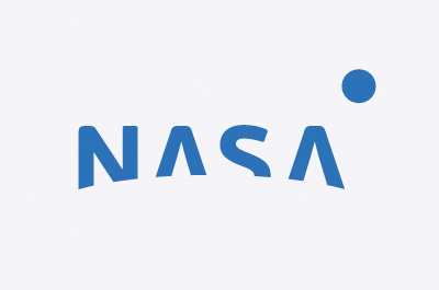 |
mach3valkyrie
Member Posts: 719
From: Albany, Oregon
Registered: Jul 2006
|
posted 09-05-2014 12:30 PM
School just started again and this looks like a first grade attempt at art class. Or, something spilled on the front of a shirt at lunch.I totally disagree with the comments about the logo in the article. It's taken us to earth orbit, the moon, the planets, and beyond. Just leave it alone. |
p51
Member Posts: 1642
From: Olympia, WA
Registered: Sep 2011
|
posted 09-05-2014 12:44 PM
quote:
Originally posted by Robert Pearlman:
NASA is not considering changing its logo; the article was simply an exercise in design by the Boston Globe.
Yeah, I caught that too. But you never know how someone at NASA HQ might look at this and think, "Hey, that would be my legacy, to redesign the logo."Never forget, graphic design is like engineering in that people love to change things. That said, I hope the ill-fated 'worm' logo changing back to the meatball design should snuff any such thought into the foreseeable future. |
Robert Pearlman
Editor Posts: 42984
From: Houston, TX
Registered: Nov 1999
|
posted 09-05-2014 01:06 PM
quote:
Originally posted by p51:
But you never know how someone at NASA HQ might look at this and think, "Hey, that would be my legacy, to redesign the logo."
Fortunately, knowing the individuals involved, that's not a concern given NASA's current staffing. |
Tykeanaut
Member Posts: 2212
From: Worcestershire, England, UK.
Registered: Apr 2008
|
posted 09-05-2014 01:46 PM
There is nothing wrong with the "Meatball" logo, it's the budget that needs changing.  |
Philip
Member Posts: 5952
From: Brussels, Belgium
Registered: Jan 2001
|
posted 09-05-2014 02:57 PM
The blue meatball = NASAChanging logos seems a trend these days but it doesn't have the intended effect the "managers" thought it would have... |
David C
Member Posts: 1014
From: Lausanne
Registered: Apr 2012
|
posted 09-05-2014 03:18 PM
What needs changing are the people who think the meatball needs to change. |
p51
Member Posts: 1642
From: Olympia, WA
Registered: Sep 2011
|
posted 09-05-2014 04:47 PM
quote:
Originally posted by Robert Pearlman:
Fortunately, knowing the individuals involved, that's not a concern given NASA's current staffing.
Let's hope it stays that way, too. quote:
Originally posted by David C:
What needs changing are the people who think the meatball needs to change.
Darn right! |
OV-105
Member Posts: 816
From: Ridgecrest, CA
Registered: Sep 2000
|
posted 09-05-2014 06:45 PM
I always liked the worm ball, got the best of both then. |
Hart Sastrowardoyo
Member Posts: 3445
From: Toms River, NJ
Registered: Aug 2000
|
posted 09-06-2014 12:52 AM
It looks like someone forgot to finish the logo. |
mode1charlie
Member Posts: 1169
From: Honolulu, HI
Registered: Sep 2010
|
posted 09-06-2014 03:43 AM
Love the meatball. It's an integral part of the NASA brand. Leave it alone.And while I'm at it: Wired's proposed logo is awful. |


