|
Author
|
Topic: Advice framing Grissom, Shepard autographs
|
Skythings
Member Posts: 243
From:
Registered: Jun 2014
|
 posted 10-03-2015 05:11 PM
   
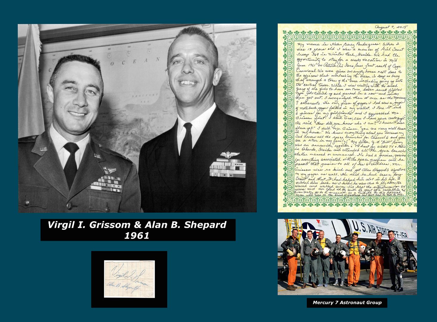
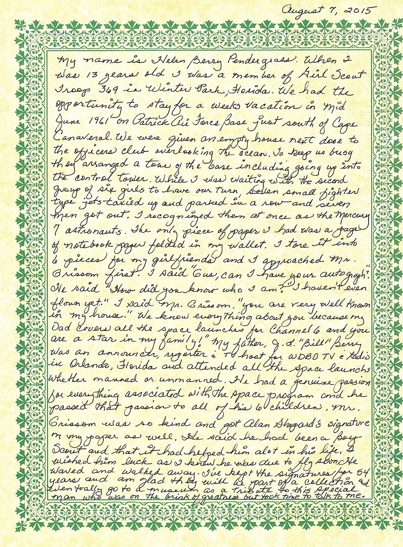
I recently acquired a Virgil Grissom and Alan Shepard autograph piece and want to have it framed. I have never done this before and would like some advice on how to do this properly. It will be approximately 30 inches wide and 20 inches high. I have heard there are proper matting types, glass types, and proper ways to affix the signature to the display, etc. I will be taking it to a professional framing shop, but knowing what I should ask for in advance should avoid any screw ups. Here is a rough layout draft of what I am thinking how it may look.  The autographs come with a handwritten provenance letter from the lady who acquired the autographs in June of 1961 and it must be part of the display. It is 8.5 by 11 inches. I'm working the other image sizes backwards from this for sizing proportions.  With help from Ed (heng44) here on cS, I have located a great black and white only image of the two astronauts together for the main image. There is one other iconic 1962 image of the Mercury 7 astronauts in front of the Convair F-106 which is fitting because of the content of the provenance letter. Should this second image be a black and white or colour image? I'm open to any other artistic ideas for the layout. It's a blank canvas right now so if somebody offers any other great ideas, I'm open to them. I do have a Zarelli Letter of Authenticity. I want to have it in a clear protective sleeve affixed to the back side of the display. My initial thoughts are that a framed display keeps the provenance and Zarelli authentication letter and the autographs connected together for the future. For me the pictures make this story come alive and make it so much more interesting. I am not an autograph collector with this being only my second space related autograph. I know Grissom autographs can be valuable, but I have absolutely no idea what the value of this piece is with Shepard's ink included on a folded scrap notebook page. Will the framing decrease, improve or do nothing to its value? Framing is expensive and I want to do the right thing for this piece. Your thoughts are much appreciated. Thank you. |
AlanC
Member Posts: 147
From: Scotland
Registered: Nov 2014
|
 posted 10-04-2015 03:16 PM
   
I wouldn't include the letter or the group picture in the display. I would centre the B/W photo and put Gus's mission patches down the left side and Alan's down the right.I'd keep that letter safe though! No doubt you will get other more creative suggestions.  |
SpaceyInMN
Member Posts: 355
From: Andover, MN
Registered: Dec 2013
|
 posted 10-04-2015 03:39 PM
   
I understand your desire to display the letter of provenance, but honestly, the length of it is overwhelming and significantly distracts from the display, in my opinion. It becomes the focal point, rather than the signatures. If it was mine, I would simply have the letter included with the Zarelli authentication letter in an envelope attached to the back of the frame. |
SpaceyInMN
Member Posts: 355
From: Andover, MN
Registered: Dec 2013
|
 posted 10-04-2015 03:44 PM
   
I should have also mentioned that it wouldn't be that difficult, or expensive, for that matter, to acquire signed index cards or cuts of the remaining Mercury Seven. You may want to consider doing that and putting together a display with the signatures of all seven and a group photo. I think I paid $10 for a Cooper index card, and $13 for a Carpenter cut, for example. |
Skythings
Member Posts: 243
From:
Registered: Jun 2014
|
 posted 10-04-2015 05:43 PM
   
quote:
Originally posted by SpaceyInMN:
I understand your desire to display the letter of provenance, but honestly, the length of it is overwhelming and significantly distracts from the display, in my opinion.
Thank you for your input. You are correct the length of the letter is too long. She was so kind to write the letter for me and it would have been rude for me to instruct her how to write her story. I thought about perhaps re-creating a condensed version of the letter, but somehow it just seemed more interesting in her own hand. As a rule I don't collect autographs. I collected this one because I have always admired Gus Grissom and in my opinion there is a pretty interesting story here of a young girl who met him and tells about a humble and polite man who was about to become famous. Shepard had just flown and Grissom was one month away from flying. Pretty interesting time in the history of the Mercury Space Program to produce these autographs.
To me, her story is the most important aspect of this entire display. I wanted it to be prominent from the very beginning of this project. Her letter gives us the who-what-where -how-and-why of these autographs. It explains how she kept them for 54 years. Without her letter it's just a display with a couple of autographs on a scrap piece of paper under their picture. Thats not the story I wanted to tell. To me these autographs substantiate her story. Not the other way around. I appreciate everyone's input and I don't want to come across as being rude, but I'm going to stay firm with the letter. It stays. I do however suspect there is a better way of laying these items out to do a better job to achieve my goal with this display. Please keep your ideas coming. |
Skythings
Member Posts: 243
From:
Registered: Jun 2014
|
 posted 10-04-2015 05:49 PM
   
quote:
Originally posted by AlanC:
I would centre the B/W photo and put Gus's mission patches down the left side and Alan's down the right.
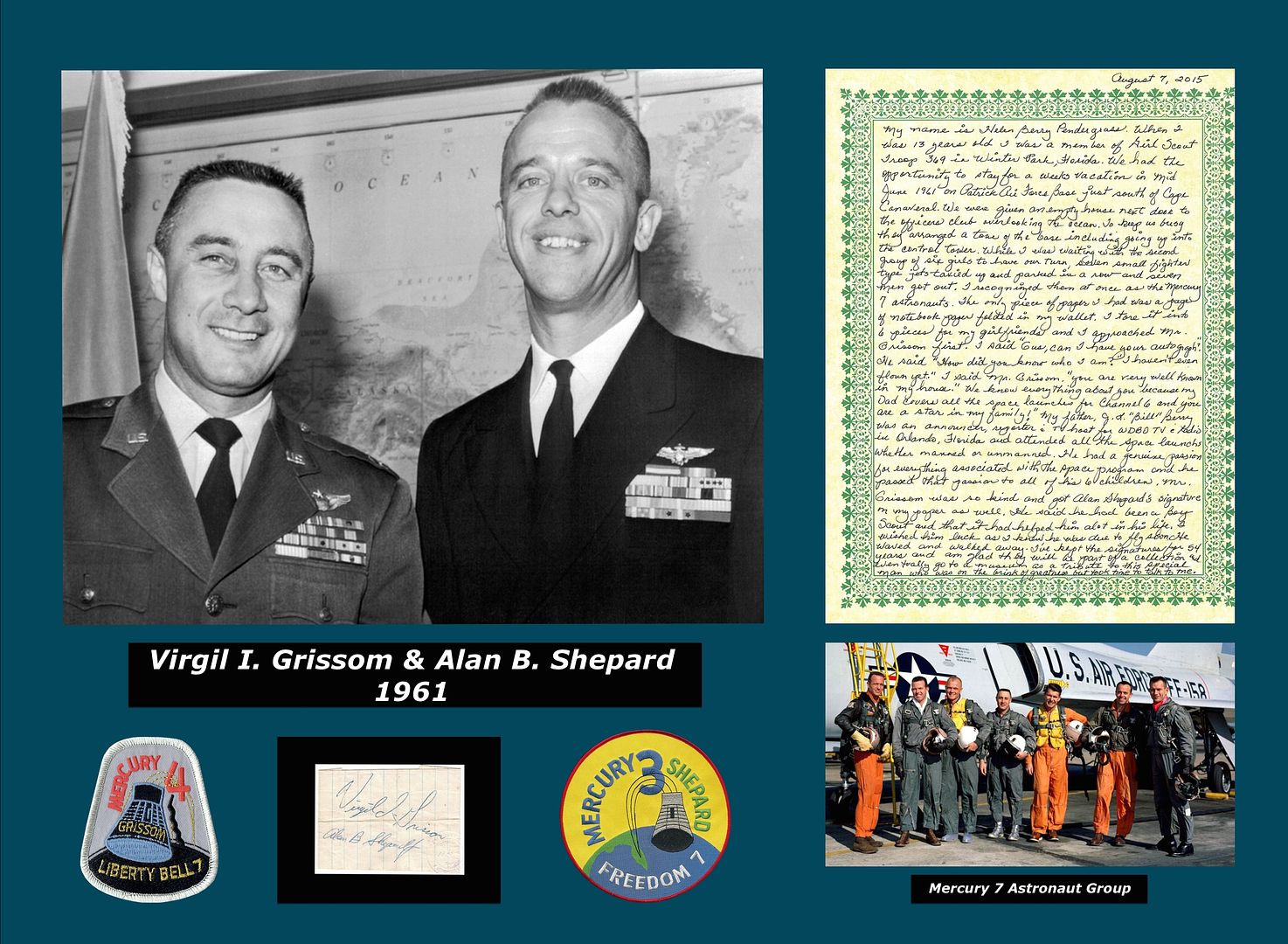
Thanks. Please see my above response regarding the letter. I really like the idea of the patches. Keeping with the time period of the two signatures, I have added Grissom's and Shepard's Mercury patches to my rough draft. Tell me what you think.  |
Steve Zarelli
Member Posts: 731
From: Upstate New York, USA
Registered: Mar 2001
|
 posted 10-04-2015 07:55 PM
   
I think the patches were a great add. My only suggestion would be to perhaps scrap the M7 jet pose photo. While it ties to the letter, it doesn't add much visually and makes the display more busy than it needs to be. Keep the focus on the two signers in my opinion. |
stsmithva
Member Posts: 1933
From: Fairfax, VA, USA
Registered: Feb 2007
|
 posted 10-04-2015 09:08 PM
   
On the plaque with their names and 1961, I'd add "The First Two Americans in Space." It would fit nicely, and show that these aren't two random early astronauts. Instead of the photo of the Mercury 7 (since you'll need something under the letter), maybe you can find a photograph of a Redstone on the launchpad. |
lunarexplorer
Member Posts: 13
From: Albany Western Australia
Registered: Dec 2012
|
 posted 10-04-2015 09:30 PM
   
At first I agreed with the others in that the letter took the focus off the signatures but can see where you are coming from. When you read the letter you can picture the day Helen watched the Mercury 7 arrive and the thrill it must have been for her as she was a big fan thanks to her dad covering the space program for television. I am in the middle of reading "Marketing the Moon" and it reminds us that the human interest stories are some of the most remembered parts of the Apollo program. Things like Alan Shepard's golf shot and Dave Scott's proving Galileo was right. I think the story in the letter is a similar thing and the detail enables us to visualise what happened that day and see a personal side of Gus Grissom and the Mercury days. I also think that since her father was a TV man, he probably would have chosen your approach as well. By the way, the photo in front of the Convair 106 was from January 1961. I would stick with the colour image, which ties in nicely with the patches and green in the letter. This post I found points out some more interesting details including an explanation for why they are all wearing different shoes. I am in the process of putting together something similar with Alan Shepard items. It won't happen to after Christmas but I will probably ask for advice like you have done. Can't offer any help with framing except to search the cS Opinions and Advice messages with the word 'Framing' if you have not already done so. I like your current layout as it is symmetrical and the content relevant to the letter. It is slightly on the busy side but framing with a bit of space on the edges and matting should reduce this. I just read the comment from Steve (stsmithva) and was thinking along the same lines. These two were the only ones to fly a suborbital in a Redstone. I also like the words "The First Two Americans in Space." Look forward to seeing the end product. |
Skythings
Member Posts: 243
From:
Registered: Jun 2014
|
 posted 10-04-2015 10:43 PM
   
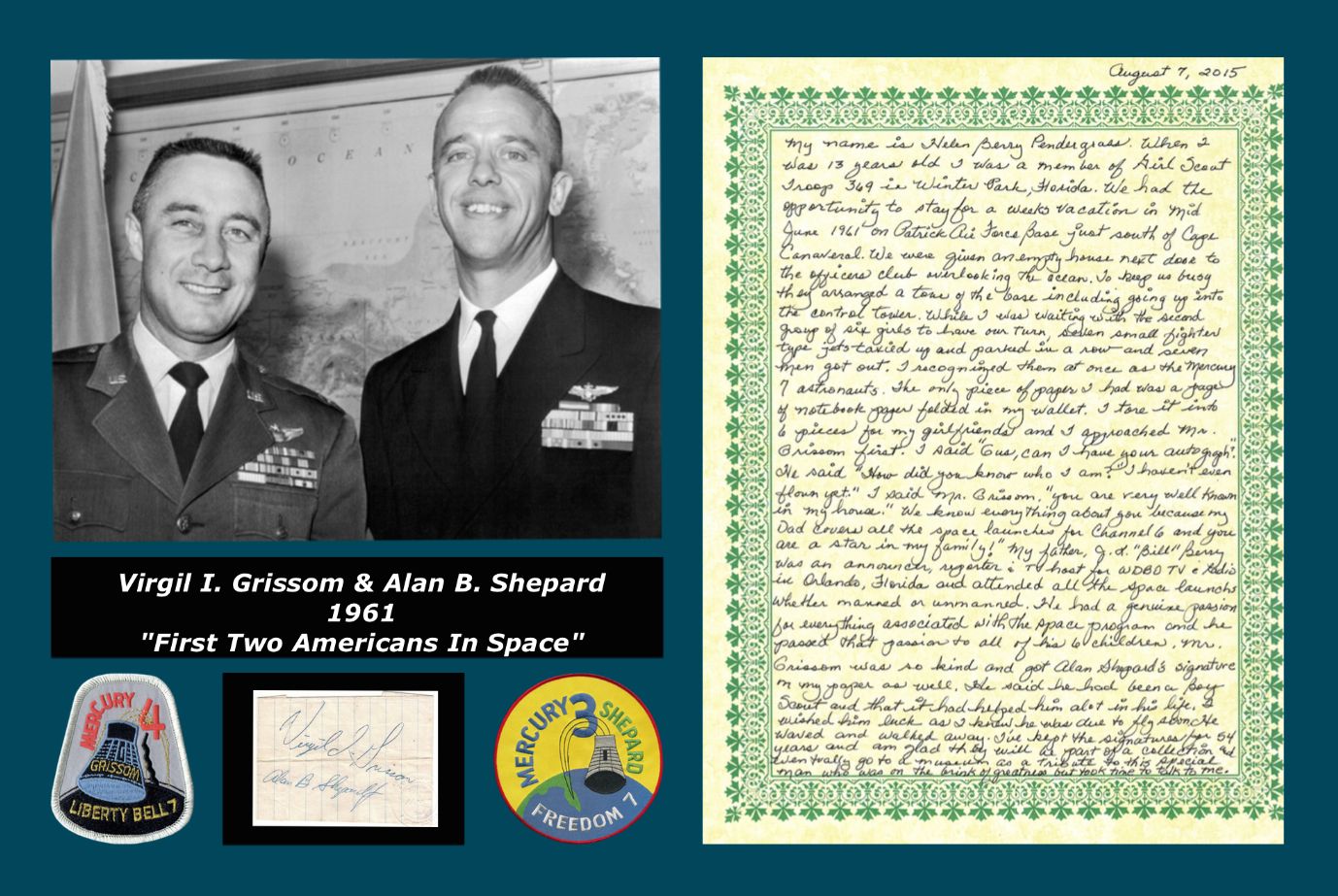
Once again thank you for all the advice everyone. Some great ideas. I like the idea of adding "First Two Americans in Space". Removing the Mercury 7 Group image allows me to make the display smaller. Here is version #3 of the rough draft with those changes.
 I think the image of the astronauts in front of the jet fighter ties in so well with what Helen witnessed that morning. It is cleaner without that image, but somehow I think it is an important image for visualizing her story. I like both versions. I will chew on it for awhile. |
ColinBurgess
Member Posts: 2031
From: Sydney, Australia
Registered: Sep 2003
|
 posted 10-05-2015 12:31 AM
   
From an aesthetic point of view I'd delete the quotation marks around "First Two Americans in Space" as unnecessary. Also, just for the record, that photo was taken at the Pentagon on 6 December 1961 when the two men (in their respective service uniforms) were officially presented with their astronaut wings. |
Skythings
Member Posts: 243
From:
Registered: Jun 2014
|
 posted 10-05-2015 09:30 AM
   
quote:
Originally posted by ColinBurgess:
Also, just for the record, that photo was taken at the Pentagon on 6 December 1961 when the two men (in their respective service uniforms) were officially presented with their astronaut wings.
Thank you Colin, You confirmed what the photo tag reads. Do you have any knowledge of what the slight controversy was? December 6, 1961 - Navy Commander Alan B. Shepard (right) and Air Force Captain Virgil I. Grissom pose at the Pentagon today after receiving the first pilot-astronaut wings awarded by the United States. The two astronauts were awarded the special wings in a double ceremony after a slight controversy over who would be the first to receive the honor. (AP Wirephoto) |
ColinBurgess
Member Posts: 2031
From: Sydney, Australia
Registered: Sep 2003
|
 posted 10-05-2015 03:29 PM
   
No, I don't know the answer to that, but it may have had something to do with a little humorous banter about inter-service rivalry between the Navy and Air Force. Presumably Shepard got his first as the first American into space. |
Mark Zimmer
Member Posts: 289
From:
Registered: Aug 2004
|
 posted 10-06-2015 02:43 PM
  
At minimum, you want the framer to use acid-free, archival quality mat and backing board so you don't damage these materials. You also want to use anti-UV glass on the front to minimize the dangers of fading. This will not be cheap if genuine (a lot of things claim "archival quality" but you want to make absolutely sure it's acid-free and neutral since no one regulates what's considered "archival quality" — don't cut corners), but you want to preserve these things as best you can. Get the name of the manufacturer and verify that their stuff is in fact acid-free/blocks UV properly to make certain, or have someone like Novaspace that really knows what they're doing do the framing. (Do they still do framing?) |
Skythings
Member Posts: 243
From:
Registered: Jun 2014
|
 posted 10-06-2015 07:54 PM
   
Thanks Mark - thats perfect information and great advice which I required. |
