|
|

|
|
Author
|
Topic: Space cover cancellations with obscured city
|
rvk
Member Posts: 38
From: Highlands Ranch, CO USA
Registered: Jul 2020
|
 posted 03-22-2024 04:58 PM
   
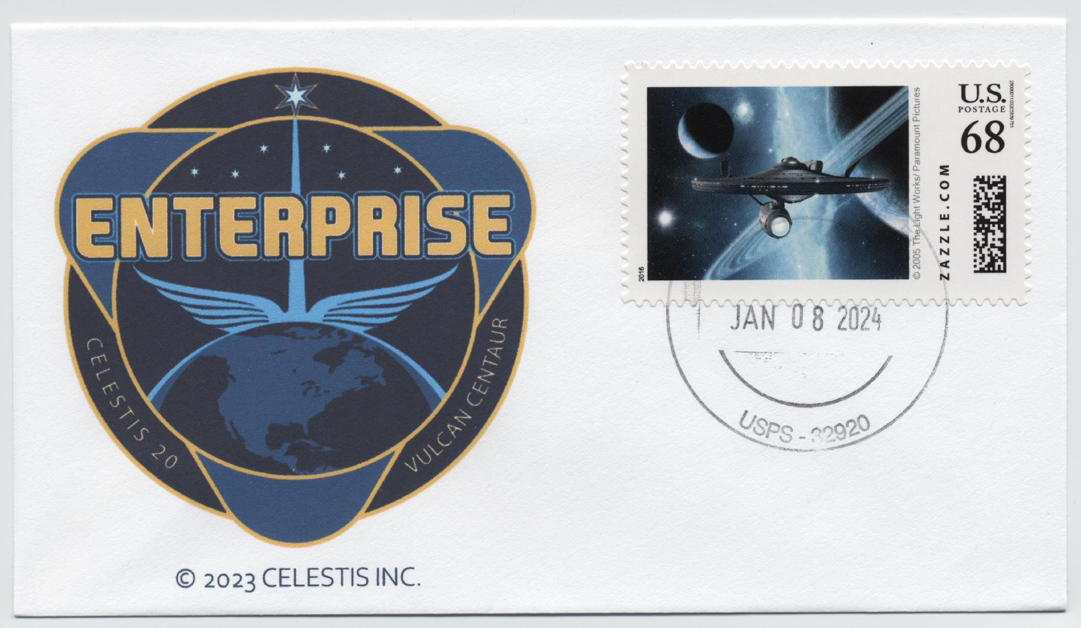
I need opinions on some envelopes that the USPS sent back to me for the ULA Vulcan launch on January 08. The post office was at Cape Canaveral, Florida. I specifically asked the post office to apply the postmark on just the edge of the stamp. However, the person who did the cancellations did not follow my instructions and now it does not show where the post office is. Only the date and zip code are visible. Are these envelopes now useless? What options do I have here? A scan of the envelope is attached below, as is another cover I received from Titusville, where the people who work there apparently know what collectors are looking for when requesting cancellations.  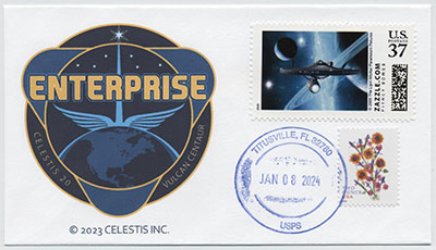
|
randyc
Member Posts: 903
From: Denver, CO USA
Registered: May 2003
|
posted 03-22-2024 05:57 PM
The cover cancelled from Cape Canaveral is still a good cover. Although it would have been better if the city area of the cancellation was visible you can see the zip code of 32920 which tells you the cancellation is from Cape Canaveral.Note that the cancellation from Titusville missed the top stamp. Again the cover is good, but the person applying the cancellation should have 'touched' both stamps with the cancellation. |
Antoni RIGO
Member Posts: 325
From: Palma de Mallorca, Is. Baleares - SPAIN
Registered: Aug 2013
|
posted 03-23-2024 01:00 PM
Richard, both covers are ok. Maybe not in excellent way, as all of you would prefer, but good according postal rules.I am agree with Randy. The Cape Canaveral postmark can be identified by zip code and Titusville postmark can be read without problem, although better if would cancel both stamps. What has happened is part of postmarking process. As you said postal employee did not follow your indications or simply was not aware of how accurate the collectors are. Just to add a different line of though. Zazzle stamps applied in both covers are very, very nice. But if background is not white, then you increase the chances that the postmark ink cannot be read correctly. To the best of your ability, the whiter the background of the Zazzle stamp, the better the postmark will look. Having all is very difficult. For this reason, when you get back your covers postmarked in excellent condition, you have a treasure on your hands. Anyways, as I told at the top of my post, both covers are ok. I myself would like to have them. |
RMH
Member Posts: 611
From: Ohio
Registered: Mar 2001
|
posted 03-23-2024 04:51 PM
I probably wouldn't put the top cover in my collection because you can't read the city. The bottom cover, for me, would be fine. Regarding the bottom cover, I think you would be expecting a lot from the postal clerk to be able to get a postmark to touch the top stamp and still be able to clearly read the city. As noted above, the darkness of the stamp is an issue. Perhaps the person doing the postmark knew it would be too difficult to barely touch the top stamp and still maintain legibility. |
astrobock
Member Posts: 193
From: WV, USA
Registered: Sep 2006
|
posted 03-23-2024 05:45 PM
I really appreciate the custom made postage stamps on these covers. That makes them very unique to me. I wish more people would do that. For me the top cover is better because the stamp is postmarked as it should be. | |
Contact Us | The Source for Space History & Artifacts
Copyright 1999-2024 collectSPACE. All rights reserved.

Ultimate Bulletin Board 5.47a
|
|
|
 advertisement advertisement
|