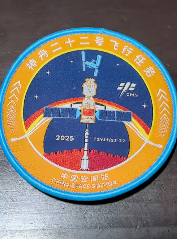
The Shenzhou-22 mission logo blends Chinese aerospace elements with traditional cultural symbols. Based on the Great Wall, it embodies the solemn commitment to the safety of astronauts. The bow and arrow shape, along with the Long March 2F carrier rocket and the Shenzhou spacecraft, forms the visual core, showcasing a sense of "ready to launch" and a steadfast belief in "mission accomplished."
Twenty-two arrows surround the logo, precisely corresponding to the mission number. In the color scheme, blue represents the foundation of aerospace technology, red represents mission responsibility, and orange highlights the swiftness of emergency rescue.
The overall design not only continues the aesthetic heritage of Chinese aerospace logos but also innovatively incorporates emergency rescue elements, perfectly interpreting the core value of "protecting life with aerospace power" and demonstrating China's technological strength and humanistic care in the aerospace field.
Subsequently, the China Manned Space Engineering Office will release an announcement regarding adjustments to the 2026 manned spaceflight mission logo design competition at an appropriate time.


 posted 11-24-2025 09:52 AM