|
Author
|
Topic: NASA History Program Office logo
|
LM-12
Member Posts: 3207
From: Ontario, Canada
Registered: Oct 2010
|
 posted 11-19-2014 09:35 PM
  
What do you think of the new NASA History Program Office logo?
 This is the NASA History Program Office logo. The H with wings to show our aeronautics research history and the rocket and stars to signify the space part of our heritage. We think that it elegantly captures a retro feel and the aeronautics, space, technology, and science aspects of the NACA and NASA, while subtly highlighting history as the launch pad for our future. |
Liembo
Member Posts: 583
From: Bothell, WA
Registered: Jan 2013
|
posted 11-20-2014 12:04 AM

First thing my brain registered is a person with a dunce cap in silhouette. |
dom
Member Posts: 855
From:
Registered: Aug 2001
|
posted 11-20-2014 02:16 AM
Terrible logo - looks like a Lego Wizard  |
cspg
Member Posts: 6210
From: Geneva, Switzerland
Registered: May 2006
|
posted 11-20-2014 04:11 AM
 Looks like the DoD History Office logo (if there's one). |
onesmallstep
Member Posts: 1310
From: Staten Island, New York USA
Registered: Nov 2007
|
posted 11-20-2014 08:33 AM
Harry Potter's personal spaceflight logo? 
|
Cozmosis22
Member Posts: 968
From: Texas * Earth
Registered: Apr 2011
|
posted 11-20-2014 09:55 AM
Halloween logo complete with a witch standing in the middle. |
fredtrav
Member Posts: 1673
From: Birmingham AL
Registered: Aug 2010
|
posted 11-20-2014 10:07 AM
Awful. First thing I thought of was why the wizard hat. So in rereading the post the wizard hat is the rocket?? |
p51
Member Posts: 1642
From: Olympia, WA
Registered: Sep 2011
|
posted 11-20-2014 10:50 AM
Horrible logo, looks like it should be for a Wiccan sports team sponsored by Pizza Hut...Beats me why they couldn't do some sort of throwback NACA/NASA reference. One primary rule for logo design is that if you can't tell what it is for when you look at the logo, you probably did a crummy job. |
cspg
Member Posts: 6210
From: Geneva, Switzerland
Registered: May 2006
|
posted 11-20-2014 11:00 AM
Very true. And on top of this, where's the word "NASA" indicated? |
Robert Pearlman
Editor Posts: 42984
From: Houston, TX
Registered: Nov 1999
|
posted 11-20-2014 11:08 AM
quote:
Originally posted by p51:
Beats me why they couldn't do some sort of throwback NACA/NASA reference.
Not that I am defending the logo, but this is what NASA History had to say: The yellow and black refers to the NACA logo, which was also yellow and black. Several of the X series planes which were tested by the NACA/NASA had yellow and black paint schemes and logos as well. |
fredtrav
Member Posts: 1673
From: Birmingham AL
Registered: Aug 2010
|
posted 11-20-2014 11:13 AM
There is nothing elegant about it. The H seems to stand for HUH? |
LM-12
Member Posts: 3207
From: Ontario, Canada
Registered: Oct 2010
|
posted 11-20-2014 11:39 AM
I think they could replace the new logo with this design until they come up with a better logo. I am not a fan of the NASA worm, but it was a part of NASA History.I would make one minor change in the Dryden design: remove the black line that goes through the blue area, so that the NASA meatball is in the middle with the NACA emblem slightly behind. |
Liembo
Member Posts: 583
From: Bothell, WA
Registered: Jan 2013
|
posted 11-20-2014 04:04 PM
How about something like this: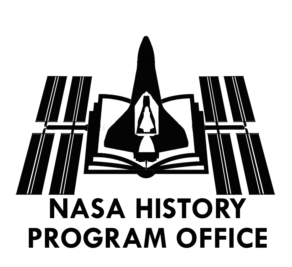 |
p51
Member Posts: 1642
From: Olympia, WA
Registered: Sep 2011
|
posted 11-20-2014 04:20 PM
Sure looks better than what they have, no question about it and you can tell what it is right away. |
LM-12
Member Posts: 3207
From: Ontario, Canada
Registered: Oct 2010
|
posted 11-21-2014 01:03 PM
What did the old NHPO logo look like, if there was one? |
Robert Pearlman
Editor Posts: 42984
From: Houston, TX
Registered: Nov 1999
|
posted 11-21-2014 03:09 PM
I believe the logo was primarily designed to serve as an avatar for the History Office on Twitter and Facebook. |
cspg
Member Posts: 6210
From: Geneva, Switzerland
Registered: May 2006
|
posted 11-21-2014 03:42 PM
quote:
Originally posted by Liembo:
How about something like this
That looks great! But the first "A" in NASA should be part of the logo. Yours focuses only on the manned spaceflight aspects of the agency (okay, granted, NASA is better known for space than aeronautics but the original logo wanted aeronautics to be represented). |


