|
Author
|
Topic: Looking for a Design for Irish Space Blog
|
COR482932
Member Posts: 212
From: Cork, Ireland
Registered: Mar 2012
|
 posted 11-23-2013 05:26 AM
   
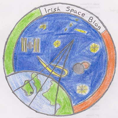
This time last year I started writing my own blog ("Irish Space Blog") to help improve my writing skills in the hope of one day becoming a space/astronomy/technology journalist here in Ireland. As you can imagine, there are not a lot of space reporters in Ireland, so I just said I'd give it a shot and see if anyone wanted me to make a contribution with a story/article. I have interviewed quite a number of astronauts both in person and via social media events/Skype/Google+ etc. I contribute to a number of science websites over here, and one of my articles even made it into a national newspaper. Along with being a big astronaut autograph collector, I recently started collecting mission patches and stickers. I have always wanted to design my own logo for my blog, but all I have been able to do is find some templates from online websites. I have been sketching away myself, with several preliminary designs made out. At the moment, this is my current logo. The current design will do fine for now, but I was kind of hoping for something a bit better. My hope is one day, when all design is complete to produce a couple of patches. stickers and pins that I could hand out at my local observatory when there are events on there. Long story short, anyone know how or where I can create a good logo design? I know I'm asking the right people here on cS. Thanks so much for your help. I look forward to your advice. Go raibh maith agat. Cian O'Regan |
KSCartist
Member Posts: 2896
From: Titusville, FL USA
Registered: Feb 2005
|
 posted 11-23-2013 06:28 AM
   
Email me a description of what you want to "say" with your logo (a mission statement if you will) and I will be happy to work with you to design it. I'm confident Jorge will help as well. |
garymilgrom
Member Posts: 1966
From: Atlanta, GA
Registered: Feb 2007
|
 posted 11-23-2013 08:45 AM
   
I'd also like a shot at this project. In addition to Tim's request for your mission statement, I'd ask what is most important for the logo to reflect: - Irish heritage
- Space exploration
- Space collection
- If above, any specific part or program?
And similar questions. Go raibh maith agat, a chara. |
COR482932
Member Posts: 212
From: Cork, Ireland
Registered: Mar 2012
|
 posted 11-23-2013 12:31 PM
   
Tim and Gary, I have sent you both emails. |
KAPTEC
Member Posts: 578
From: Madrid, Spain
Registered: Oct 2005
|
 posted 11-23-2013 02:23 PM
   
I will be very happy to help! |
COR482932
Member Posts: 212
From: Cork, Ireland
Registered: Mar 2012
|
 posted 11-23-2013 03:03 PM
   
quote:
Originally posted by KAPTEC:
I will be very happy to help!
Thanks a lot!! Just sent you an email!! |
Space Emblem Art
Member Posts: 194
From: Citrus Heights, CA - USA
Registered: Jan 2006
|
 posted 11-23-2013 03:49 PM
   
Hi, I'd be glad to help also, just e-mail me with your information. Please put "Irish Space Blog" in the subject line. Thanks. |
Hart Sastrowardoyo
Member Posts: 3445
From: Toms River, NJ
Registered: Aug 2000
|
 posted 11-23-2013 10:43 PM
   
Send me an email as well. I'm looking at something I got from Dublin that might work.... |
COR482932
Member Posts: 212
From: Cork, Ireland
Registered: Mar 2012
|
 posted 11-24-2013 02:19 AM
   
Thanks guys, I've sent both of you emails. |
MarylandSpace
Member Posts: 1336
From:
Registered: Aug 2002
|
 posted 11-24-2013 10:23 AM
   
What about a shamrock shaped patch? or at least including a shamrock in the field of design? |
COR482932
Member Posts: 212
From: Cork, Ireland
Registered: Mar 2012
|
 posted 11-24-2013 11:06 AM
   
Yeah a clover seems like a really good idea! I would certainly be interested in seeing what a shamrock-shaped patch would look like, and if that doesn't work out, we could definitely fit it into the patch in some way I'm sure. Keep the ideas coming! Also, there's no deadline or anything like that, so no rush whatsoever. |
COR482932
Member Posts: 212
From: Cork, Ireland
Registered: Mar 2012
|
 posted 11-24-2013 01:59 PM
   
As regards the inclusion of a shamrock, if the logo isn't in this shape, perhaps we could do something as simple as just having it in the background somewhere, just like the one for SpaceX's first geo-transfer mission.As you can see the there is a small shamrock at the bottom of the patch. |
Robert Pearlman
Editor Posts: 42984
From: Houston, TX
Registered: Nov 1999
|
 posted 11-24-2013 02:05 PM
   
All but the first three of SpaceX's flight patches have four leaf clovers on them. The fourth flight included the icon and it was their first success, so it has been included as a sign of a good luck ever since. |
KAPTEC
Member Posts: 578
From: Madrid, Spain
Registered: Oct 2005
|
 posted 11-24-2013 02:11 PM
   
Email received Cian. Thinking is something better than the nice logo you have right now. |
COR482932
Member Posts: 212
From: Cork, Ireland
Registered: Mar 2012
|
 posted 11-24-2013 05:18 PM
   
Here is one of my better sketches. Excuse my poor artwork! It may remind you of the STS-120 patch. This is because this was the first patch that I got for my collection, and the first two astronauts I interviewed for Irish Space Blog were Dan Tani and Paolo Nespoli!It's just something to let you guys know what kind of ideas for design I have in my head.  |
Zarya
Member Posts: 11
From:
Registered: Jun 2013
|
 posted 11-25-2013 02:43 AM
  
That's a nice design, simple and elegant. I also prefer the Irish tricolour over the blue, white and red scheme. If you need Irish symbols, how about incorporating those from the provincial flags: Connacht's eagle and sword, the Red Hand of Ulster, Leinster's harp, and Munster's three gold crowns? Having said that, I stil believe that the design you have presented is excellent as it stands. Perhaps, using a Gaelic typeface would be good.Sláinte agus saol agat! |
COR482932
Member Posts: 212
From: Cork, Ireland
Registered: Mar 2012
|
 posted 11-25-2013 10:33 AM
   
quote:
Originally posted by Zarya:
How about incorporating those from the provincial flags: Connacht's eagle and sword, the Red Hand of Ulster, Leinster's harp, and Munster's three gold crowns? Having said that, I stil believe that the design you have presented is excellent as it stands. Perhaps, using a Gaelic typeface would be good.
Some great ideas there too. I think that all for provincial emblems may be a bit too much, so I am thinking maybe just the harp would be a nice addition. I think this would look nice incorporated into the border somewhere. As for the writing, I think I will just use just plain text used on all the patches these days. I don't want it looking too Irish if you know what I mean.  Great ideas! Thanks! |
dom
Member Posts: 855
From:
Registered: Aug 2001
|
 posted 11-25-2013 12:38 PM
   
Yes, definitely no leprechauns!What about symbols of the country's rich history of astronomy, with a representation of ancient Newgrange (Ireland's Stonehenge) or the Birr Telescope? |
COR482932
Member Posts: 212
From: Cork, Ireland
Registered: Mar 2012
|
 posted 11-25-2013 01:46 PM
   
Hmm. Yeah they sound like good ideas. As much as I like the thought of Newgrange, I feel that if I put it in the logo people might think the blog is associated with the famous site. Not many people know about Birr, but I have always thought including just a telescope would be a good idea. It's definitely something to look into. So what do you think guys? |
COR482932
Member Posts: 212
From: Cork, Ireland
Registered: Mar 2012
|
 posted 12-03-2013 10:56 AM
   
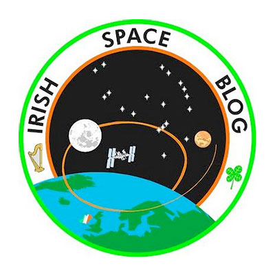
Here is one potential design. As you can see it is very similar to the initial sketches I have posted above. Thoughts? |
MarylandSpace
Member Posts: 1336
From:
Registered: Aug 2002
|
 posted 12-03-2013 04:07 PM
   
I like it! but am drawing a blank on the stars (constellations). |
Robert Pearlman
Editor Posts: 42984
From: Houston, TX
Registered: Nov 1999
|
 posted 12-03-2013 04:10 PM
   
I'd suggest moving "Irish Space Blog" closer together and center at the top or to one side. Garry, I believe the stars are the constellation Orion. |
COR482932
Member Posts: 212
From: Cork, Ireland
Registered: Mar 2012
|
 posted 12-03-2013 04:53 PM
   
Correct. The stars in the background make up the constellation Orion, my favourite constellation and also the name of NASA's next crew capsule that will send astronauts into the solar system than ever before.I think putting the text closer together is certainly a good idea. The only problem is that there might be a lot of empty space in the border as a result. I'd love to know what everyone thinks regarding Robert's point. Thanks. |
JBoe
Member Posts: 959
From: Churchton, MD
Registered: Oct 2012
|
 posted 12-03-2013 05:02 PM
   
I agree with Robert regarding the lettering. Also, just a suggestion, but the golden swoosh could start from Ireland and loop around both moon and Mars or individually. All in all I really like the simplistic design, which makes it elegant. |
Zarya
Member Posts: 11
From:
Registered: Jun 2013
|
 posted 12-04-2013 01:47 AM
  
Very nice indeed! I concur with moving the words closer together. Do you think the globe should be zoomed in more to emphasise Ireland more? Also, shamrocks have only three petals. |
MarylandSpace
Member Posts: 1336
From:
Registered: Aug 2002
|
 posted 12-04-2013 11:09 AM
   
I see the three belt stars and the rest of Orion now. I just needed to move the patch or move my head. There is a great display at Green Bank Telescope in Virginia showing the distances apart the stars are in Orion. |
MarylandSpace
Member Posts: 1336
From:
Registered: Aug 2002
|
 posted 12-04-2013 11:25 AM
   
A suggestion for the lettering: an tactic in typing that spreads words out with spaces called S P R E A D . C E N T E R I N G.You put one space between letters and three spaces between words. I taught typing, keyboarding, and then something called computer applications in my 37 years as a teacher. I R I S H . S P A C E . B L O G ...or maybe put a star between Irish and Space and a star between Space and Blog to space things out but yet have the words spread centered. |
COR482932
Member Posts: 212
From: Cork, Ireland
Registered: Mar 2012
|
 posted 12-05-2013 01:22 PM
   
What do you guys think of the slogan "From the Emerald Isle to the World" appearing on the logo? It looks really good on Tim's design, but I was wondering if anyone had any other ideas for a motto/slogan? Not too long though- it's gotta fit in the border. Can't wait to hear from you all!
|
COR482932
Member Posts: 212
From: Cork, Ireland
Registered: Mar 2012
|
 posted 12-07-2013 03:54 AM
   
Here is another design proposal. Again, open to any comments, particularly concerning the motto. |
dom
Member Posts: 855
From:
Registered: Aug 2001
|
 posted 12-07-2013 05:14 AM
   
That design is great but shouldn't it say 'From the Emerald Isle to the Universe'?  |
COR482932
Member Posts: 212
From: Cork, Ireland
Registered: Mar 2012
|
 posted 12-07-2013 05:51 AM
   
Hmm... it just doesn't have a ring to it does it?  |
JBoe
Member Posts: 959
From: Churchton, MD
Registered: Oct 2012
|
 posted 12-07-2013 06:51 AM
   
I really like the revised patch, very nice and clean! I would agree to use "Universe" instead of "World" to provide more of an "impact." Great job! |
COR482932
Member Posts: 212
From: Cork, Ireland
Registered: Mar 2012
|
 posted 12-07-2013 07:08 AM
   
How about "From the Emerald Isle to the Stars"? |
dom
Member Posts: 855
From:
Registered: Aug 2001
|
 posted 12-07-2013 04:08 PM
   
Yes, I think "to the Stars" has a good ring to it! |
COR482932
Member Posts: 212
From: Cork, Ireland
Registered: Mar 2012
|
 posted 12-11-2013 08:15 AM
   
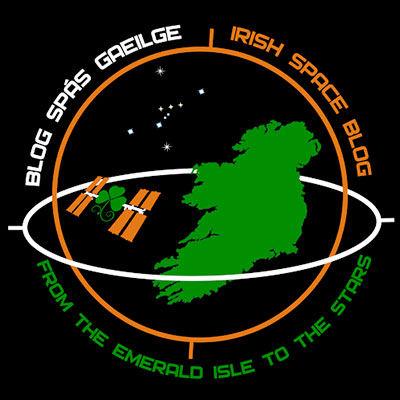
Here is another design proposal:  |
Zarya
Member Posts: 11
From:
Registered: Jun 2013
|
 posted 12-11-2013 08:25 AM
  
The logo gets better as you progress through the design phases. I like the use of an Ghaeltacht, the elimination of land masses other than Ireland, and the use of the shamrock to form the body of the ISS. The colour scheme is good, too. I especially like that the orbital path of the ISS passes entirely over Munster. |
JBoe
Member Posts: 959
From: Churchton, MD
Registered: Oct 2012
|
 posted 12-11-2013 09:13 AM
   
WOW! I too like this new iteration. Great job! |
MarylandSpace
Member Posts: 1336
From:
Registered: Aug 2002
|
 posted 12-11-2013 09:18 AM
   
I like the colors and boldness of the 12/7 design for a patch. Also, it is easier for me to identify Ireland as part of the British Isles on this patch. The blog is directed to readers in this world not to readers in the universe.The 12/11 design has too many words for a patch but it's square design could work as a sticker or logo — that is just my opinion. If you have not been reading Cian's Irish Space Blog, now is the time to start. |
COR482932
Member Posts: 212
From: Cork, Ireland
Registered: Mar 2012
|
 posted 12-11-2013 01:05 PM
   
Thanks a lot Garry! I really appreciate it my friend. Glad to see you like the designs and thanks for your comments!  |
dom
Member Posts: 855
From:
Registered: Aug 2001
|
 posted 12-11-2013 01:38 PM
   
Personally I think the first design is much better as the Europe/British Isles map gives more context to Ireland's 'place in the universe'. Also, I think the ISS shamrock looks a little cheesy... |
