|
Author
|
Topic: New York Times: NASA Meatball vs. Worm
|
Robert Pearlman
Editor Posts: 42984
From: Houston, TX
Registered: Nov 1999
|
 posted 03-08-2009 09:47 AM
   
New York Times: Art of the Seal Some things seem doomed to divide us: Lennon versus McCartney, Yankees versus Mets, boxers versus briefs and so on. If you love one, you'll probably loathe the other, and each camp makes an equally convincing case as to why its choice is right. For design nuts, one of those alpha-versus-beta divisions is choosing between the two logos of the National Aeronautics and Space Administration, also known as NASA.One is the symbol that NASA adopted in 1959 and still uses today. It's the NASA Insignia, commonly known as "the meatball" for the obvious reason that it looks like one. The other is the logo that replaced it from 1975 to 1992. It, too, has an official name, the NASA Logotype, and a similarly self-explanatory nickname, "the worm." The arguments in favor of both are steeped in space-race romanticism, but they also tell us why some organizational identities (to give logos their posh name) seem so special. 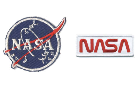 Meatball vs. Worm: which do you prefer? Which better represents NASA today? |
Linda K
Member Posts: 62
From: Greensboro, NC 27455
Registered: Aug 2008
|
posted 03-08-2009 11:08 AM
Speaking for myself, I personally prefer the "meatball." If you read the logo information from NASA's History Division, the explanation for the design is as follows: "In the "meatball" design, the sphere represents a planet, the stars represent space, the red chevron is a wing representing aeronautics (the latest design in hypersonic wings at the time the logo was developed), and then there is an orbiting spacecraft going around the wing." It is also explained that "In 1992, Administrator Dan Goldin brought NASA's meatball back from retirement to invoke memories of the one-giant-leap-for-mankind glory days of Apollo and to show that "the magic is back at NASA." The "worm" logo was introduced in 1975 in an attempt to modernize NASA's image. While the lettering does look rather "hi-tech," or more modern in some ways, to my way of thinking that logo never did justice to the breadth of the NASA program. Just as the mission patches incorporate many meaningful images in one design, the meatball is a much better representation of the wide range of knowledge gained (and yet to be learned). It is also an excellent representation of how much we have achieved, i.e., the aeronautics represented by the red chevron shows how human ingenuity has made spaceflight possible. The stars representing space remind us of the fact that space is, in fact, the "final frontier," and the possibilities are truly endless. I just feel that the worm looks more like a business logo, while the meatball is more of a symbol of an ideal. |
embangloy
Member Posts: 75
From: Nashville, TN, USA
Registered: Aug 2007
|
posted 03-08-2009 11:11 AM
I am partial to the "Meatball." It is the most recognizable and unique to the agency.The "Worm" logo looks too much like a military name tape to is sewn on BDU's. Remember the Black and Gold "Worm" logo as well? |
Voyager1975
Member Posts: 188
From:
Registered: Dec 2008
|
posted 03-08-2009 11:36 AM
One of my all-time favorite NASA worm logo patches is the navy blue patch with the white NASA worm lettering. Just take a look at the STS-8 crew photo. They are wearing the patch on their royal blue flight suits. I only wish that that patch version was available. |
Mr Meek
Member Posts: 353
From: Chattanooga, TN
Registered: Dec 2007
|
posted 03-08-2009 11:13 PM
Amateurish or not, I like the meatball. It's iconic, eye-catching, and historic. I think it's the worm's lack of crossbars on the A's that bothers me. It seems to fall into the class of logos that are designed solely to make an impression in and of themselves, and not necessarily to represent the essence of the entity in question.(Yes, I know. 42% of our beloved cS's logo is the worm font, including the crossbar-less A. Robert can use whatever font he wants...not even Papyrus would keep me from reading cS  ) ) |
Robert Pearlman
Editor Posts: 42984
From: Houston, TX
Registered: Nov 1999
|
posted 03-08-2009 11:22 PM
quote:
Originally posted by Mr Meek:
It seems to fall into the class of logos that are designed solely to make an impression in and of themselves, and not necessarily to represent the essence of the entity in question.
The use of the "worm" font in the collectSPACE logo does represent the essence of the entity by evoking a style associated with space history.  |
Mike Z
Member Posts: 451
From: Ellicott City, Maryland
Registered: Dec 2005
|
posted 03-09-2009 01:06 AM
I truly think the Meatball is one of the best logos ever. The only other logo that comes close is the Coca-Cola logo. Like the Meatball logo, everyone around the world knows it. The Worm logo is also a great logo but NASA did the "impossible" while using the Meatball, Mercury-Reaching space, Gemini-rendezvous, docking and the first EVAs and Apollo-going to the moon! My two cents. |
Mr Meek
Member Posts: 353
From: Chattanooga, TN
Registered: Dec 2007
|
posted 03-09-2009 08:33 AM
quote:
Originally posted by Robert Pearlman:
The use of the "worm" font in the collectSPACE logo does represent the essence of the entity by evoking a style associated with space history.
Exactly. I was going to say something like "It's not Robert's fault NASA chose a bad looking font," but decided to take a cheap shot at the Papyrus typeface instead. I think the whole "marrying a graphic designer" thing is starting to have an effect on me. |
cddfspace
Member Posts: 609
From: Morris County, NJ, USA
Registered: Jan 2006
|
posted 03-09-2009 06:35 PM
Have to go with the meatball! |
Space Emblem Art
Member Posts: 194
From: Citrus Heights, CA - USA
Registered: Jan 2006
|
posted 03-09-2009 11:24 PM
Hands down, it's the meatball. |
dogcrew5369
Member Posts: 750
From: Statesville, NC
Registered: Mar 2009
|
posted 03-12-2009 10:41 PM
The meatball says "exploration" while the worm says "business". Need I say more! |
Voyager1975
Member Posts: 188
From:
Registered: Dec 2008
|
posted 04-25-2009 03:07 PM
Speaking of the NASA worm logo doesn't the Hubble Space Telescope have the worm logo on it? |
ShuttleDiscovery
Member Posts: 152
From:
Registered: Feb 2007
|
posted 04-28-2009 11:19 AM
The meatball is definately the best!! |
nasamad
Member Posts: 2121
From: Essex, UK
Registered: Jul 2001
|
posted 04-28-2009 12:38 PM
I must have doodoo in my eyes, until Robert mentioned it in the post above I had never noticed he had used the worm font in the cS logo!Anyway, it's the meatball for me, with the stars and the orbit, what else says space like that patch? |
GoesTo11
Member Posts: 1309
From: Denver, CO
Registered: Jun 2004
|
posted 04-28-2009 03:16 PM
The meatball is timeless. The worm screams "'80s." |
GoesTo11
Member Posts: 1309
From: Denver, CO
Registered: Jun 2004
|
posted 05-07-2009 04:18 PM
I think I've asked before about this, but the pic at the top of this thread reminds me... Does anyone make/sell the white-bordered meatball patch on the left? I can't find one anywhere. Thanks! |
Voyager1975
Member Posts: 188
From:
Registered: Dec 2008
|
posted 05-07-2009 05:51 PM
I do not know of anyone or any company that reproduces the "Type 1" "Type 2" or "Type 3" which are the three white-bordered versions of the NASA vector or meatball logo patches. I am of course talking about the ones that the Mercury, Gemini and Apollo astronauts wore. The only one that is out there is a 2 1/2 inch white-bordered patch made by AB Emblem but it is more or less what the Apollo suit technicians wore on there white hats. |
Go4Launch
Member Posts: 542
From: Seminole, Fla.
Registered: Jul 2003
|
posted 05-07-2009 10:19 PM
A five-inch white-bordered meatball patch is available from Flight Suits. |
mjanovec
Member Posts: 3811
From: Midwest, USA
Registered: Jul 2005
|
posted 05-07-2009 10:41 PM
While I greatly prefer the meatball to the worm, I kind of wish NASA had designed a new logo in the 90s instead of just returning to the meatball. I think it would have been nice to have a new design to distinguish a newer era of spaceflight. To me, the meatball is a symbol of 1960s NASA, a classic symbol that should have remained associated with that era only.Having said that, I still think it's a nice design and it's probably better than some of the alternatives. |


